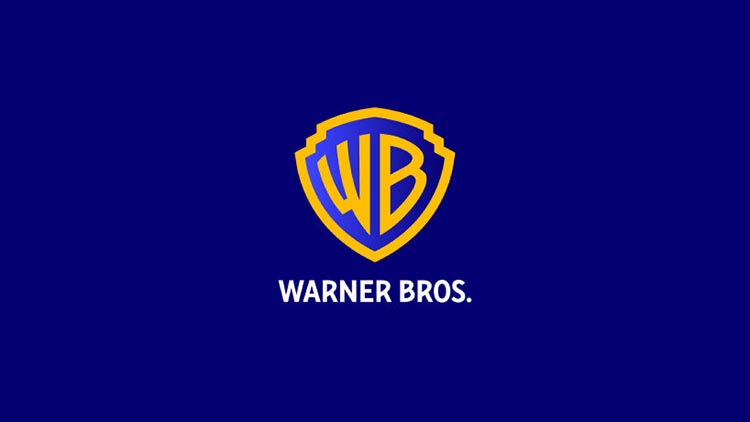
Chermayeff & Geismar & Haviv have recently unveiled their redesign of the iconic shield logo for Warner Bros, Pictures and Studios. The design team’s goal was to create a refreshed and modernized look while retaining the classic and recognizable features of the original logo.
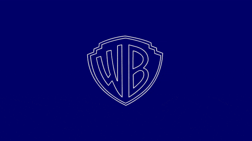
One of the key changes made to the logo was the removal of the “Warner Bros. Pictures Inc.” banner from the middle of the shield. The curvature and letterforms of the shield and the capital letters ‘WB’ were made thicker, bolder, and sharper, resulting in a more sleek and chunky appearance.
the shield has gotten bigger and the laddered and pointed edges above are now decked out with softer turns
The new logo and its changes
The redesigned logo will be used across the entire Warner Bros. family portfolio and will be the new logo for the company and its brands starting in May 2023, coinciding with the studio’s 100th anniversary. Chermayeff & Geismar & Haviv have accomplished this redesign through reductive geometry, streamlined curves, and even more vibrant hues.
The design team also paid special attention to the curvature of the rounded letterforms in the logo, such as the Ps, Bs, and Rs. They equalized the weight of the W and B letterforms with the stroke of the encasing shield shape, and the strong, sans serif, all-capital letters for the word marks have been accentuated to underscore the curvature of the rounded letterforms. The new typography maintains the distinctive character of the lettering that resonates with the revised WB letters in the shield.
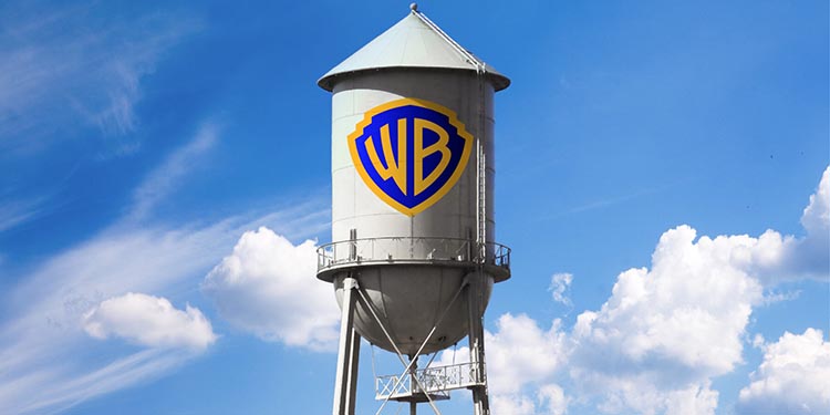
The revamped consistency of line weight between the elements creates a unified, timeless symbol that can work seamlessly with all the properties in the company’s extensive portfolio. The new logo comes in two forms: a solid rendition of yellow and blue that is used for corporate communications and an outline rendition that promotes movies, television shows, games, and other content.
the tips have been sharpened, and the shadowing inside the shield is even more pronounced
A redesigned logo for modern times
Chermayeff & Geismar & Haviv have successfully redesigned the Warner Bros. Pictures and Studios shield logo by creating a modernized yet timeless symbol.
This new logo suits Warner Bros. company. With this redesign, Chermayeff & Geismar & Haviv managed to capture the studio’s past, present, and future all in one symbol.

Designing the logo based on the characters’ personalities
The new logo adapts to the movies’ and characters’ personalities with details that immediately recall a specific protagonist or scene. Additionally, the redesigned logo allows for more creativity and flexibility when promoting movies, television shows, games, and other content.
The redesigned logo is not only a symbol of the studio’s history and legacy but also a representation of its commitment to innovation and creativity. By creating a more modern and sleek logo, Warner Bros. is telling the world that it is a company that is always looking towards the future and is willing to adapt to changing times.
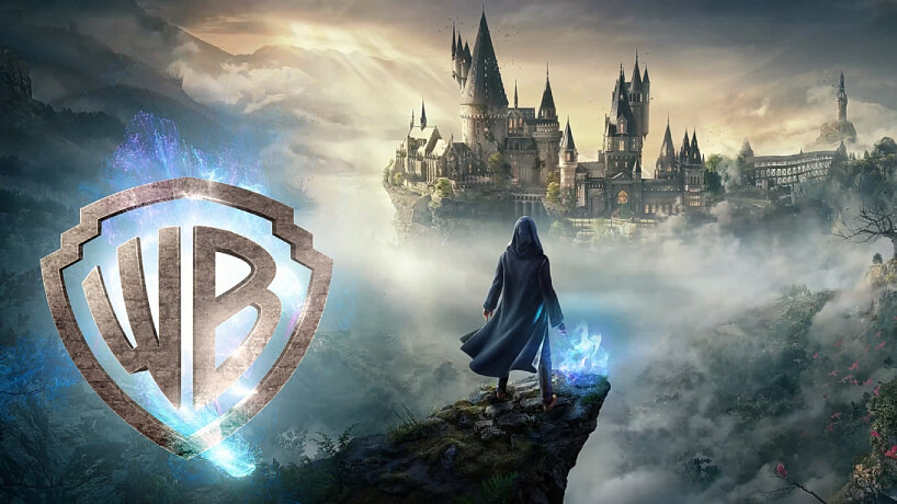
new Warner Bros. logo for Harry Potter
In conclusion, the redesign of the Warner Bros. Pictures and Studios logo by Chermayeff & Geismar & Haviv points to the power of a well-designed logo. The new logo is a symbol that will undoubtedly stand the test of time and become an iconic part of the Warner Bros. legacy.