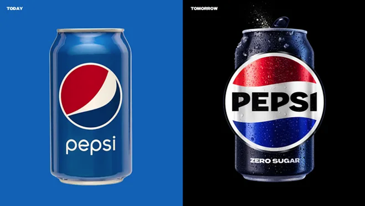
Pepsi has recently launched a new logo and brand system that aims to sell its Zero Sugar products through high-contrast visuals. The rebranding marks the first significant update in 15 years and is built to distance Pepsi’s association with sugar.
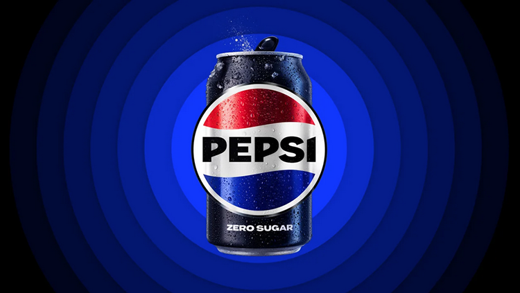
The iconic Pepsi word mark has been placed back into the company’s yin-yang “globe” with black cutting through the red, white, and blue palette to bind the brand together. The new design also features a digital pattern called the “pulse,” which ripples out from the logo and animates to any background beat.
New color in new identity
The black color used in the new Pepsi logo design starts with the word mark, outlines the globe, and represents Pepsi Zero Sugar, the lead brand used in marketing.
Moving away from sugar is a significant topic on Pepsi’s mind as consumers are looking to drink less of it, with 30% of Gen Z claiming to avoid it altogether. The company’s growth is mostly due to the increase of the price of soda, rather than extending its reach.
During these years, Pepsi has represented billions of dollars in investment and divestment for Pepsi, as the company sold off its juice brands Tropicana and Naked in 2021, while pumping more resources into its concentrate-based Soda Stream platform.
Of half a dozen logo concepts that Mauro Porcini, SVP, and chief design officer at Pepsi, had been considering for the new branding, all but one used a blue word mark. However, after showing prototypes to more people inside the company, the black iteration always stood out, even though no one loved the design itself.
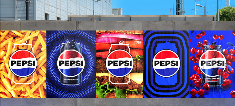
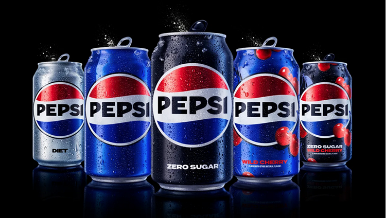
The company refined the logo in black for launch, which increased the pop of Pepsi’s visuals, allowing the brand to cut through the noise of social media and other digital environments. The new brand system is designed to work well on Instagram, cans, NFL broadcasts, hoodies, and other branded merchandise.
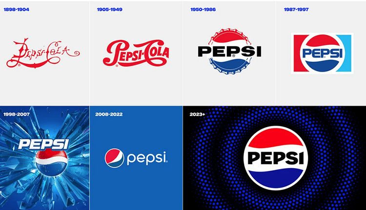
Pepsi’s new brand system is logical and flexible. Retrospectively, Pepsi’s logo redesigns tend to capture the essence of their era’s cultural zeitgeist. For instance, 1998 embraced the glitzy, gaudy optimism of Y2K, while 2008 embraced the flat, muted colors beloved by millennials.
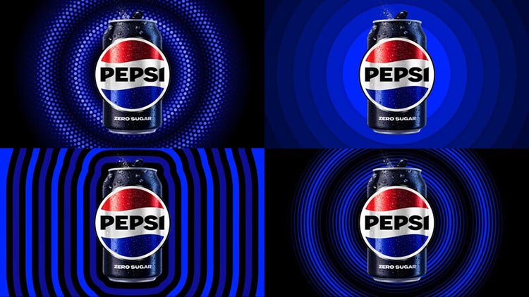
The 2023 rebrand features a bold, digital animation that mixes graphics and photography. The black and blue “pulse” is expected to change its design based upon its context, and fresh animations will appear in the next decade of Pepsi ads.
Have a goal for brand future
Jokes aside, it’s clear that Pepsi’s new logo and brand system are a strategic move to distance the brand from its association with sugar and appeal to consumers who are increasingly conscious about their sugar intake.
The use of black color in the logo and design is a clever way to tie the brand together and make it stand out in a crowded digital landscape, while the new brand system is flexible and adaptable enough to work across various mediums.
As with any rebranding effort, only time will tell whether Pepsi’s new look and messaging will resonate with consumers and drive sales. But for now, it’s clear that the brand is taking a bold step forward in an effort to stay relevant and appeal to the next generation of consumers.
Black color and its benefits in Pepsi new logo
The design team also incorporated the use of black into the brand system, which is a color associated with Pepsi Zero Sugar. The black outlines the globe and spills out into what the team refers to as the “pulse,” a digital pattern that ripples out from the logo and animates to any background beat.
Kaplan, the CMO of Pepsi, stated that “It’s an intentional color we added in with [Pepsi] Zero Sugar, which will be the lead brand we use marketing. [Black] can act as a master brand statement.”

The shift away from sugar is a significant focus for Pepsi. While the company’s revenue is growing, the increase is mostly due to the company raising the price of soda rather than extending its reach. Additionally, consumers are looking to drink less sugar, with 30% of Gen Z claiming to avoid it altogether.
In recent years, Pepsi has invested billions of dollars into moving away from sugar. For instance, in 2021, the company sold off its juice brands Tropicana and Naked, while investing more resources into its concentrate-based SodaStream platform, which it first acquired in 2018.
New logo design process
During the design process, of half a dozen logo concepts that Mauro Porcini, SVP, and chief design officer at Pepsi, had been considering for the new branding, all but one used a blue wordmark. As he showed them to more people inside the company, the black iteration always stood out, even though no one loved the design itself.
“We realized people loved the concept because of the contrast,” he says, and so the company refined the logo in black for launch. The new brand system is designed to be logical, flexible, and relevant to the times. It is expected to work well on various platforms, including social media, cans, NFL broadcasts, and branded merchandise like hoodies.
The black and blue “pulse” will change its design based on its context, and the brand system uses various silhouettes like cans and cups to frame the logo in a food service context.
altogether, Pepsi’s new brand system is a subliminal war on sugar, emphasizing the shift away from sugar through the use of black and the marketing of Pepsi Zero Sugar. The design is flexible, relevant, and captures the essence of the current cultural zeitgeist.
References: +