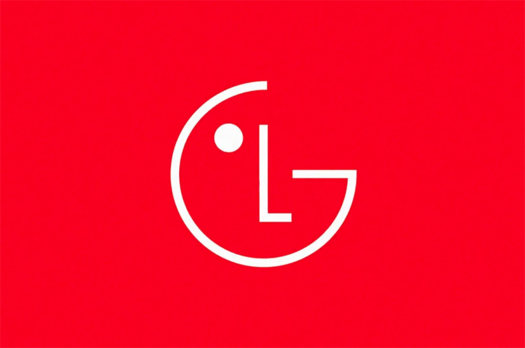
This time around, the South Korean electronics brand LG has adopted a simpler, flatter design to appeal to younger consumers, with the ‘G’ in LG standing for “glow-up“.
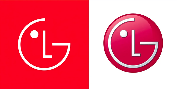
The updated global brand identity is most noticeable for its brighter new red color, named ‘LG Active Red’. Additionally, the ‘LG’ face in the logo has been animated with eight unique expressions. It includes winking, smiling, and looking around to engage with viewers.
The new color palette for Gen Z
The company also intends to make its ‘Life’s Good’ slogan more prominent across its branding and product packaging, using a fresh typeface. Although the logo is now flatter, LG plans to introduce “gradient elements” to LG Active Red. Color palette changed with the aim of appearing more “dynamic and youthful” to all generations in all regions.
LG hopes that this visual refresh will enhance its relevance with Gen Z and beyond. It may have succeeded in that regard and brand colors resemble the Nintendo Switch logo to some extent.
LG explains that the refresh demonstrates its willingness and ability to evolve with generations, as well as its commitment to innovating customer experiences around the world.

The purpose of rebranding
LG has decided to update its brand identity to keep up with other companies which have started rebranding to appeal to younger consumers. New generation has different preferences and values compared to previous generations. By adopting a simpler, flatter design and brighter colors, LG is attempting to appeal to a generation that values minimalism, boldness, diversity, and equity, and expect brands to reflect these values.

Moreover, by animating the ‘LG’ face with unique expressions, the company is attempting to create a more personalized and engaging brand identity. Something that resonates with younger consumers who value authenticity.
New brand identity for a wider rage of consumers
The inclusion of gradient elements and a broader color palette also suggests that LG is trying to create a more diverse and inclusive brand identity. Identity that appeals to a wider range of people. This move is in line with the growing trend.
LG’s decision to update its brand identity is a strategic move that reflects the changing preferences of younger consumers. By embracing simplicity, boldness, and personalization, LG is positioning itself to stay relevant and competitive in a rapidly evolving market.