Brands are increasingly abandoning their script logos, raising curiosity about which brand will be the next to follow suit. As the Gen Z struggles to read cursive, there is speculation about whether iconic brands like Ford, and Coca-Cola will be persuaded to change their logos.
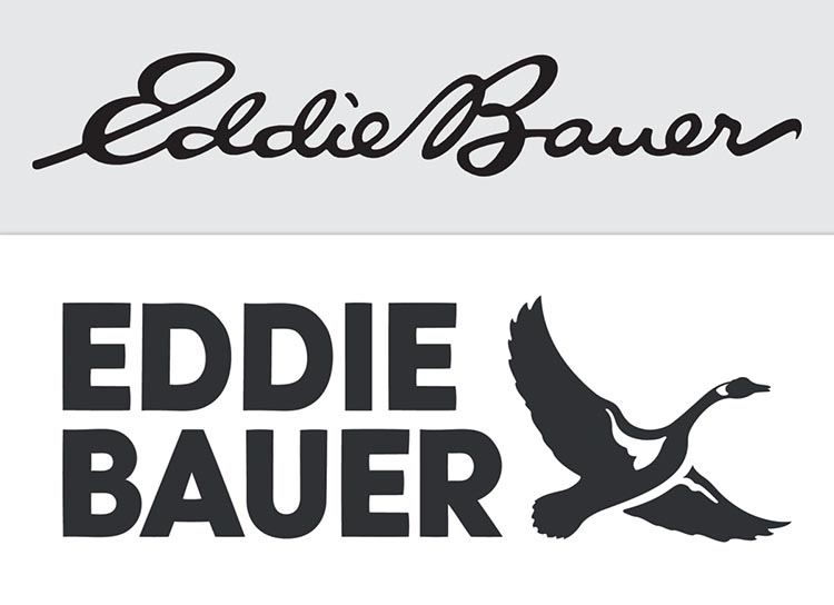
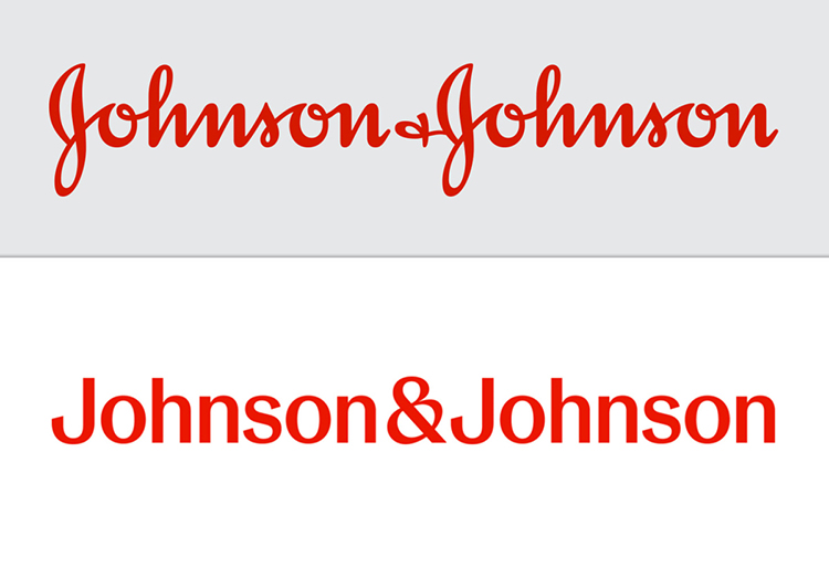
The replacment of Johnson & Johnson and Eddie Bauer’s cursive logos with sans-serif designs sparked discussions in the branding communities. Accusations of “blanding” were thrown around, referring to the loss of character in brands’ visual identities, often exemplified by fashion houses adopting minimal and indistinct logos.
People sought answers, wondering if corporate executives lacking appreciation for hand-lettering craftsmanship or the educational system’s abandonment of cursive teaching were to blame. The question arises: which script logo will be the next to fall? Will it be Kellogg’s, Coors, Lysol, Hallmark, Cadillac, Champion, or even the classic Ford Motor Company wordmark?
Struggles Behind Brands’ Logo Transformations
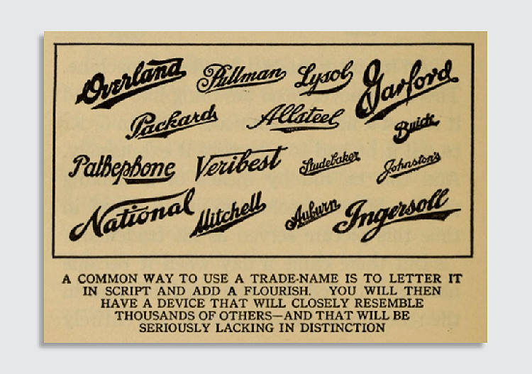
It’s important to acknowledge that this trend is not completely novel. Criticisms regarding the lack of uniqueness have been present for many years, and companies have long felt uneasy about the perceived stiffness of their scripted logos.
Despite this unease, numerous brands have been reluctant to abandon cursive writing. Ford enlisted the expertise of acclaimed logo designer Paul Rand in 1966 to modernize its cursive emblem. Rand argued that the script had become a cliché of the previous century.
However, despite the arguments put forth by Paul Rand, Ford lacked the bravery to fully embrace Rand’s proposed replacement design. Similarly, General Electric avoided the contemporary emblems suggested by design agency Landor in 1986.
In the near future, we may witness an increasing number of brands abandoning their script logos. Instagram, which stands out as one of the few tech companies with a script logo, might opt for a design that resonates better with the younger generation, particularly as it competes against TikTok’s bold logo.
From Modification to Modernization
Certain brands have already taken small steps away from script logos. For instance, Campbell Soup separated the letters of its logo, catering to Gen Z individuals who are less familiar with cursive writing.
Coca-Cola, too, has utilized various supplementary visual elements over the years to enhance its traditional script logo. These include a “dynamic ribbon” reminiscent of Pepsi’s earlier “wave” and the non-cursive “Coke” wordmark introduced in 1969 by Lippincott & Margulies.

Interestingly, the term “Coca-Cola” itself has become somewhat outdated, with its usage in books peaking in 1940, as indicated by Google Ngrams. Nowadays, referring to it as “Coke” has become more commonplace.
According to data from the Trademark Office, there has been a noticeable decline in the use of cursive wordmarks. In 1970, around 12.4% of newly registered U.S. wordmarks were in cursive, but this figure dropped to 4.7% in 2000. However, there has been a slight rebound, with cursive wordmarks accounting for 7.2% of new registrations this year.
Although signatures may not hold the same level of significance as in the past, they still carry a symbolic value. The survival of cursive logos will depend on whether their owners believe that the sense of humanity, authenticity, and personality they convey outweigh the associations of being outdated.
As more companies phase out their script logos like Johnson & Johnson or Eddie Bauer, those that continue to utilize cursive may even gain a heightened sense of distinctiveness.