Mirinda has launched a new global brand platform. A new visual identity system with the aim of appealing to Generation Z audiences.
The PepsiCo-owned brand is hoping to establish its fresh and impactful appearance as a representation of the next generation.

The features of the new visual identity
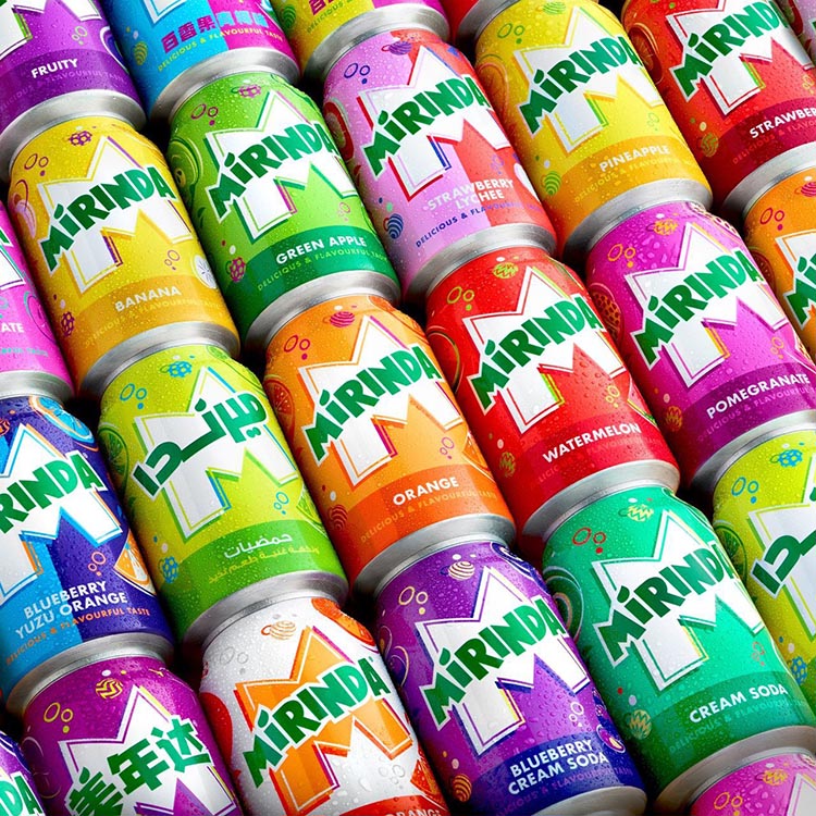
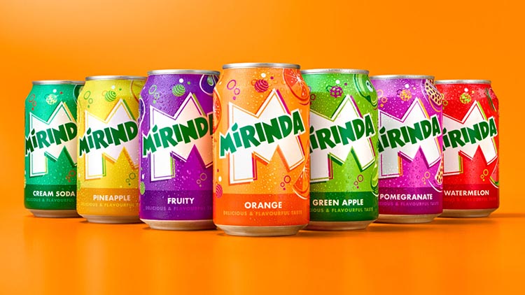
Created by PepsiCo Design, the Mirinda logo redesigned with a brighter shade of green, featuring sharper corners and cleaner lines to enhance its distinctiveness. The new visual identity also incorporates playful color palettes that aim to provide a burst of refreshment.
Each of Mirinda’s 50-plus fruit flavors, including popular choices such as Green Apple, Orange, Pineapple, Strawberry, and Watermelon, assigned a corresponding color palette, each with its own contrasting shades.

Mirinda has introduced a new global brand platform and visual identity system to attract Generation Z audiences.
Resigned visual identity for Generation Z audiences
“We are delighted to unveil Mirinda’s new global brand platform. This inspires vibrant creativity and encourages Gen Z to embrace their uniqueness as a superpower.” Said Eric Melis, PepsiCo’s Vice President of Global Brand Marketing. “Through the #NoFlavourLikeYourFlavour campaign, we have developed a refreshing visual identity. A platform that resonates with Mirinda fans, empowering this generation to resist conformity and embrace self-expression.”
“This marks the first step for the brand as we continue to evolve and grow in line with today’s youth. We are excited to roll out the exciting plans we have in store,” Melis added.

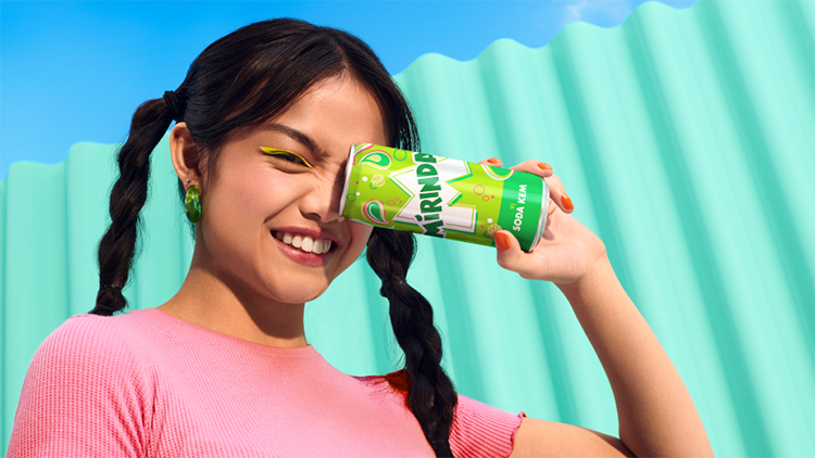
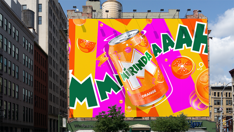
The new visual identity will be prominently displayed on all Mirinda cans, merchandise, advertisements, retail displays, and digital media across its presence in 200 markets.
Mauro Porcini, PepsiCo’s Senior Vice President and Chief Design Officer, stated, “Mirinda’s 50+ flavors are a sensory delight. We wanted the brand’s visual identity to evoke the same experience. PepsiCo Design and Innovation brought Mirinda to life with vibrant, contrasting colors and conventional illustrations. A visual identity that create a sense of dynamic energy and playfulness. Recognizing that Mirinda fans engage with the brand both digitally and physically. We have developed a visual identity that maintains its excitement and distinctiveness across all platforms.”


