Designing a product’s packaging involves bringing together several aspects of design. it includes but not limited to: shape, structure, materials, color, images, typography, and regulatory information. It helps you create something that can be sold.
The creation of a container that can hold, shield, transport, dispense, store, identify, and differentiate a product in the market is the major goal of this project.
In the end, the purpose of package design is to fulfill marketing goals by distinctly conveying a consumer product’s personality or function and making a sale. This is done in order to satisfy these objectives. Follow us to attract customers.
Packaging Design For Goods & Products
The process of designing product packaging involves a few more steps than simply slapping a label on a cardboard box and calling it good.
You need to start by determining the type of packaging that is being used. Will it be a straightforward cardboard box with a custom print job, or will it be a more sophisticated rigid box?
The medium of your packaging is frequently disregarded as unimportant. After you’ve settled on a material, take the following into consideration:
The design of graphics and packaging Physical packaging design Marketing and design One of these aspects defines design in a different way than the others.
When you have an understanding of these various perspectives, it will be easier for you to select the most appropriate packaging for the products that you are selling.
Graphic Design In Packaging
From the perspective of a graphic designer, design is the manner in which the design of the brand is reflected in the packaging of the product.
In this sense, the design concept not only needs to capture the attention of a customer, but it also needs to impart knowledge regarding the product.
The graphics used for packaging should also showcase the brand’s designs and values. This should be done on the box itself.
If you want to simplify the process, you should think about hiring a professional graphic designer or using a graphic maker that is easy to use but still effective online.
Related Article: Packaging Color; Add Emotion to Product
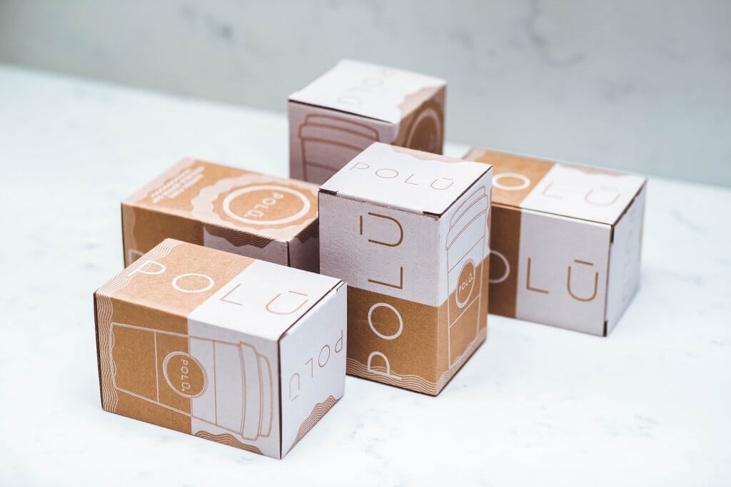
Disadvantages of Packaging
When compared to the expenses of transporting other forms of packing, more weight results in higher prices.
Lower than average resistance to breaking, scratching, and thermal shock in comparison to other materials Containers with more changeable dimensions than those made of metal or plastic.
The presence of glass shards or particles in food poses the risk of major health complications.
Marketing and Packaging Design
“Packaging design” refers to the process through which shape, structure, materials, color, images, typography, and regulatory information are connected with auxiliary design components. It makes a product marketable.
Related Article: The History of Packaging, The Evolution Of Packaging Design
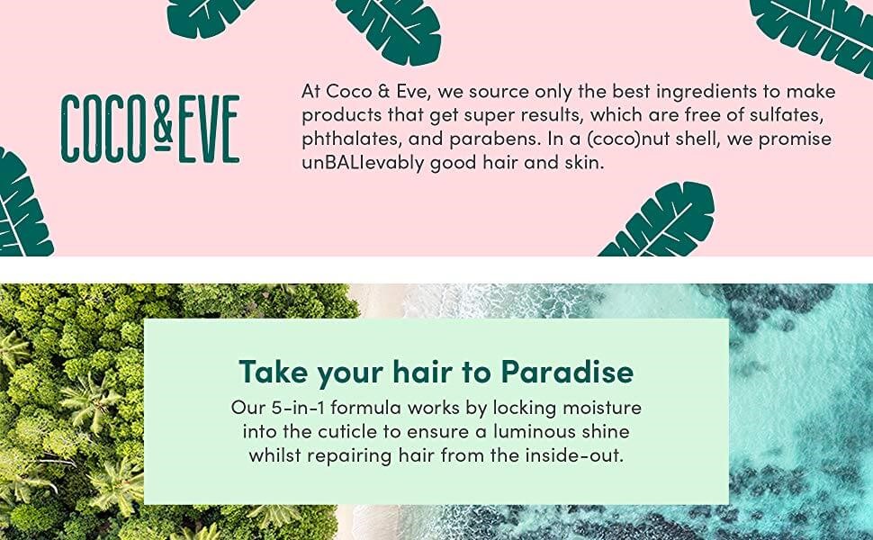
Important Element In Packaging Design
The packaging of a product is often considered to constitute the product’s identity. It is of the utmost importance that your product stands out among the many others that are on the shelf, since there may be hundreds of other options.
To glamorize a product in a manner that would not only get the attention of the customer but also be a fantastic source of promotion, packaging is an essential component of any branding strategy.
Packaging can make or break the success of a product. It is also similar to having a direct encounter with the brand, which makes the packaging a crucial component in the process of teaching the buyer about the product.
According to what Martin Neumeier had to say about the matter, “A retail package is the final and greatest opportunity to make a sale.”
Brand logo
If you are just starting out in the business of creating product packaging, then the most important element of your finished product packaging design will most likely be your company logo. It may just be a simple black logo printed on Kraft cardboard.
You might also go with a complicated design that is all-encompassing and encompasses both the inside and exterior surfaces.
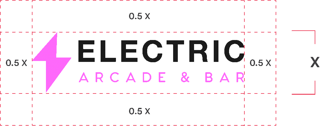
In any case, make sure you have your company logo on hand and include it in the process of designing your box. To prevent the appearance of pixilation, be sure to make use of a high-quality vector file.
Related Article: Importance Of Packaging; Why Is It More Important Than the Product?
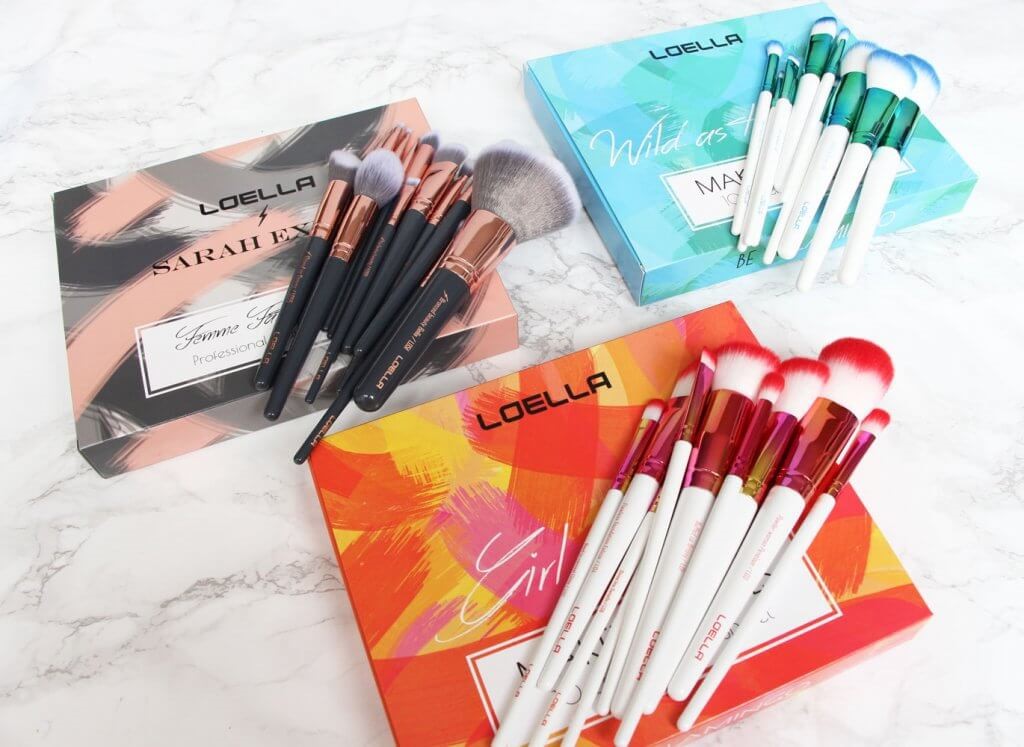
Colors
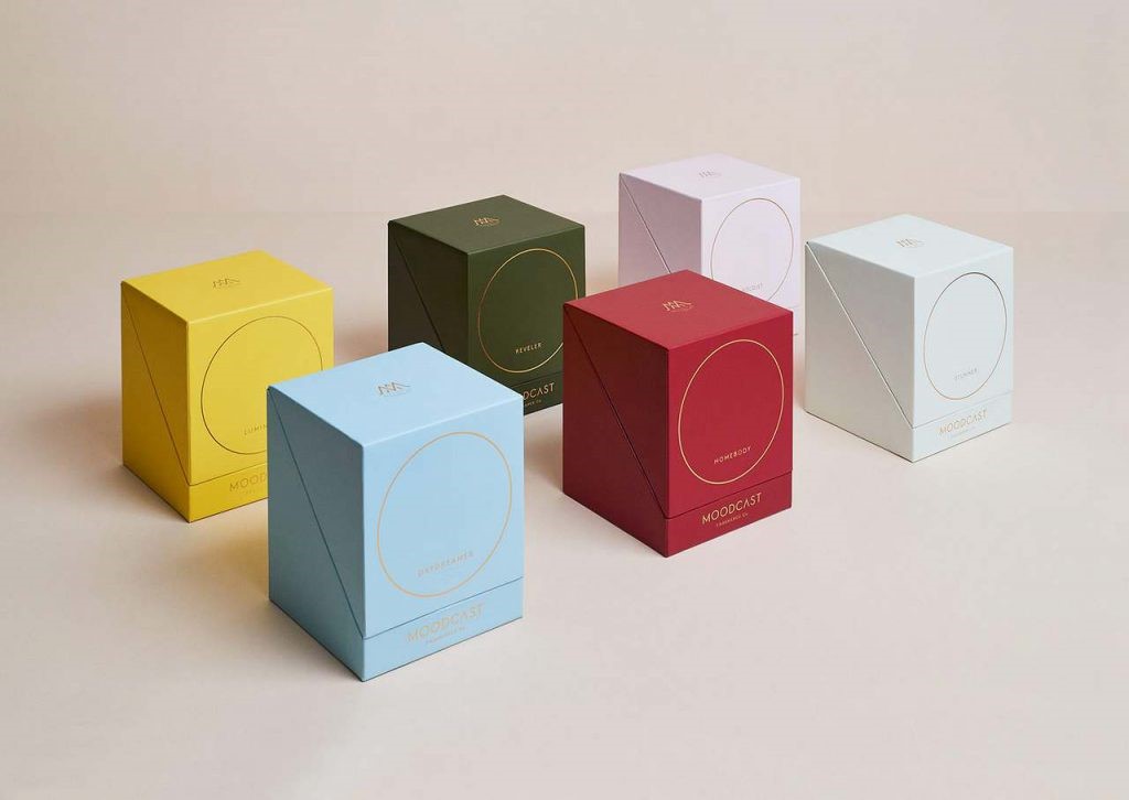
Along with your company’s logo, your brand certainly has a few colors that are associated with it. Replicating these colors on the packaging of your product is an excellent way to rapidly express the presence of your brand.
You can see how Alex Ko achieves the look of minimalism while still conveying the idea of their brand in the image that is shown above by using a sleeved mailer box in conjunction with a plain shipping box.
One of the most important components of maintaining brand consistency is sticking to a single color scheme across your retail location, product, website, and packaging.
Fonts
The selection of a typeface might be challenging due to the fact that a company’s logo may consist of nothing more than the company name written in a particular font (for example, GMC).
On the other hand, you could wish to utilize a certain typeface when listing the USPs of your items on the product package.
In such a scenario, you need to be completely familiar with what they are, as well as the appropriate weights and letter spacing for them.
Check to ensure that the typeface you’re using also includes the necessary native characters. Examples include the letters ß, a, and e, among others.
Photography and images
Photography and packaging go hand in hand; illustrations and symbols are not the only graphical elements that can be used to design a box’s exterior.
If you think about the design of the packaging for food products, you’ll notice that it’s common for them to show images of either the entire product or only some of its components.
Customers who need to buy a product are most likely to be drawn to a box that contains images of the product, even if the pictures are not used in a creative manner, because customers prefer to have an idea of what they will be purchasing before they go to the store.
They believe them to be more reliable, despite the fact that product photos do not always accurately portray the item’s appearance.
Because consumers are able to modify both their opinions and the products that they intend to buy based on what they see in a product’s photograph, the packaging industry is increasingly making use of product photography.
Related Article: Packaging Materials; Essential Information About Material In Packaging Industry
The Importance of Materials In Packaging Design
One of the most often used and environmentally friendly materials for packaging is cardboard. It is usual practice in both online and offline retail settings to make use of cardboard fiber that has at least 90 percent recycled content.
When cardboard is “corrugated,” it means that its individual sheets have been adhered to one another in order to form a layered structure known as a flute. These layers not only strengthen the box but also provide some cushioning.
Corrugated cardboard
Because of this, cardboard is the preferred method of packing for heavy things like shoes. It is also widely used by e-commerce businesses due to its ability to withstand most impacts. Additionally, corrugated cardboard serves as an excellent blank canvas for the package design process. Either the natural Kraft texture, which may be printed directly onto, or a white canvas, which can serve as the basis for any kind of color that you choose, can be used.
Biodegradable & compostable packaging materials
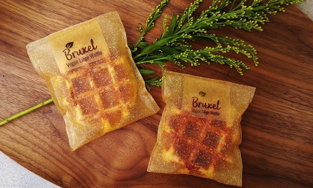
Many different kinds of packaging employ components that are derived from plants as their foundation. In most cases, not only are these materials just as printable and long-lasting as cardboard, but they are also entirely biodegradable and, in some cases, compostable.
Additionally, organic ingredients are used throughout the packaging manufacturing process.
This mostly refers to components derived from plants, which are becoming an increasingly popular trend in the packaging sector.
While edible packaging is probably going to be out of reach for the majority of companies in the near future, packaging that is safe for the environment is unquestionably a step in the right direction.
Since many regions of the globe have begun to restrict single-use plastics or will soon begin to do so, the industry will only continue to develop even more.
Because of this, there is significant potential available for businesses that place a higher priority on the environment in the manner in which they conduct their business.
Polyethylene packaging
Polyethylene is a kind of plastic that is used in the production of polymailers as well as other lightweight packaging solutions.
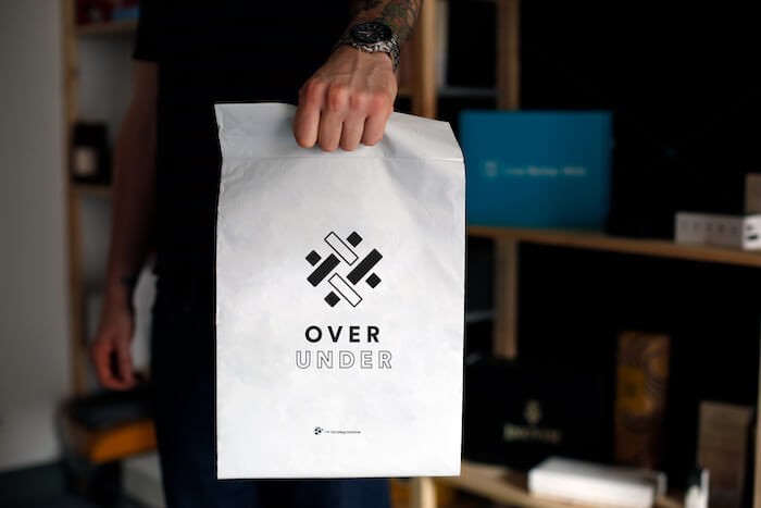
It is a form of tough plastic layer that is also waterproof, making it an excellent choice for use in transportation. It is possible to print on polyethylene bags in the same way that one would print on cardboard.
Polymailers are becoming an increasingly popular option for companies that are looking to reduce their overall consumption of raw materials.
If you need a solution that is both robust and waterproof for anything that is durable, such as clothes and other accessories, a basic polymailer bag will do the trick.
Glass & Aluminum packaging
Glass is a material that is often used in the packaging of foods and beverages. It is devoid of any polymers and components derived from petroleum, which enables it to be recycled in a very cost-effective manner despite the fact that it cannot break down under any circumstances.
Glass also has design restrictions when it comes to packaging. In spite of the fact that a variety of forms may be made, the only printing option available is the conventional label on a sticker.
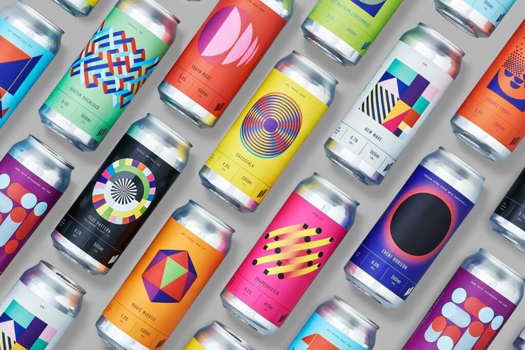
Last but not least, there is aluminum, which is a relatively lightweight material for packaging that is most often used in the manufacturing of cans, bottles, mailer bags, and some kinds of food packaging. Halo Brewing Package Design
Related Article: Key Steps In Packaging Design Process
Design Inspiration In Packaging Design
It doesn’t matter what you’re offering; what matters is that you differentiate yourself from the other businesses in your industry.
A creative approach to the design of the product’s packaging is an excellent technique to attract customers’ attention and, eventually, make sales.
Even the most ordinary things may be given an air of distinction with the help of clever package design.
Packaging supplies
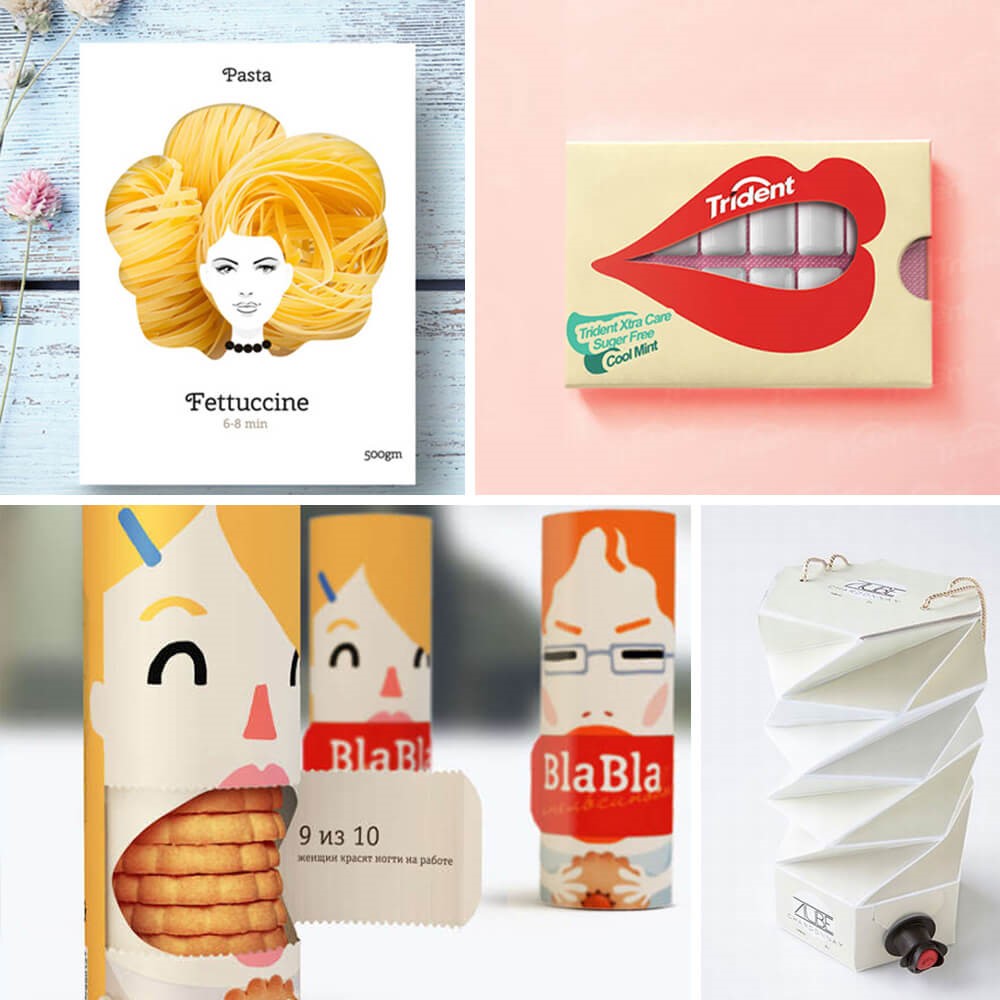
The development of cutting-edge packaging is progressing at a breakneck pace. Whether it’s the product packaging or the materials used for environmentally friendly packaging, creative product boxes can show off the originality and creativity of your company.
You can see that translucent windows that employ the texture of your raw product are quite prevalent and will always be intriguing by looking at the samples that are provided below.
Minimalistic design
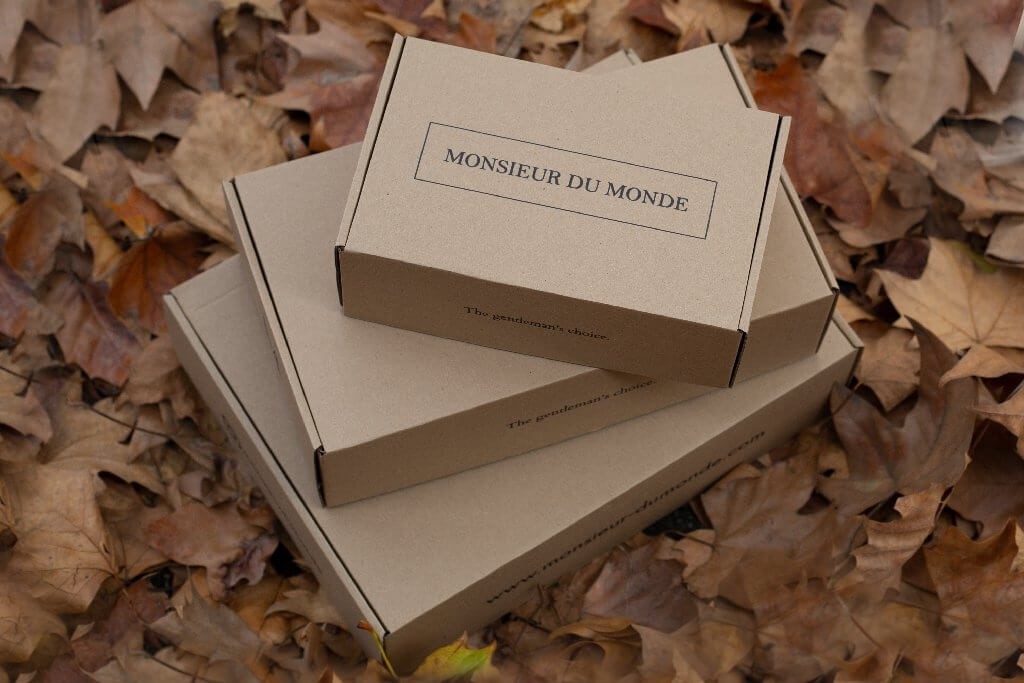
The Nordic countries and Japan are the birthplaces of the minimalist design movement, which prioritizes simple, unadorned shapes and seeks to eliminate as much unnecessary detail as possible without compromising utility.
The minimalist aesthetic is proving to be an adaptable and popular choice for a variety of design applications, from packaging for craft beer brands and wine bottles to shipping boxes for online retailers.
It is a simple design idea to put into action, and it is an excellent method for lowering design expenses. Take, for instance, a cardboard box that has a logo that seems to have been “handwritten”.
Because of its adaptability, minimalism is applicable to a wide range of industries and, contingent upon the company’s branding, may be successful there.
Using vintage aesthetics
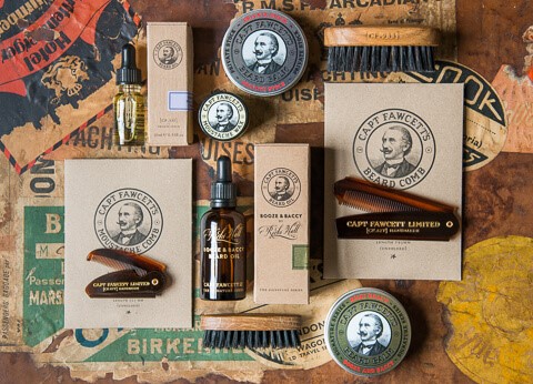
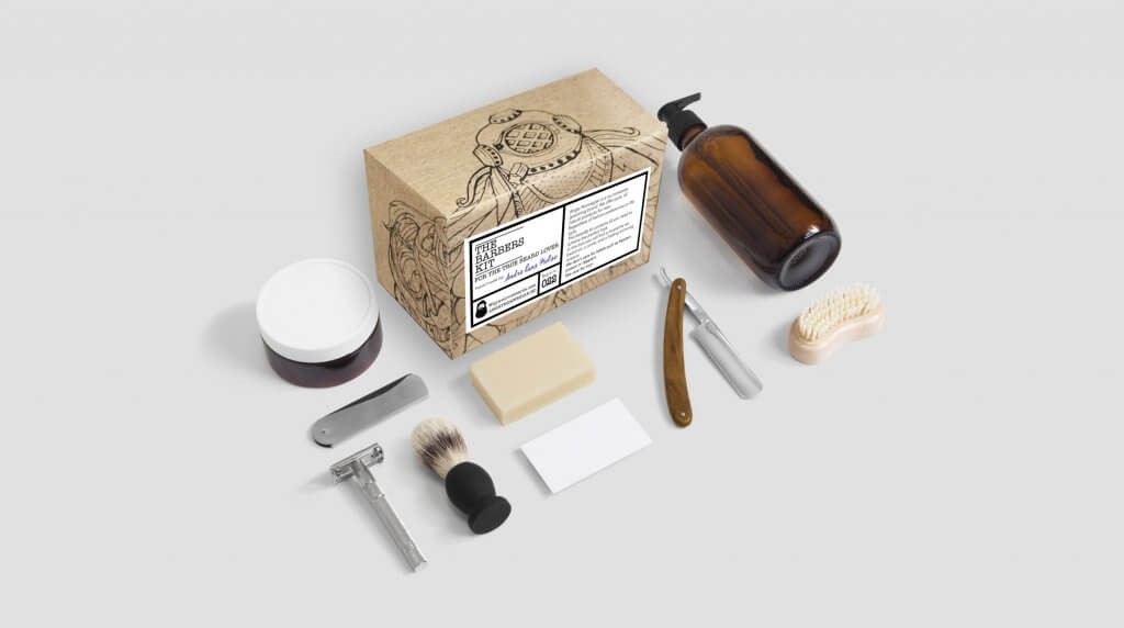
The meaning of the word “vintage” is notoriously difficult to pin down. For the sake of packaging, it’s important to channel design features that were popular in the late 19th century and early 20th century, during the time when the industrial revolution was happening.
There are a lot of new companies that prefer to incorporate retro details into their modern designs. Packaging that is designed to seem antique is a deft way to convey to your target market that “we’re the company that your grandparents adored”.
Because it appeals to a man’s “manliness,” this strategy is used by a great deal of male cosmetic products, such as hair care and beard oils.
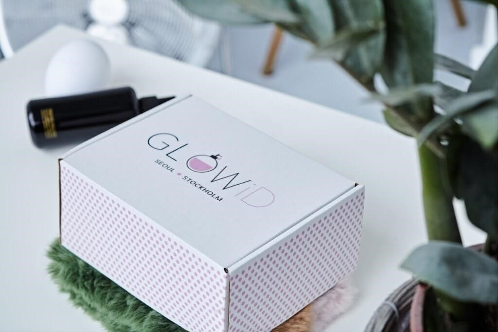
Pattern-based packaging
The human brain is specifically designed to pick up on recurring themes and patterns.
Since the detection of patterns may cause our brains to feel attracted to something for no apparent reason, it is easy to see why this technique can be useful when applied to packaging.
The appearance of a particular texture, such as fur or wood grain, may be simulated with the use of patterns.
On packaging, complex and intricate shapes can be used in a variety of ways, including disjointed shapes laced with color or patterns that perfectly tessellate. These are just two examples.
Culturally inspired design
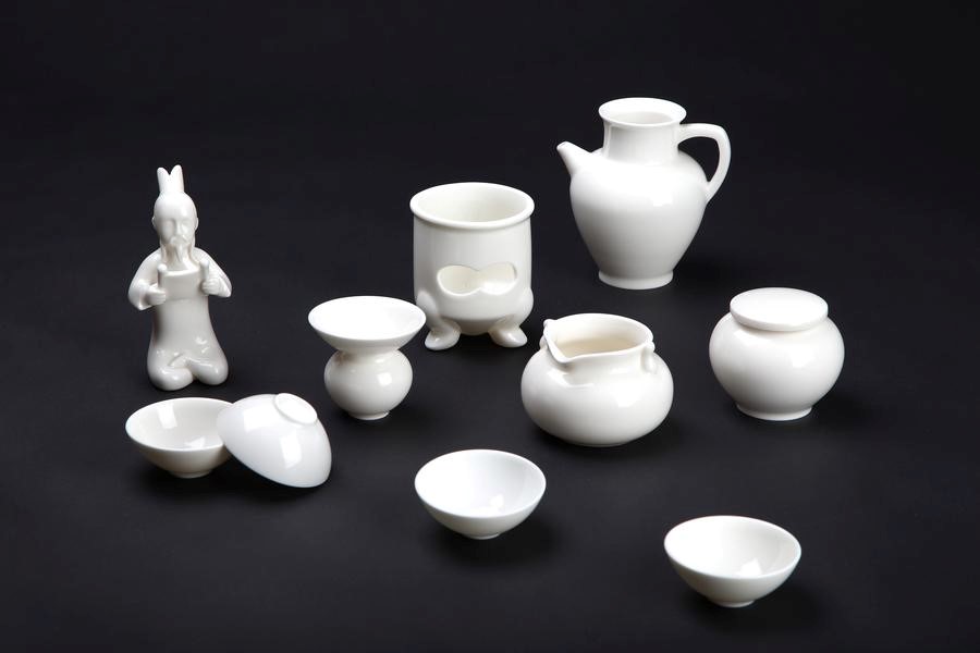
Consumers buy for utilitarian, cultural, artistic, or emotional reasons. Emotional content is one of the most essential variables in deciding whether buyers will buy a product since it stirs up emotions and creates effective resonances.
In the 1970s, fast-growing countries used design to sell culturally appropriate goods. This tendency started in the middle of the decade and continues.
This 1980s trend favored culturally sophisticated objects above technological ones. Companies and design studios use symbolic values in product design to compete in marketplaces.
Modern manufacturers incorporate symbolic values into product design since utility and technology are essential.
Modern design
The word “contemporary” might be difficult to define, but in its most fundamental sense, it refers to a trend or fashion that is occurring in the here and now.
One trend in current packaging that is becoming increasingly widespread is the use of an image or form that is distributed over a number of different surfaces.
On one of the surfaces, there is a great deal of complexity and intricacy, whereas on the other surfaces, there is a lot less to look at.
Labeling the product and providing information about it makes use of colors that contrast with one another on the surface.
Product shapes
The actual form of your product box is an element that is just as significant as the visual design you choose for it.
It is a waste of time and resources to develop product packaging that looks fantastic but does not effectively protect the contents within.
one of the most typical kinds of packaging is transparent plastic wrap that is derived from petroleum. This is a terrific strategy to use if you don’t want people to remember your brand name, but it’s terrible for the environment.
Whether you are selling your goods at a retail shop or delivering them to the other side of the world, it is essential to ensure that the items within the box are kept safe and secure at all times.
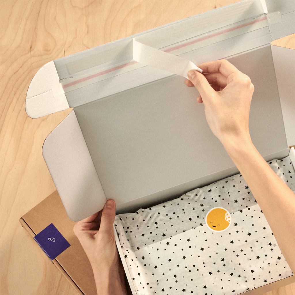
You can ensure the safety of your items by using a packing filler. Wood wool or branded tissue paper is an excellent alternative that not only adds some sophistication but also maintains the integrity of the brand.
You may use packing tape to seal your box and ensure its safety, or you could purchase a corrugated mailer box that comes with a self-adhesive sealing strip instead.
Design A Creative Packaging
Graphic designers are ultimately responsible for taking on the additional responsibilities associated with the packaging and labeling of products.
They are asked to build product packaging that can act as a salesman for the product, which requires them to invest all of their creative energy into the process.
Every single graphic designer is well aware of how important it is to carefully design product packaging and labels.
As a result, they are always looking for pointers and strategies that will make the appearance of their design more appealing to the target audience.
Design
In a broad sense, it refers to the process of visualizing and planning the production of many things, including items, interactive systems, buildings, cars, and so on.
The end user, or users, are prioritized throughout the design thinking process, making it a user-centered methodology.
It is the process of coming up with answers to questions or problems, whether those questions or problems concern people, tangible things, or more abstract systems.
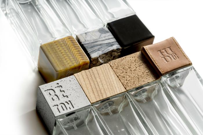
Texture
Graphic design is tailored to transmit a message with the purpose of capturing the viewer’s attention and holding it there. When referring to graphic design, the sensation of feeling, touching, and actualization is what is meant by the term “texture”.
Graphic design is distinguished by its use of texture, which elevates the presence of other visual components such as patterns, colors, images, information, and more.
Texture is a defining component of graphic design. It is not possible to produce a graphic design that is both aesthetically pleasing and meaningful while simultaneously compromising on the quality of the texture.
Pattern
When there is a repeating arrangement of lines, forms, or colours over a surface, this kind of design is known as a “pattern design.”
The symbols or pictures that are used, as well as the manner in which they are repeated, whether at regular or irregular intervals, both have an impact on the impression that it gives.
Patterns may now be all the rage, but in actuality, they have been in existence for as long as any of us can remember.
It should come as no surprise that humans have been creating patterns and utilizing them to decorate their homes and the environments around them since patterns may be seen in abundance in nature, such as in forest trees or sea shells.
Bold
How do we make a product that is meant to be thrown away relevant in the eyes of potential customers?
When one of our clients approached us with the idea of collaborating on a new venture, it was exactly the question that we posed to ourselves.
He had the idea to develop his own kind of clumping litter for cats. In this industry, packaging has a tendency to emphasize the qualities and capabilities of the product inside.
We tried out a new strategy that went beyond the qualities that would become important in the lives of the customers as a result of the product’s efficiency and cultivate a connection with them.
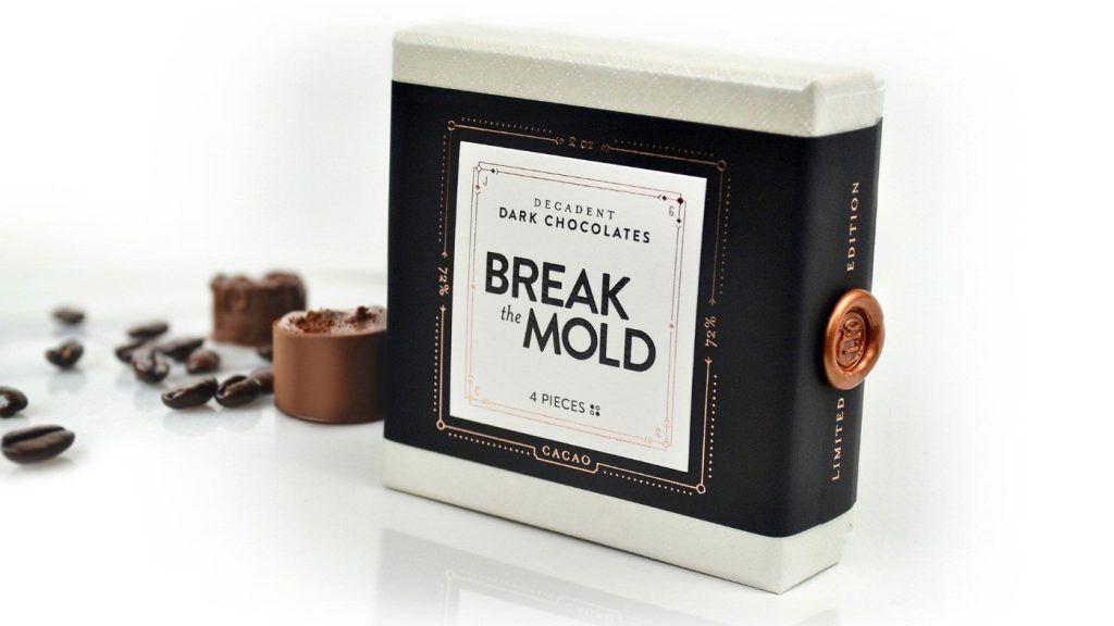
Break the Mold
How do you tell whether you’ve created the ideal packaging for your product?
The people who receive it just cannot bring themselves to open it so that they may consume the handcrafted chocolates that are contained inside it because it is simply too beautiful to disassemble.
This was successfully accomplished by Jess Glebe Design and C.R. Copywriting with the “Break the Mold” Christmas client present they created.
It comes with four different types of dark chocolate that are encased in a box that appears to dissolve in your mouth if given the chance.
Style
Style packages are a kind of standard package that are used only for the purpose of managing the style of a single application, or even numerous applications.
Packaging style are use for a special business objects. These business objects include style business objects, style value business objects, and resources specifying logos or typefaces.
Style business objects are also included in style packages. It has been communicated to the platform that it should use style business objects sourced from the defined style package (instead of the style business objects already assigned to the different screen components from the base or design system packages).
Without limitation
We do not place any limitations on how we pack the goods. You can try and test materials and components sourced from well-known manufacturers located all over the world.
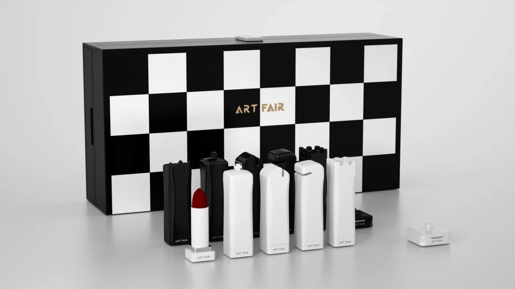
Modern
A paradigm shift has taken place in contemporary product packaging, which may be attributed to both advances in technology and rising levels of customer awareness.
Both environmentally friendly practices and user friendliness have emerged as priorities in today’s industry.
The packaging used nowadays is far more environmentally friendly.
They have understated designs, are crafted from materials that are kind to the environment, and make use of vivid hues.
These top five examples of contemporary package design are sure to spark your imagination.
Consider roots
A great deal of care and enthusiasm went into the creation of the Roots brand, which is comprised of goods produced in Greece.
The potato is the firm’s foundational product, and the roots are the family values and entrepreneurial principles upon which it is built.
Roots also give the company its name. A culinary approach is used toward the preparation of the potato chips thanks to the handcrafted manufacturing technique and the flavors that are chosen.
Creative
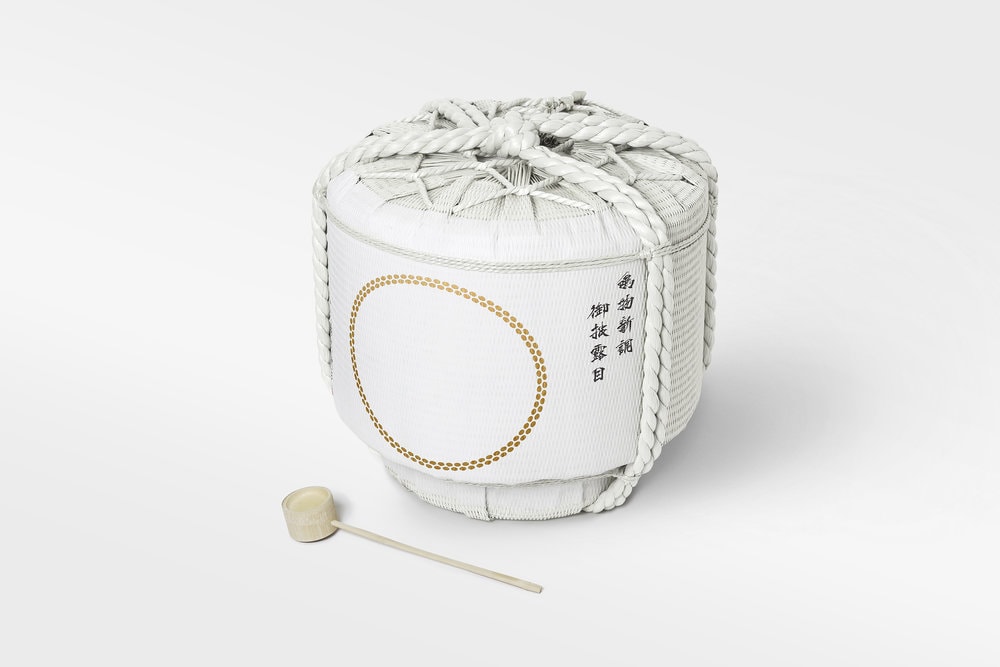
Innovative designs and solutions for creative packaging not only help products stand out from the competition, which increases the growth and success of the product, but they also provide more sustainable and cost-effective solutions throughout the lifetime of the package—from the warehouse and assembly line to the store shelves and the hands of customers.
Creative packaging can be defined as the combination of creativity and innovation. Innovative approaches to packaging may have a good impact on the marketing campaign for a product or service.
These approaches can help reduce the costs of transportation and storage through the use of innovative and environmentally friendly design.
Continue reading to find out more about successful marketing through creative packages, as well as creative sustainable packages that contribute to a greener future and offer advice on how to create such packages.
Trendy
2022 packaging trends include customized and eco-friendly packaging. Product packaging protects your goods, promotes your brand, and builds customer relationships.
Product packaging decisions can impact your company or brand’s success, whether you design it for creativity and innovation or for utility and practicality.
In fact, 72 percent of US customers say product packaging affects their purchase decision. Product packaging, like all design, is influenced by creative and technological trends.
Elegant, minimalist packaging has become popular in recent years. In 2022, product packaging will prioritize usability, sustainability, and organic, handmade design.
Restricted colors
When it comes to picking a color for a brand, whether it be the logo or the packaging of a product, managers often give more consideration to the atmosphere they want to evoke in the spectator than they do to the distinctive character of the company.
When one’s disposition is considered significant, other factors must make way.

Bright colors
Bright colors have been a vital component of packaging from the beginning, and it is expected that they will continue to hold this position in the foreseeable future. Color choices have the power to quickly affect the mood of any audience they are presented with.
The use of vibrant colors is an effective way to capture the attention of one’s audience, prompt them to open their eyes, and bring a feeling of excitement to the fore.
As a consequence of this, vibrant hues have inexorably made their way to the forefront. In the past, they played more of a supporting role, but nowadays, many different package designs include them as a bright and vibrant centerpiece.
Senses
Product packaging may catch a tremendous amount of attention on the shelf. It also allows for interaction with all five senses, resulting in a truly unforgettable brand experience.
Sensory encounters with items may assist in raising sales, enhance customers’ ability to remember your brand, and promote loyalty.
Playful
Product packaging may catch a tremendous amount of attention on the shelf. It also allows for interaction with all five senses, resulting in a truly unforgettable brand experience.
Sensory encounters with items may assist in raising sales, enhance customers’ ability to remember your brand, and promote loyalty.
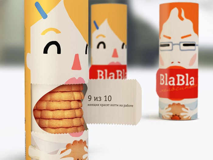
Humor
It could be beneficial for your business to include some comedic elements in the design of your box.
It is possible that it may build a positive image of your brand, and it will certainly lend itself to robust participation on social networking sites.
Take a look at some of the most hilarious examples of packaging design that we found.
User experience
One excellent strategic initiative was the impetus for Apple’s climb to become the most valuable brand in the world. They decided to change the focus of the audience rather than go head-to-head with the flourishing PC industry at the time.
They were aware that, at their core, shoppers were looking for something striking but uncomplicated. Apple is credited with helping to commercialize the field of user experience on certain levels.
And billions of dollars continued to pour in.
Clear
When it comes to the design of their goods, a corporation has to take a number of different considerations into account, doing their best to leave no stone unturned in the process.
The maker is required to take into consideration all of the relevant elements, including those that the customer may not consider to be important.
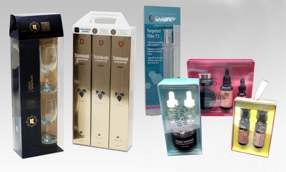
Consumers have a tendency to overlook some aspects of products, including the packaging of such products, despite the fact that these aspects may have a substantial impact on the purchase decisions they make.
As a result, companies that make goods invest a significant amount of time and effort into determining the types of product packaging that are the most profitable. It has been shown time and time again that packing products in transparent plastic results in more effective sales.
The outcomes speak for themselves; listed below are just a handful of the numerous benefits that come with using transparent packaging for products.
Luxury
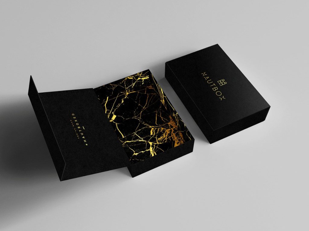
When it comes to their packaging, luxury firms want to ensure that they are meeting or exceeding all of their customers’ expectations.
It is the ideal chance for them to market their goods in addition to being a reflection of the quality of the things that they sell, so it is a win-win situation.
Customers of a luxury brand become walking ads when they carry the company’s bag, box, or other branded item.
This is possible if the luxury brand can make high-quality, fancy packaging that makes it clear right away what brand the item is.
Imagery
Illustrations, pictures, icons, symbols, and characters may all be created in a wide variety of styles, each of which contributes to the development of a sophisticated visual language and offers visual stimulation.
Complex or subliminal imagery needs more than a second or two for the viewer to completely comprehend its meaning, while simple imagery helps the viewer to comprehend a notion in a short amount of time.
Think about the many olfactory, gustatory, and thermal sensations that are conveyed by the various visuals:
flavor, fragrance, taste, and warmth (including the sensation of spicy food).
Everything may be communicated visually via the design of the box.
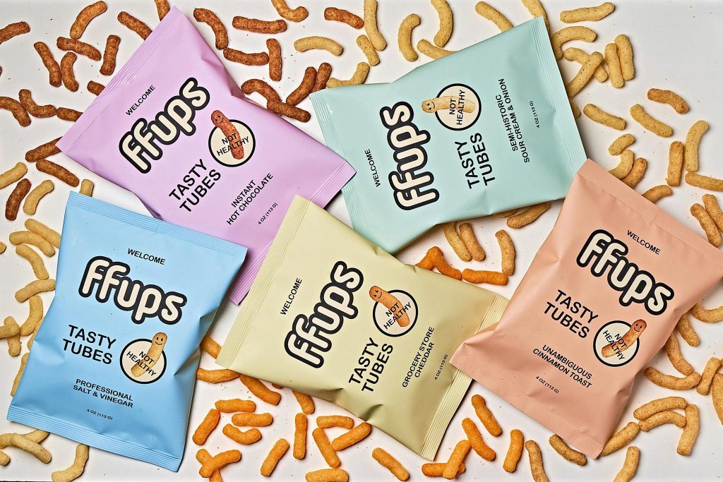
Literal
Make an effort to include the manner in which your product is made into its packaging, if possible. These cookies, for instance, go through the baking process in an oven.
So why not use an oven to wrap them instead?
The conventional bakery box has been given a new twist that is both lighthearted and accessible, and the result is something that looks and feels like a true treat.
Relatable
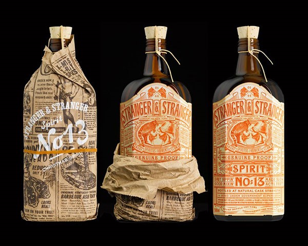
Is there a general conception that people have about the kind of goods you sell? Make an effort to use it in your packaging so that it may be understood anywhere.
This whiskey bottle not only has a label that is very detailed, but it also has a humorous brown paper overwrap.
Everyone is aware of what it refers to, and almost everyone is able to get some amusement from it.
Tactile aspect
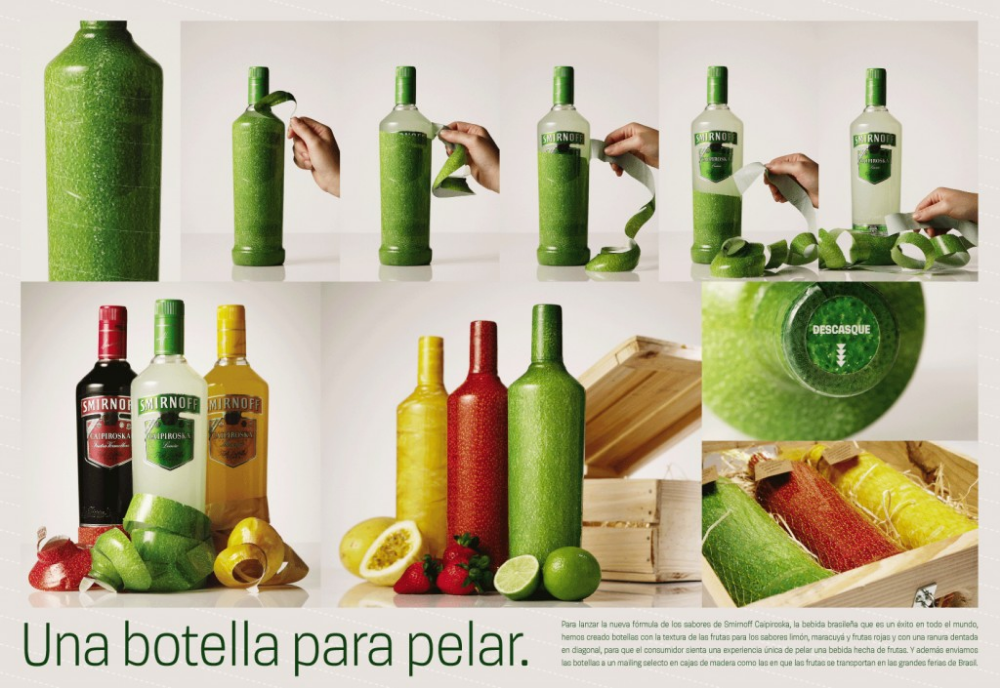
People will love your product more if it has some kind of interactivity.
This bottle of Smirnoff has a wrapping on the exterior that you have to manually peel off before you can drink the booze.
Additionally, it looks like the fruit was used to flavor the alcohol, which lends an air of authenticity to the product.
Weird
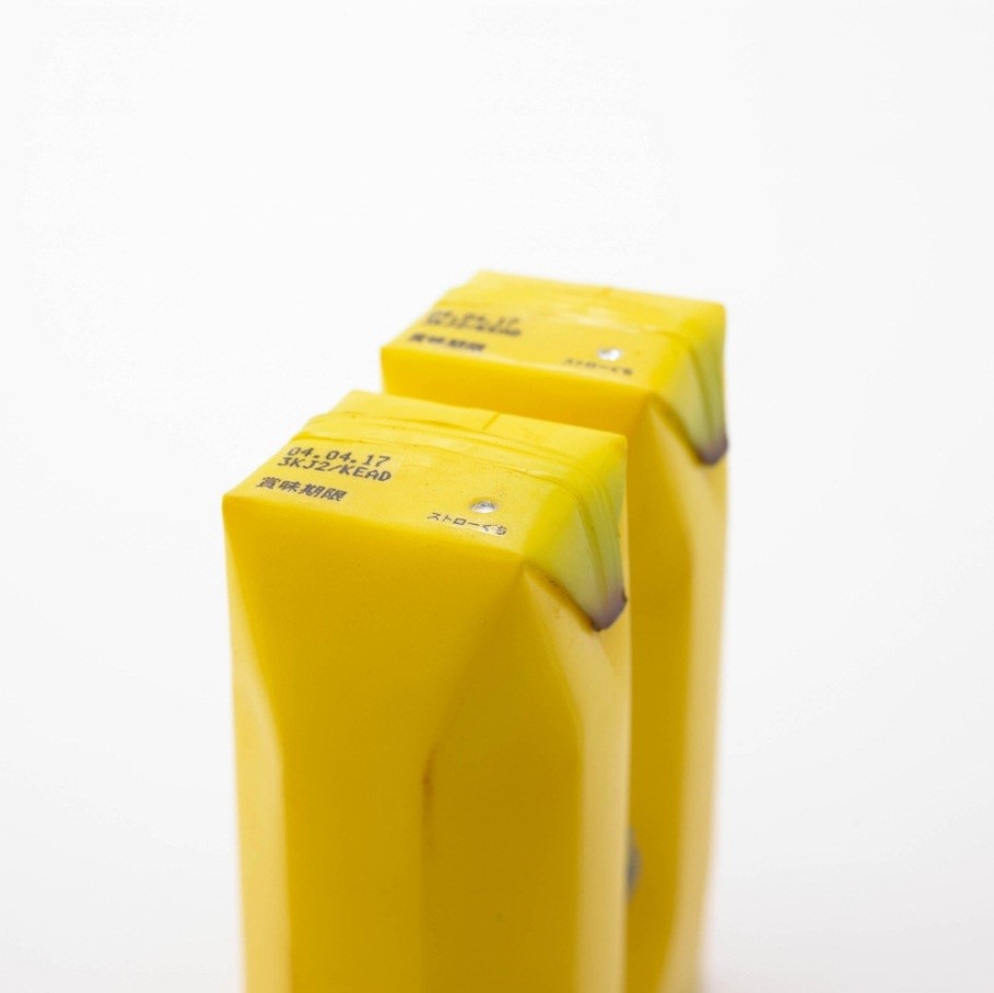
If that’s how you roll, put other people in awkward situations. The appearance of these juice cartons is really peculiar, to say the least.
The likeness to the real fruit is eerie, and the fact that it is presented in the form of a juice box causes one to do a second take.
It creates the idea that you are drinking directly from the fruit, which gives the product the appearance of being healthier.
Exaggerate
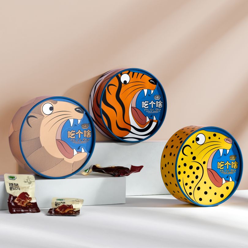
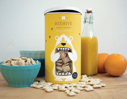
When you have the opportunity, try to exaggerate the forms, colors, and drawings you use. Because of the cereal’s honey sweetness, the mascot for this brand of bear-shaped cereal is a bear.
Instead of merely having an image of an adorable bear, the illustration shows the bear with his mouth open, cramming it full of the delectable cereal that is included inside the box.
Beauty
People have a deep appreciation for aesthetics. People get into a positive mental state by using and purchasing them.
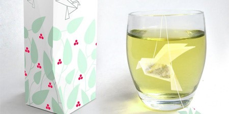
This bird tea bag is another intriguing example of a tea bag, but one that takes a somewhat different approach.
It gracefully floats in your cup, giving the impression that it is flying, and exudes an air of calmness all around it.
Ridiculous
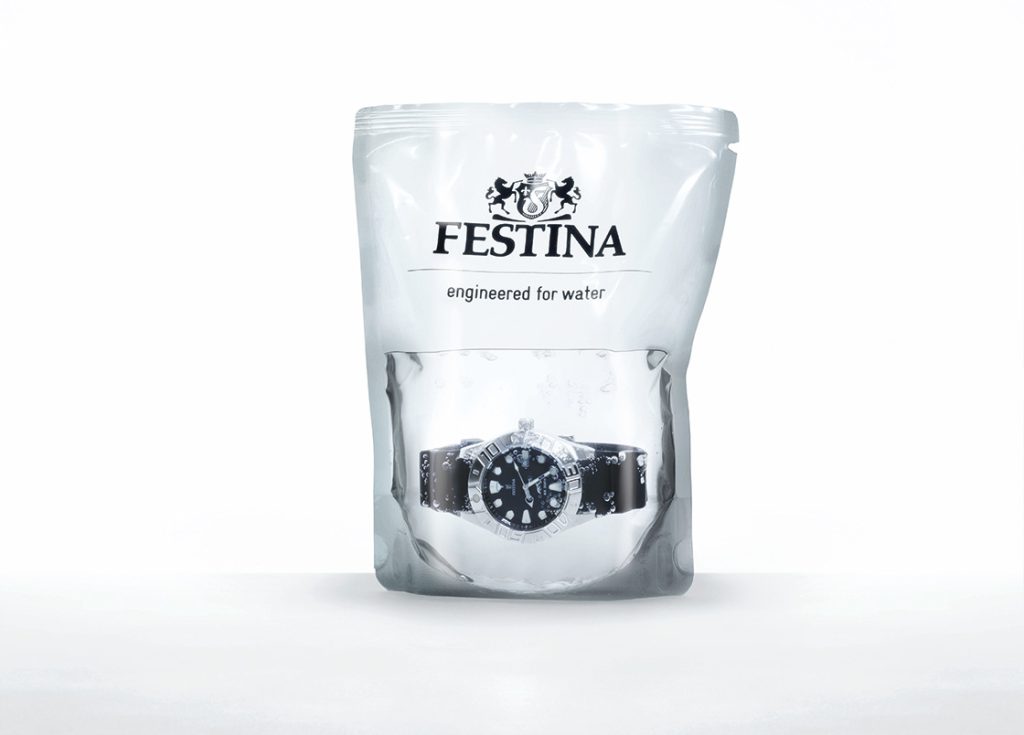
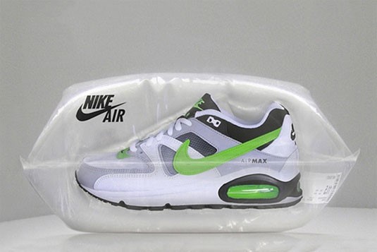
Be extreme, even absurd. These Nike Air sneakers do not come wrapped in a box; rather, they come packaged in a bag of air.
Yes, you read that correctly. It is both literal and imaginative at the same time.
It is essential that you get a hold of them, and the results will blow your mind.
Some Important Advice In Packaging Design
Because of this, it shouldn’t come as much of a surprise to learn that ineffective packaging may have a significant impact on the number of units sold of your product.
So, you should constantly endeavor to develop an effective package design.
Abstract
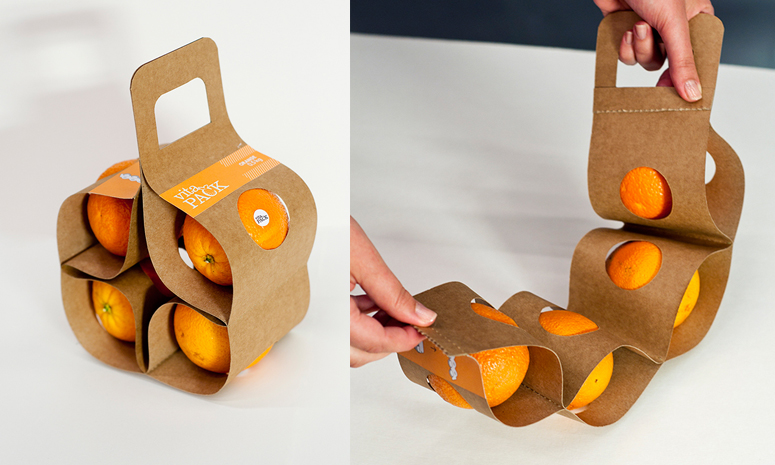
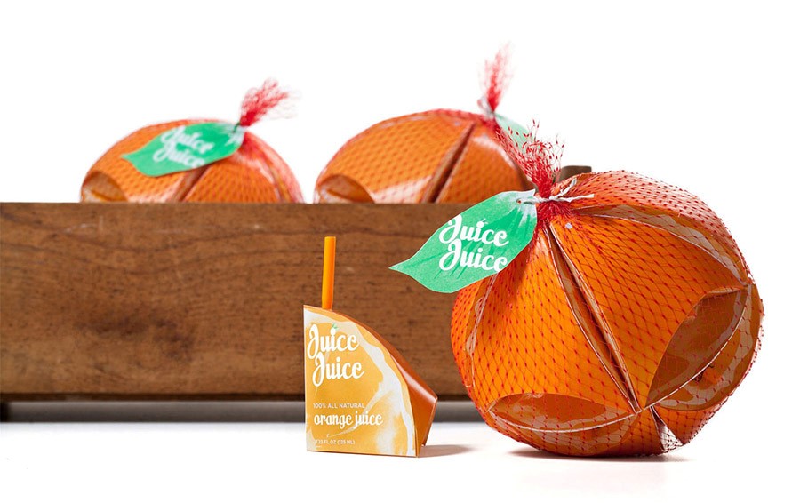
Put your goods in a box and make it seem like something entirely different. Instead of merely having a typical tiny box of orange juice, the boxes are abstracted into “segments” of an orange.
This allows for more efficient storage. After that, they are packaged in a substance that is similar to the bag that fresh oranges are sold in, giving the impression that the product is a complete orange.
Simplicity
One thing that sticks out on the crowded shelf of a grocery store is packaging that is straightforward and uses few design elements.
It provides the information that the consumer is looking for in a direct and concise manner.
If you take a look at the packaging for the natural chocolate bar made by Mandarin, you will be astounded by the clever way in which the taste is represented.
Available space
A study by DS Smith and Forbes Insights, which comprised a poll of 370 corporate leaders worldwide, found that at least 25% of what corporation’s transport in non-optimized packaging is air. This will harm the economy and ecology.
According to DS Smith, eliminating unnecessary packing space could save USD 46 billion globally. According to the report, Marks & Spencer reduced its logistics, handling, and packaging costs by $2.1 million.
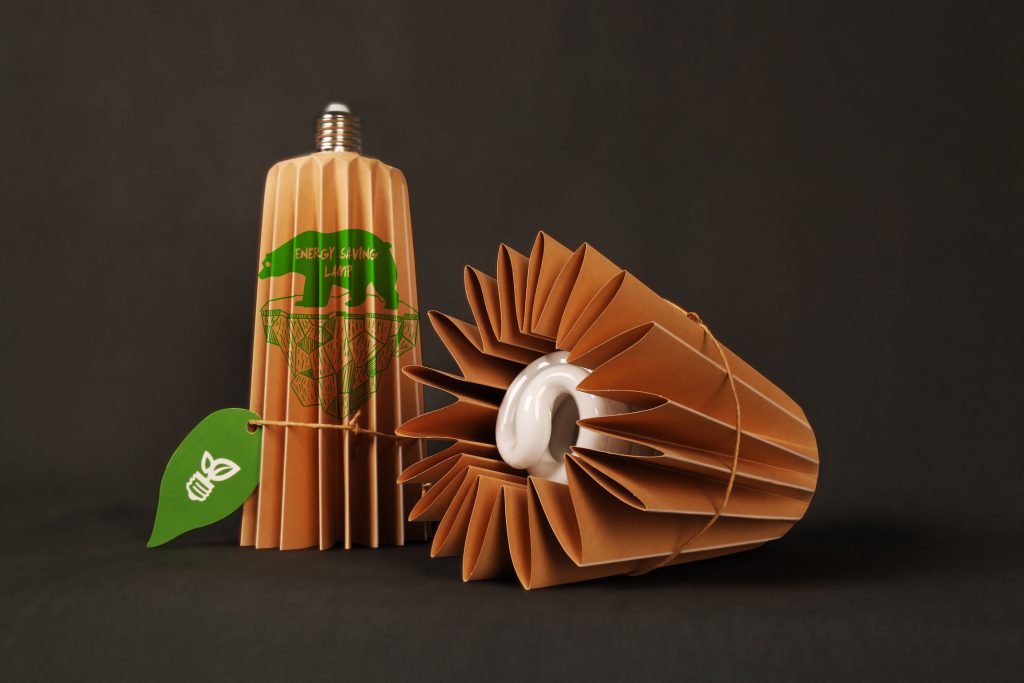
process
Packaging is a technique to safeguard the goods and enable marketing and delivery to producers, distributors, and consumers.
The process of putting product and package together is normally the final phase of the product production procedure, but assembling packages inside other packages or additional units sometimes follows product packaging.
Story
Packaging has developed into an essential component of our daily lives. It can be used to store items, guard them, and transport them.
The origins of modern packaging can be traced all the way back to the beginning of the manufacturing industry. In ancient times, humans packaged their goods using natural materials such as bark and leaves. Animal skins, woven fabric, and wooden crates were some of the materials used.
As human civilization advanced, people began to package their goods with more long-lasting materials as time went on.
Because of this, technologies for packaging food and other items were developed, such as paper, cardboard, and plastic.
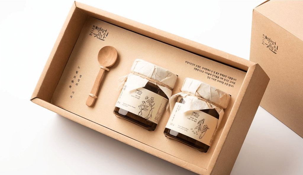
Packaging interior
Putting together interior design of packages that will blow your client’s mind may be a challenging and time-consuming endeavor to carry out successfully.
Many designers become perplexed when deciding which packaging interior design will provide the best results for their clients. When the users open the box, there should be something special there for them.
Different purpose
Self-service marketing is increasing the importance of packaging. A typical grocery consumer passes 600 goods each minute, or one every 10 seconds. Thus, only displays, shelf hangers, tear-off coupon blocks, point-of-purchase devices, and attractive packaging may attract particular people.
Because packaging is so important, a lot of study is done on motivational research, colour testing, psychological manipulation, and other methods to assess how most people would react to a new package.
Based on this analysis, prior experience, and competitors’ current and prospective decisions, the marketer will first determine the package’s main role.
Risqué
If you are willing to be a bit provocative with your packaging, you may be able to attract a different audience than you otherwise would.
In reality, this food is nothing more than ordinary bread; yet, the packaging gives the impression that it is something more. For example if the purpose of the package is to raise awareness of breast cancer, it succeeds admirably in doing so with its attention-grabbing design.
Cause
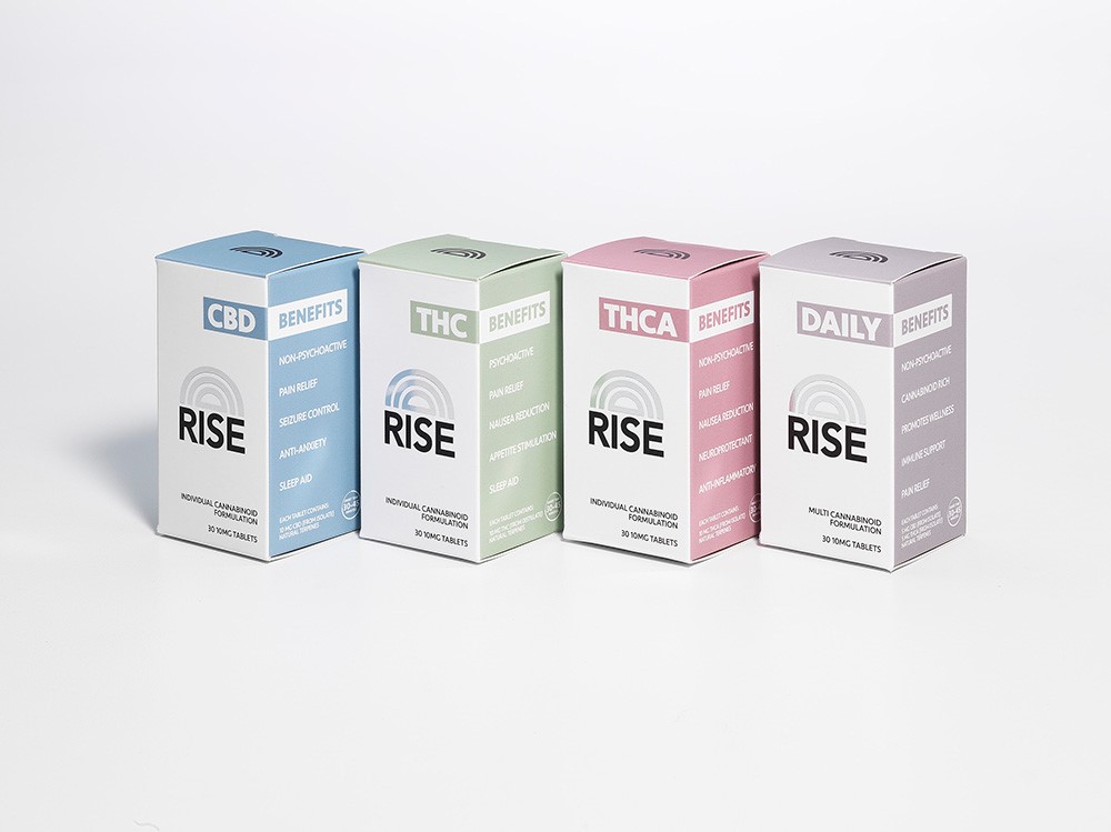
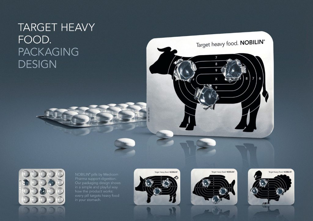
Your cause should be cheered by the visuals. This is the packaging for a digestion aid that is derived from plants.
When the pills are popped out, it seems as if they were fired at a shooting range. This action is performed on meat.
It lends credence to the idea that the product is potent and is consistent with the motto “target heavy meals.
Compact
It would seem as if they were shot at a shooting range. Meats go through this process in order to be processed.
It bolsters the argument that the product is powerful and is in line with the slogan “target heavy meals.”
Think outside the box
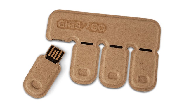
It would seem as if they were fired at a range of some kind. The processing of meats requires that they go through this procedure.
It lends credence to the claim that the food is potent and is consistent with the phrase “target heavy meal.
Turn it into something else
Use your imagination to come up with several ways that your product might appear; just because it does one thing does not imply that it cannot look like something else.
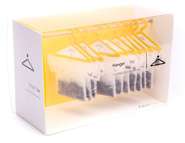
This particular brand of tea transformed its tea bags into “tea shirts,” complete with a hanger, rather than just a regular old tea bag.
The bag is held vertically on the rim of your cup by the hanger, making the accessory not only aesthetically pleasing but also useful.
Create something new
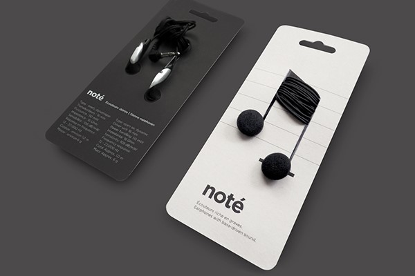
Make sure that the images you generate are relevant to the product that you are selling by using the product itself.
The music notes are composed with the help of these headphones. Because they are not written on the paper, the notes have a three-dimensional appearance and add something unique to the otherwise flat piece of cardstock.
Make it something new
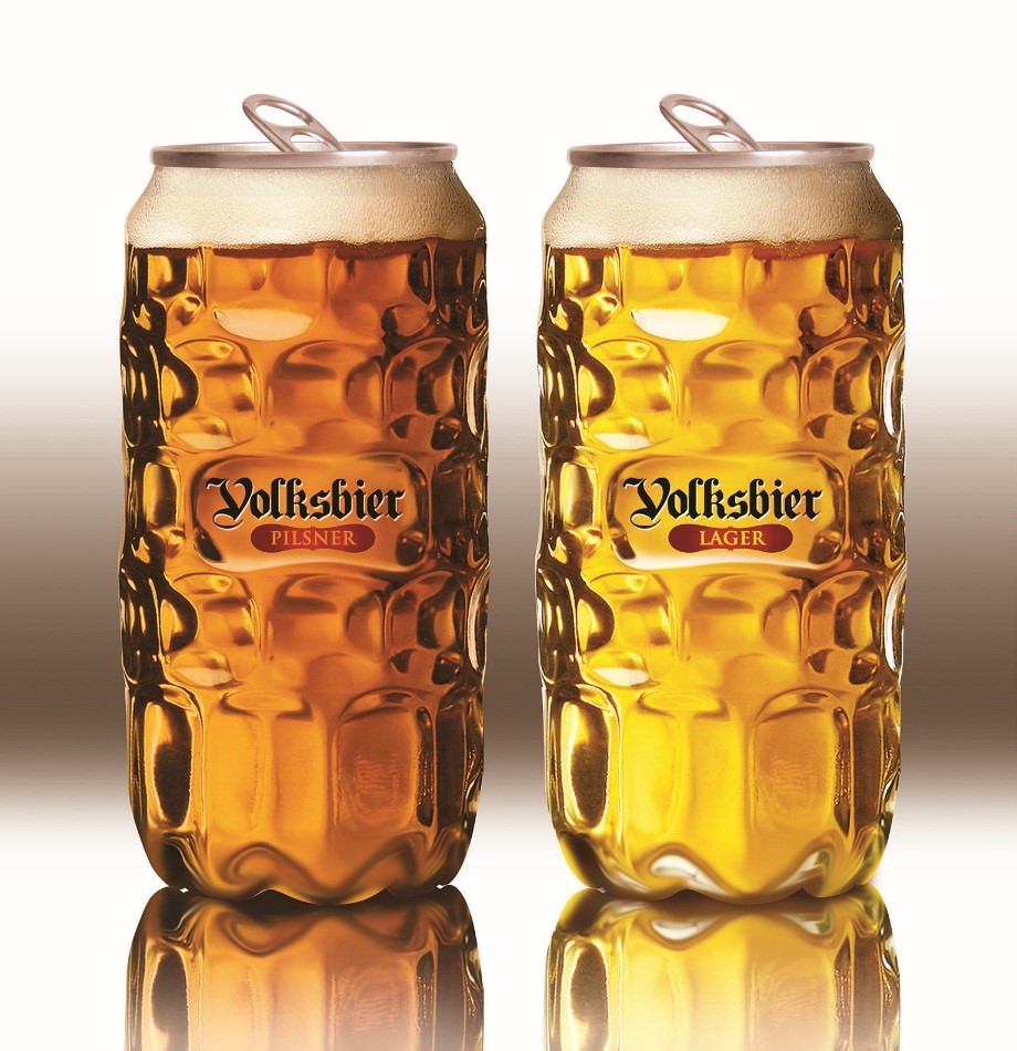
By utilizing the actual goods, you are selling, you can ensure that the photographs you make will be relevant to the product you are offering to customers.
These headphones were used in the process of notating the musical composition. The notes have a three-dimensional aspect and add something distinctive to the piece of cardstock, which is otherwise flat.
This is due to the fact that they are not written on the paper itself.
conclusion
There are numerous package types, and many of them feature artwork and design. The “design” of a brand refers to how it is created.
The process of constructing form, structure, materials, color, and pictures is referred to. Given that there may be hundreds of other possibilities, it’s critical that your product stand out from the numerous others that are on the shelf.
You should attract the customers’ attention by using the brand logo, colors, fonts, photography, and images.
References: +++++++++++++++++++++++++
“Packaging design” refers to the process through which shape, structure, materials, color, images, typography, and regulatory information are connected with auxiliary design components. It makes a product marketable.
Brand logo, color, font, photography & image are very essential factors in packaging design.
The packaging should be abstract, simple, compact, creative and if a graphic designer asked to build product packaging, it can act as a salesman for the products. Every single graphic designer is well aware of how important it is to carefully design product packaging and labels. As a result, they are always looking for pointers and strategies that will make the appearance of their design more appealing to the target audience.

