The CW Television Network, also known as “The CW,” recently introduced a refreshed logo design and brand identity. As part of this evolution, they decided to remove the definite article from their name.
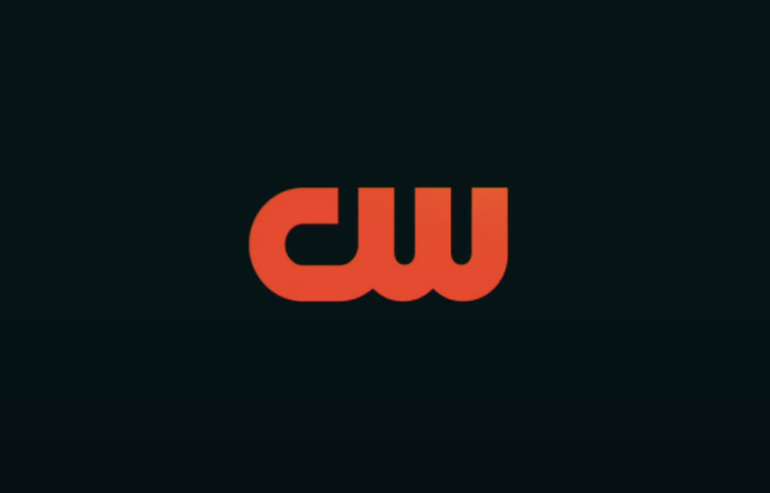
The new logo design incorporates the network’s previous font, while the color scheme centers around a vibrant orange-reddish shade known as “hot sauce” hue. These changes aim to give The CW a revitalized and modernized visual identity.
The CW unveiled its redesigned logo shortly before broadcasting the 2024 Critics Choice Awards. Chris Spadaccini, the network’s chief marketing officer, explained that this rebranding is part of an ongoing transformation to give The CW a fresh look and feel.
Logo Transformation
The previous logo was considered somewhat outdated, and there was a lack of consistency in how the network presented itself as a brand. With the new logo, The CW aims to establish a more defined and cohesive brand identity, signaling a significant change in its visual representation.
The decision to remove the definite article from The CW’s name was driven by the logo makeover, as the article was not easily readable. The primary concern was that the previous logo design did not consider mobile platforms, and it did not scale well to other digital formats.
It posed readability challenges when streaming content and was particularly difficult to read on social media and smaller screen devices such as smartphones. Considering that The CW heavily engages with its audience through these platforms, the need for a more legible and adaptable logo became evident.
While the visually appealing shortened logo does not change how audiences refer to the network, The CW is still commonly known as “The CW.” The removal of the definite article from the logo implies its presence rather than explicitly displaying it.
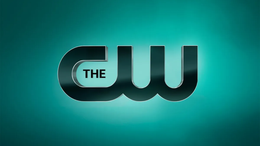
old logo
The Power of Color
In terms of visual changes, the modifications are not drastic and primarily revolve around the logo itself, including its font, formatting, and the shift from green to a distinctive hot-sauce orange color. This color change significantly enhances the logo’s visibility and makes it more easily recognizable.
After color mapping, The CW settled on the vibrant hot-sauce orange for its logo. Initially, blue was considered as an option, but it was deemed too crowded within the color schemes of other prominent networks like Disney, MAX, Amazon, and Fox, all of which incorporate various shades of blue.

The marketing team at The CW aimed to stand out and avoid blending into this particular color space. Thus, they opted for the distinctive hot-sauce orange, which is complemented by pink icing against a dark mint green background, creating a visually striking combination for their logo.
The CW’s Hit Series Renewals
In addition to the logo change, The CW has announced the renewal of several original series, all of which are scheduled to premiere in 2024. This includes popular shows such as Superman & Lois, Walker, All-American, and All-American: Homecoming, all of which have consistently performed well in terms of viewership.
The CW’s success with these series has also enabled them to engage in negotiations with CBS and Warner Bros., who feature these shows on their own platforms. Furthermore, the same applies to sales discussions with platforms like Netflix and HBO. The CW’s strong track record with these particular series has positioned them in these negotiations for wider distribution.
The CW’s redesign was introduced on Sunday across various streaming platforms and other media channels that the network relies on to connect with its customers.