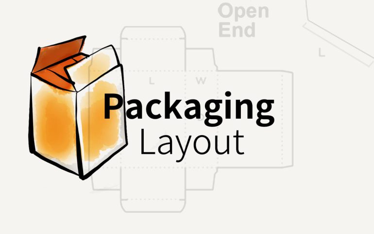
It is an art that involves making use of all of the graphics, text, and spaces on a product package in such a way as to convey the message. The exact massage that you want your customers to understand and feel.
Nevertheless, packaging layout design is an essential component of an effective package design process, particularly when it comes to the creation of designs for multiple product lines that fall under the umbrella of a single brand. The persuasive packaging layout will result in increased sales despite having fewer words. Follow us to experience more.
Handling The Elements
The first thing you should do in the process of designing the packaging layout, which is something that has to be done in advance to make the process as efficient as possible, is figure out what components of your design need to be present. Everything that has to be on the box in order to figure out the best possible layout includes texts, images, logos, pack shots, marks, and barcodes, among other things.
Imagine a scenario in which you need to place an extra product certification marking on the box, and you need to do so after the design is almost finished being completed. What would you do? In such a scenario, the whole packaging layout would need to be redone, which would have to be priced differently and would push back the artwork production timeline.
If you have everything you need in advance, the process of designing the packaging layout for the product will go much more smoothly. It is also an important feature of the element management process to call attention to the aspects that are most relevant. It will make the process for design easier, and it will give a better outcome, reflecting the product values and generating the layout that is the most aesthetically attractive.
Finding The Weight & Balance
A crucial aspect of the design is ensuring that there is a healthy equilibrium between the components. In most cases, the most effective strategy involves making the various parts relatable by establishing a distinct numerical connection between them.
When it comes to efficiency, one of the most useful strategies is to begin the process of sizing the elements by beginning with an element that is either the full width or full height of the overall design. This will ensure that the smaller components are well balanced and can be transferred to elements of varying sizes. In the event that such an element is not included in the design or is not planned to be included, an additional strategy is to begin sizing by using the actual width or height of the box.
The following step is to determine the size of the elements that are most important, such as the product name or the logo. In most cases, those parts shouldn’t make up more than 30 percent of the whole in order to maintain a sense of equilibrium. The actual width or height will be determined by the aspect ratio of the logo or the type of logo.
Following that, the subsequent elements are scaled and positioned according to the specifications, with consideration given to the primary elements. A striking and eye-catching design will be produced as a result of the combination of visual appeal and strong mathematical connections. This design will be liked on a subconscious level because it will be appealing.
Playing with Composition
After determining component dimensions, create the optimal blend. Naturally, this stage may lead to an iteration on the preceding point, and components should be scaled if the composition’s sizes seem off. Following certain standards will help create the best artwork.
Thirds rule This time-tested method divides the layout into three rows and three columns, then arranges objects accordingly. Focus points are where the most important design elements should go. Logos work best as focal points in the top or bottom left corner.
This strategy highlights and simplifies the main components. Shelf Effect Remember that retail products are seldom sold alone when designing the package. Always remember this. You may create a great work of art, but it may blend in with the others on the shelf.
Z-scanning and F-scanning in packaging layout
The best way to separate the design from “product noise” is to keep it clean. Producing components using thoughts about how people read and absorb information is a good approach. packaging layout design relies largely on Z- and F-scanning. In Z-scanning, a design is subconsciously divided into four sections across its height and width.
Top left is the primary optical area, top right is the strong fallow area, bottom left is the weak fallow area, and bottom right is the terminal optical area. The Z-scan skips the two following parts and goes directly to the terminal area. Hence, in terms of composition, the best places to put vital design elements are the top left and bottom right parts.
The F-scanning separates the design pane into two parts, which form an F. The first element of the design composition is the one on which the users focus most, and with each line, their attention deteriorates. Both approaches are applicable, but it depends on the product and its point of contact to determine which one is more suitable.
The Z-scan is better for everyday products, which don’t require a lengthy buying decision process, while the F-scan is better for packages that entail more attention from consumers. In the end, a good composition can make a significant difference in the final design and can affect the product’s sales.
Related article: Packaging Structure
Adjusting The Fine-Tune
One of the last tasks is to go over everything one more time and check for consistency twice, three, or even four times. Even while this may seem like a routine check work, there are really quite a few adjustments being made to the layout right at this point in time.
The most effective strategy in packaging layout is to begin the process all over again in your brain, building upon the design that has previously been developed, and to iterate at each stage. This will guarantee complete consistency and may bring to light some of the more insignificant errors that have been committed. Checking on all of the design’s more inconspicuous components is one more essential step that carries a lot of weight.
During the process of element scaling and composition, they are sometimes overlooked; nonetheless, their importance cannot be overstated because of the stunning end product. We have high hopes that you have, by this point, grasped both the significance of and the nuances associated with an efficient layout design in product packaging.
Keep it consistent
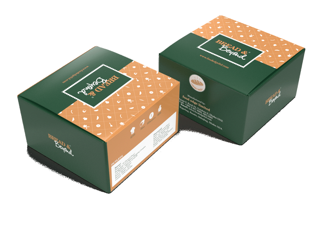
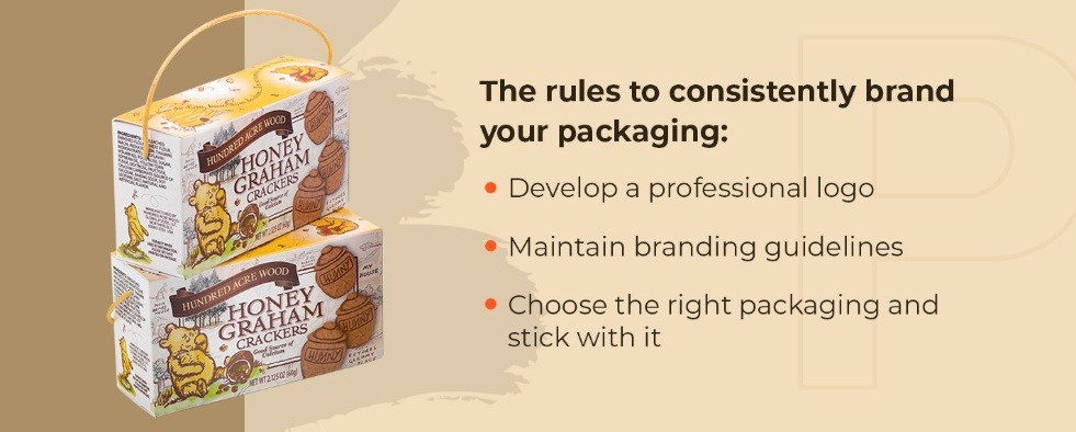
Establishing a look for your business that is readily recognized by customers should be a priority for any and all branding activities you do. It makes no difference whether you create your brand’s image with your logo, colors, typography, or anything else; what matters is that you keep your brand’s image consistent in order to gain brand awareness.
When it comes to maintaining brand consistency, one of the first things to focus on is the packaging of your goods. You don’t have to cram your company emblem into every available space on the packaging, but you should make sure that the design of the packaging accurately represents the identity and principles of your business.
There is more to branding than simply the selection of colors, typefaces, and a logo. These characteristics do play a role, but the most essential aspect of branding is conveying to consumers the personality of your organization, its dedication to providing value to clients, and its desire to meet their expectations.
If you put significant branding efforts behind your goods and marketing plan, you may raise the authority of your brand, which will allow you to generate new clients on a constant basis while also maintaining existing ones. If you don’t have a well-defined brand, you’ll end up confusing the market, which will hamper your capacity to keep customers coming back to your goods and build loyalty among them.
Maintaining consistency in the packaging of your brand is important to do if you want to attract clients to your goods, have a favorable influence on your bottom line, and provide your products with a great return on investment.
Make It Easy to Understand
Because customers will only spend about four seconds looking at your product while it is on the shelf, you need to get your point across as quickly as possible. Most importantly, you need to convey a message that will make them want to purchase your product, or at the very least think about doing so in the future. In order to accomplish this, your packing needs to provide answers to the following two fundamental questions:
What exactly is the function of this product?
What name brand is it being sold under?
Of course, answering the first question is essential because you want the consumer to know right away if the product matches their needs. It is not a problem at all if the potential customer does not currently have any use for your product but is able to understand what it is that you offer.
If you don’t waste their time with poor packaging that makes it impossible for them to determine what the product is, you will have given them a favorable impression of you. You will also increase the likelihood that they will choose your product the next time they require something similar to what you sell them.
If, on the other hand, a customer does need the product that you are selling but the packaging does not immediately tell them what the product does, you will lose out on valuable customers. As a general rule, a simple design that highlights the product’s uses will be received better than a complex design that obscures the product’s use in the message.
Visual identity in designing packaging layout
You want the audience to know who is selling your product, in addition to what it does, through the packaging that it comes in. For instance, if you’ve already established a strong brand identity through marketing materials, you want customers to know at a glance that the product you’re selling comes from you—a brand that they’ve come to trust. Additionally, if you’re still establishing your brand, your packaging will help increase brand awareness and work toward increasing your future sales.
A significant number of businesses base their ability to sell products on the familiarity and credibility of their brand in the minds of consumers. They do this because it works, and your company should too. Start by designing your packaging with the brand clearly visible.
Include Texture
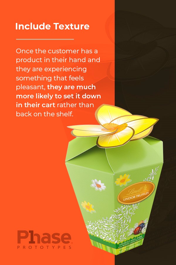
Customers will glance at your goods because of their appealing appearance, but the vast majority of the time they will choose not to purchase them and instead choose an alternative. What are some ways to prevent this from happening? Make use of different textures to give your goods a welcoming and pleasurable feel to the touch in order to give them a tactile appeal.
When a consumer has the product in their hands and is able to personally experience something that makes them feel good, they are significantly more likely to place it in their shopping basket rather than return it to its original location on the shelf.
Think About How a Consumer Will Use It
In addition to the aesthetic value and attractiveness of the packaging you create, you must ensure that it serves the needs of the people who buy your products. Take, for example, the squeeze bottles used for condiments like ketchup, mustard, and mayonnaise.
These bottles are used in the packaging of food. Their ability to be squeezed out makes them ideal for spreading over foods like hamburgers, hot dogs, and sandwiches. This packaging prioritizes the requirements of the consumer and has quickly become the standard for condiments.
The concept of the squeeze bottle is applicable in any setting, regardless of whether you sell condiments. Put yourself in the position of the customer to better understand how they will use the product and how you can make it even more user-friendly for them.
Consider How It Will Look on a Shelf
Your product, when it is sitting on a shelf, will nearly always be in the company of other things that are quite similar to it. The average consumer will not pay close attention to it and instead focus their attention on a number of competing items that can fulfill their requirements at the same time.
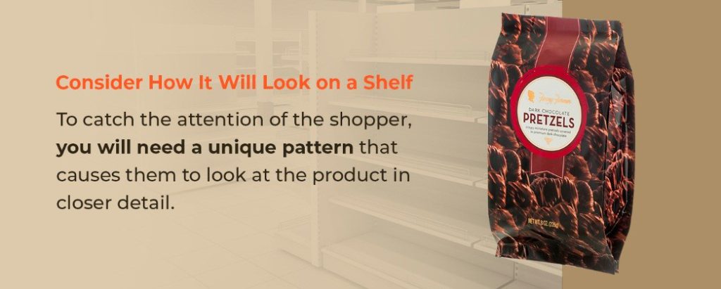
Because of the typical viewing distance of the consumer to the shelves as well as the placement of the items in columns and rows, the customer will often only see the patterns created by the products rather than the actual objects themselves.
To get the attention of the buyer, you will need a distinctive design that compels them to examine the item in further depth. The creation of a one-of-a-kind pattern contributes to an essential aspect of marketing known as “shelf impact.” Shelf impact refers to the allure of a product while it is displayed on a shelf.
If you want your product to make a greater impression on the shelf, you should experiment with a number of designs to see which one stands out to those who are walking by. You may do this by creating a fictitious shelf at a shop that has items that are in direct competition with those that you want to sell there.
For the best results, use many columns and rows and experiment with a range of different package designs to see which one attracts the most attention from customers. Because it’s possible for even the most interesting and distinctive package design to be lost among the other products in the store, you should constantly test all of your packages to determine how they perform on the shelf.
Create a Prototype
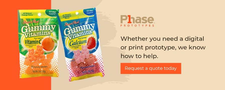
You will need to have a mockup of the packaging built in order to assess the effect that your packaging will have on the shelf before you give the design of the package your final approval. Before actually seeing the design, you won’t have a good idea of how aesthetically appealing it will be when it’s printed on packaging.
Conclusion
Packaging layout is an art that involves making use of all of the graphics, text, and spaces on a product package. Consider the elements and handling, weight and balance, composition, and fine-tuning.

