Introduction
As a graphic designer, your skills go far beyond just creating visuals. One of the most crucial aspects of your job is the ability to communicate your ideas effectively, especially when dealing with clients. Even the most beautifully designed project can be rejected if it’s not presented well. In the client-designer relationship, the way you present your work can determine whether you get immediate approval or face rounds of revisions.
Presenting your work is an art form in itself, and when done correctly, it can lead to faster approvals, more satisfied clients, and fewer frustrating back-and-forths. This article will guide you through a structured approach to presenting your designs to clients, from the initial concept to the final approval. Whether you’re a seasoned designer or just starting, these tips will help you refine your presentation techniques and get more consistent approvals.
1. Understanding Client Expectations
The Importance of the Initial Brief
Before you even begin designing, the key to a successful presentation lies in understanding the client’s expectations. The quality of the initial brief you receive, or request from the client, sets the foundation for your design process and presentation. Ask questions that give you insight into their vision and requirements. Here’s what you should always clarify:
- Target Audience: Who is the design meant to reach? Is it a younger demographic, a professional audience, or a niche market?
- Brand Identity: What is the brand’s tone and personality? Does the client prefer something bold and modern or soft and traditional?
- Client Goals: What is the primary objective of the design? Is it to increase sales, boost engagement, or establish brand recognition?
Understanding these elements helps you create a design that not only looks good but aligns with the client’s broader goals.
Research and Understanding the Client’s Industry
Taking the time to research your client’s industry is another essential step. Whether your client is in tech, retail, or healthcare, knowing their competitive landscape and audience will add value to your work. By understanding their business environment, you can present your designs as informed solutions rather than just creative outputs. This not only makes your designs more relevant but also shows the client that you are invested in their success.
Use this research to frame your presentation. For example, if your client is in the fitness industry, explain how your use of vibrant colors and dynamic typography aligns with the energy and motivation they wish to convey. When you position your design as a solution grounded in industry insights, clients are more likely to see its value.

Setting Clear Expectations
Once you have a solid grasp of the client’s needs, it’s important to set clear expectations from the beginning. Define the scope of work, deliverables, and timeline before the design process starts. This prevents misunderstandings and sets the stage for a smoother presentation process. Ensure that the client understands:
- The number of design concepts you will present.
- The revision process: How many rounds of revisions are included?
- Milestones: Key checkpoints where you’ll deliver drafts or get feedback.
By managing expectations early on, you reduce the risk of scope creep and prevent any surprises when it comes time to present your work.
2. Preparing the Presentation
Tailoring the Presentation to Your Audience
Not all clients are the same. While some may have a deep understanding of design principles, others may not. Knowing your audience is key to creating a successful presentation. For example:
- Corporate clients may want to see how your design impacts their bottom line and aligns with their brand strategy.
- Small business owners might prefer to focus on how the design will appeal to their customers and increase engagement.
It’s important to gauge your client’s knowledge level. For clients unfamiliar with design, avoid too much technical jargon and focus on the visual and practical benefits of the design. For more experienced clients, dive deeper into design theory, explaining how specific elements like color and typography contribute to the overall effectiveness.
Organizing Your Work
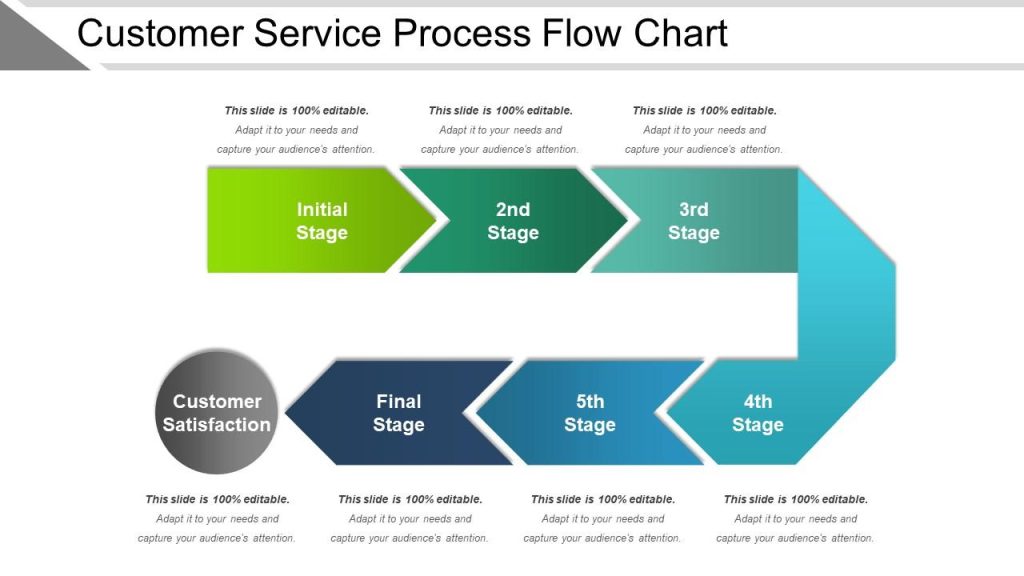
How you organize your presentation can significantly influence how the client perceives your work. Present your design in a structured, logical flow that tells a story. A common and effective structure looks like this:
- The Problem or Opportunity: Briefly restate the client’s needs and objectives. What problem is the design solving, or what opportunity is it addressing?
- The Process: Walk the client through your design process. Explain your research, inspiration, and how you arrived at your design decisions. This shows that your design is thoughtful and grounded in strategy.
- The Solution: Present the final design(s), highlighting how each element contributes to the client’s goals. Explain your choices regarding color, typography, layout, and imagery.
- How It Works: Demonstrate how the design functions in the real world, whether it’s a mockup of a website, business card, or ad campaign. Showing the design in context helps the client visualize its effectiveness.
Creating a Visual Story
People respond to stories and that includes your clients. When presenting your designs, think of it as telling a visual story. Begin by introducing the problem or challenge, and walk the client through how your design addresses and solves it. Use real-world examples or scenarios that the client can relate to.
For instance, if you’re designing a new website for a brand, explain how the color scheme you’ve chosen reflects their brand identity and connects with their target audience. You might say, “We chose blue to convey trust and reliability, which aligns with your core values and will resonate with your target audience of professionals.”
Presenting Multiple Options
Should you present one concept or several? This depends on the project and the client’s preferences. Some clients prefer a single, fully developed concept, while others like to see a few variations to choose from. If you do present multiple options, make sure each one is distinct and solves the client’s problem in a different way.
- Pros of presenting multiple options: It gives the client a sense of involvement and choice. If one concept isn’t exactly right, another might be closer to what they want.
- Cons: Presenting too many options can overwhelm the client and make it harder for them to decide.
If you’re offering multiple concepts, guide the client toward the option that you believe is the strongest. Explain why it best meets their needs and objectives.
3. Choosing the Right Tools for Your Presentation
Presentation Tools
Choosing the right tool to present your designs can make all the difference in how polished and professional your work appears. Different tools offer varying levels of flexibility and interactivity, so consider what works best for your project and client.
- PowerPoint or Keynote: These are great for structured presentations where you want to control the flow. They allow you to create a cohesive narrative with bullet points, transitions, and easy-to-follow layouts.
- Figma or Adobe XD: For more interactive projects, like websites or apps, Figma and Adobe XD are ideal. They let you demonstrate functionality, such as navigation, buttons, and animations, giving the client a real feel for the design.
- PDF Decks: If you prefer a static presentation, a well-designed PDF can be an excellent option. It allows you to create a visually stunning presentation while ensuring that the formatting stays consistent across devices.
- In-Person Presentations: When presenting in person, mockups and printed materials can make a big impact. Clients can touch, feel, and interact with the designs, which can help them better understand the final product.
Mockups and Prototypes
One of the most effective ways to present your work is by using mockups and prototypes. Clients often have trouble visualizing how a flat design will work in the real world, so mockups can bridge that gap.
- Static Mockups: These are useful for showcasing things like logos, business cards, and posters. A mockup of a logo on a product package, for example, allows the client to see how it will look in real life.
- Interactive Prototypes: For web design, app interfaces, or any interactive project, prototypes are invaluable. Tools like Figma or Adobe XD allow you to create clickable prototypes that simulate user interactions. This helps the client understand the flow and functionality of the design.
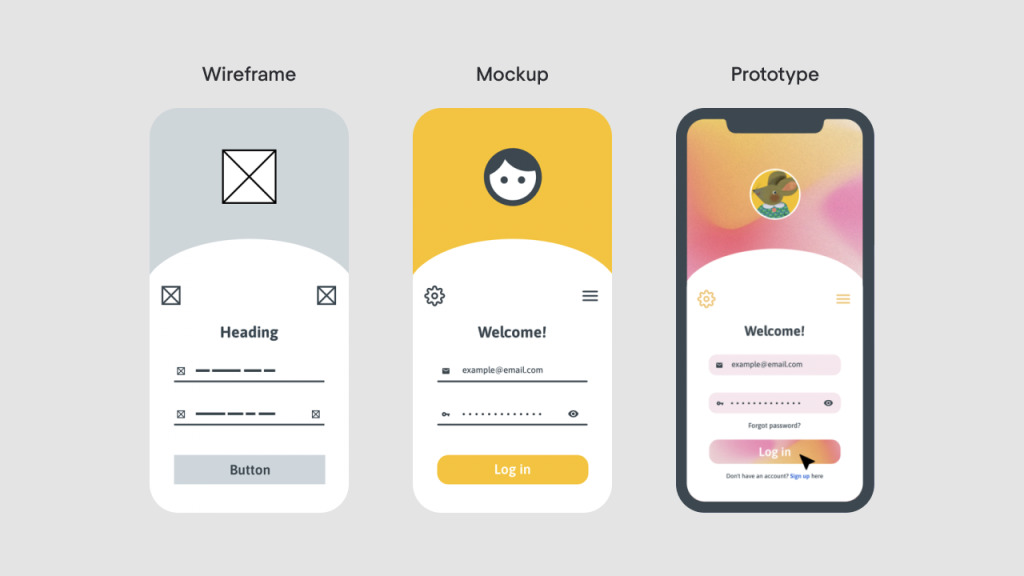
Mockups not only make your presentation more engaging, but they also help clients visualize the end result, which increases the likelihood of approval.
4. Communicating Your Design Choices
Using Data to Back Up Your Decisions
Clients often appreciate when design decisions are grounded in data, especially when the project involves marketing, branding, or web design. For example:
- User experience (UX) research: If you’ve based your design on user behavior studies, mention that. Explaining that a particular layout improves user interaction by a certain percentage, or that a specific color increases engagement, adds credibility to your design choices.
- Analytics from past projects: If applicable, reference similar past projects and how those designs led to successful results. For instance, “In a similar project, we saw a 30% increase in clicks with this type of button placement.” Check out our article on measuring design success for more insights.
Backing up your design with data helps clients see that your decisions aren’t just about aesthetics—they’re strategic moves aimed at achieving their objectives.
Handling Feedback and Criticism
Not every client will immediately love your design, and feedback is part of the process. How you handle it can make or break your relationship with the client. Here’s how to deal with criticism constructively:
- Listen Actively: When a client provides feedback, make sure to listen carefully and understand their concerns. Avoid interrupting or defending your design right away.
- Ask Clarifying Questions: If the feedback is vague, ask questions to clarify what the client doesn’t like. For example, “When you say the design feels too modern, could you elaborate on what specific elements feel out of place?” For more tips, read our guide on effective client communication.
- Offer Solutions: Instead of simply agreeing to make every change the client suggests, offer thoughtful solutions. For example, if they want to change the color scheme, you can say, “I understand your concern. What if we try adjusting the tone of the blue rather than replacing it entirely? That way, we maintain the modern look while addressing your concern.”
This approach shows that you’re open to feedback but also knowledgeable and invested in finding the best solution.
Creating a Clear Revision Process
One of the most effective ways to avoid drawn-out revision cycles is by setting a clear and structured revision process from the beginning. Establish how many rounds of revisions are included in the project scope and what type of feedback you expect from the client at each stage.
For example:
- First Review: General feedback on the overall concept.
- Second Review: More detailed feedback on design elements (e.g., color, typography).
- Final Review: Minor adjustments and tweaks.
This structure keeps the feedback process focused and prevents endless rounds of vague or unproductive revisions.
Anticipating Client Concerns
Another way to streamline the approval process is to anticipate and address potential client concerns before they arise. For example, if you know the client has been worried about how the design will appear on mobile devices, include a mobile version of the design in your presentation. This preemptively answers their questions and helps move the approval process along more smoothly.
Providing Rationales for Key Design Elements
When presenting your design, make sure you explain the key elements in a way that aligns with the client’s objectives. This helps the client see the thought behind each decision, making it easier for them to approve the design. For example:
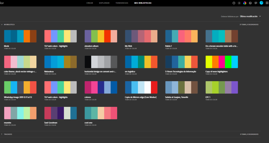
- Color Choices: Explain how your color palette reflects the brand’s values or appeals to the target audience.
- Typography: Discuss how the fonts you selected enhance readability and convey the right tone for the brand.
- Imagery: Show how the imagery or iconography supports the client’s message or marketing goals.
Offering Options for Final Approval
When you’re nearing the final approval stage, it can be helpful to offer clients a choice between two slightly different final versions. This makes the client feel involved in the decision-making process and gives them a sense of control over the outcome, without overwhelming them with too many options.
For instance, you might present two versions of a logo—one with a slight variation in color or typography—and explain the subtle differences. This strategy often leads to quicker approvals because the client feels more empowered to choose between options rather than making changes to a single design.
6. How to Present Design Work Remotely
Virtual Presentation Best Practices
In today’s world, more design presentations are happening remotely than ever before. Presenting remotely has its challenges, but with the right approach, you can still make a strong impression. Here are some best practices for virtual presentations:
- Test Your Technology: Make sure your internet connection is stable and test the video conferencing software ahead of time to avoid any technical hiccups during the presentation.
- Share Your Screen Effectively: Use screen-sharing tools like Zoom or Google Meet to walk clients through the designs in real-time. Make sure your files are organized and easy to access, so you’re not fumbling during the presentation.
- Use Visual Aids: Just as you would in an in-person meeting, use visual aids like mockups and prototypes to make the presentation more engaging. Tools like Figma allow for interactive demonstrations, which can make remote presentations more dynamic.
Recording the Presentation
One advantage of presenting remotely is that you can record the session. By doing this, the client can review the presentation later if they have questions or want to revisit your explanations. Recording also allows you to reference the presentation during follow-up discussions, reducing the likelihood of misunderstandings.
Follow-Up After the Presentation
After a remote presentation, it’s crucial to follow up with a summary of the meeting. Send a concise email that recaps the key points, any decisions made, and the next steps. This reinforces what was discussed and provides a written record for both parties to reference.
7. Building Client Trust Through Communication
Transparency and Consistency
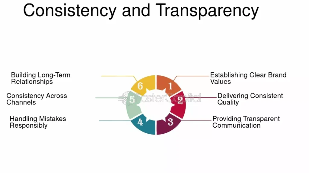
Building trust with your clients is one of the most effective ways to get quicker approvals. Trust comes from transparency and consistency. Keep your client updated on your progress, even if there’s a delay or a roadblock. Honesty about timelines and challenges builds credibility and reassures the client that you’re invested in delivering quality work.
Managing Expectations
Managing expectations doesn’t stop after the initial brief. Throughout the project, regularly check in with the client to ensure you’re on the same page. If the project is shifting or evolving, be proactive in communicating those changes. Clients appreciate when they’re kept in the loop and are more likely to trust your judgment when it comes time for the final approval.
Involving the Client in the Process
Involving the client in the design process makes them feel like a partner rather than just a customer. By seeking their feedback at key milestones, you can address concerns early and prevent major revisions at the end. Clients who feel heard and involved are more likely to approve the final design quickly.
Conclusion
Presenting your graphic design work to clients isn’t just about showing them the final product—it’s about storytelling, communication, and building trust. By understanding client expectations, preparing a thoughtful and engaging presentation, and handling feedback constructively, you can streamline the approval process and build stronger relationships with your clients.
Remember, every client is different, and being adaptable is key. Tailor your presentations to each client’s needs and preferences, whether it’s providing multiple options, using data to back up your decisions, or involving them in the process. When you approach presentations strategically, you’ll not only get more approvals but also gain long-term, satisfied clients who trust your expertise.


