A Bold New Look for PayPal
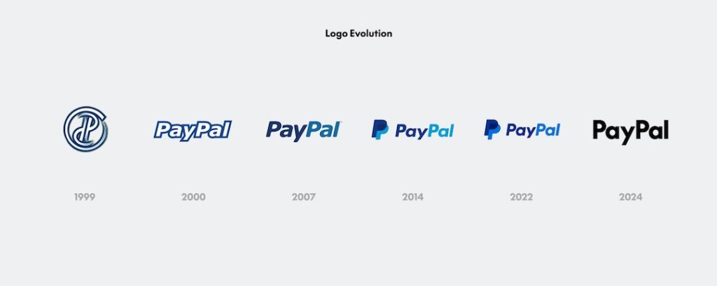
PayPal has introduced a fresh brand identity to celebrate its 25th anniversary. Designed by Pentagram, this new look underscores the company’s role as a leader in digital payments. It emphasizes simplicity and modernity, reflecting PayPal’s goal of making transactions easier for everyone.
Sharper Logo and Updated Colors
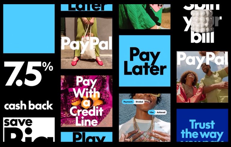
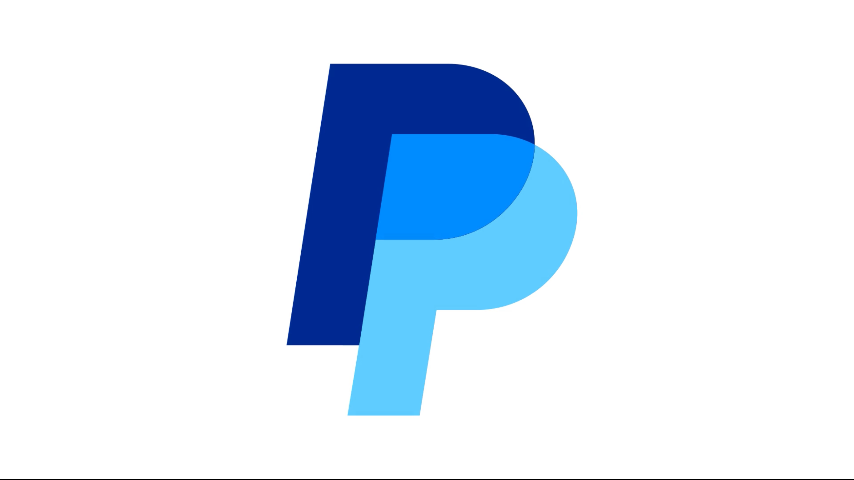
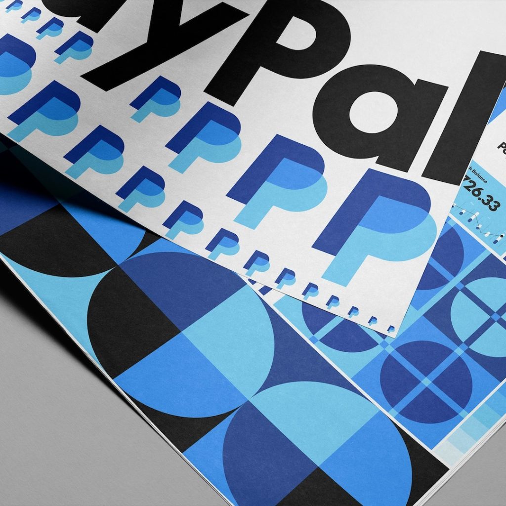
Andrea Trabucco-Campos and the Pentagram team gave PayPal’s logo a sharper, more geometric look. They removed the rounded corners to create a clean, crisp feel. The color palette also received an update, with bright blues that add dimension. Additionally, a subtle nod to Venmo’s signature blue ties the family of apps together.
Simplifying the User Experience
Pentagram also developed a new custom font, PayPal Pro. This typeface is based on the classic Futura and brings a sense of boldness and clarity. A companion font, PayPal Pro Text, was created specifically for smaller screens to ensure legibility.
PayPal has also dropped the yellow from its branding. It has been replaced with an elegant black-and-white scheme, with blue accents adding energy. The new colors are now seen across the platform, including in the interface where black buttons have taken the place of the familiar yellow payment buttons.
Rolling Out the New Identity
Movement plays a key role in the updated brand. PayPal’s new look incorporates animations inspired by gestures like tapping, swiping, and flipping. These elements bring the brand to life, mirroring the seamless actions users take when making payments.

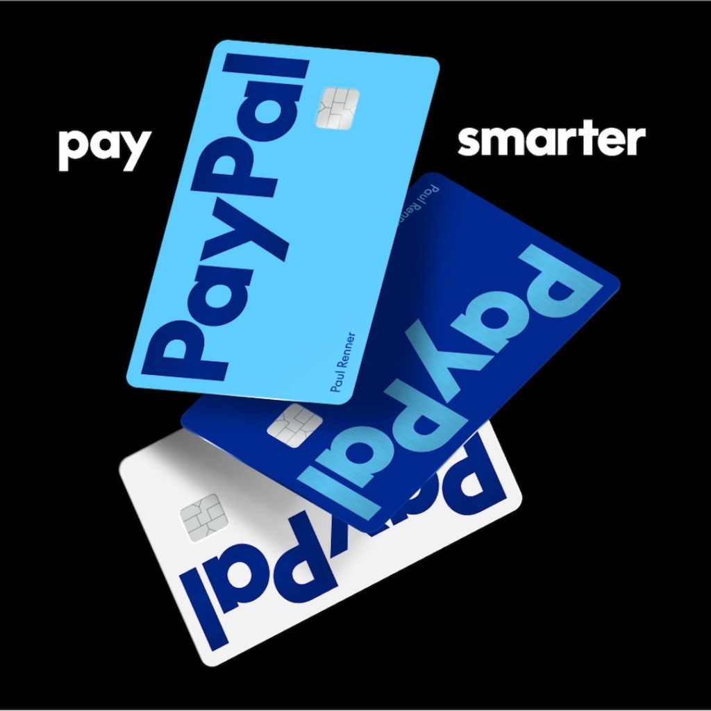
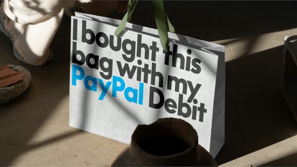
The refreshed branding will first appear on PayPal’s updated debit card, with plans to roll out the new look across all products. This adaptable identity ensures PayPal stays connected with a broad audience while staying true to its roots.