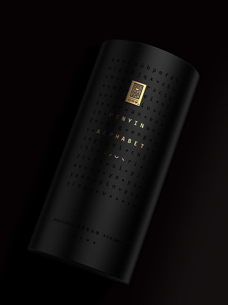
Childhood memories play a significant role in shaping an individual’s emotional connections. For many Chinese people, writing Pinyin with a pencil holds a special place in their recollections of their early years. They look back fondly on the hours spent in classrooms, engaged in practice sessions with classmates.
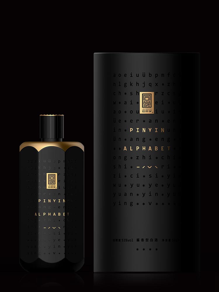
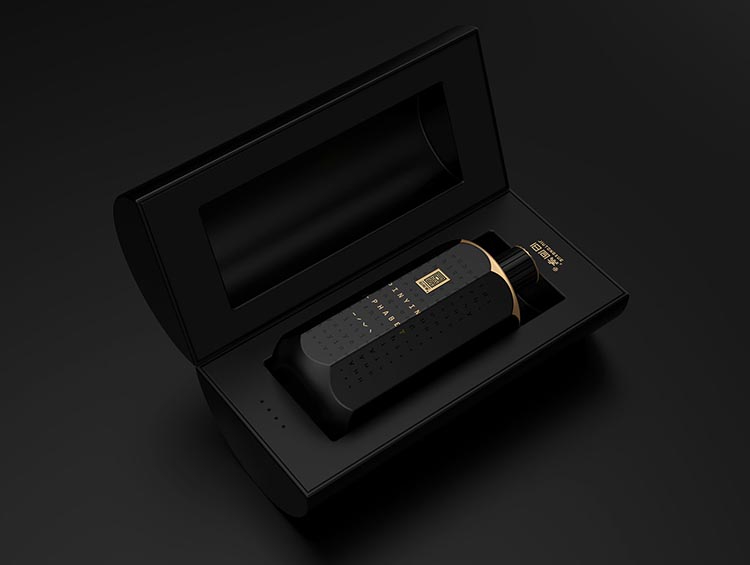
To tap into these nostalgic emotions, a new Pinyin-Inspired packaging has been introduced. This packaging evokes the memories connected with writing Pinyin blossomed during those childhood experiences. Further, it creates a warm atmosphere, and fosters communication when people gather to enjoy a drink together.
Hexagonal packaging; A tribute to the pencil and Pinyin
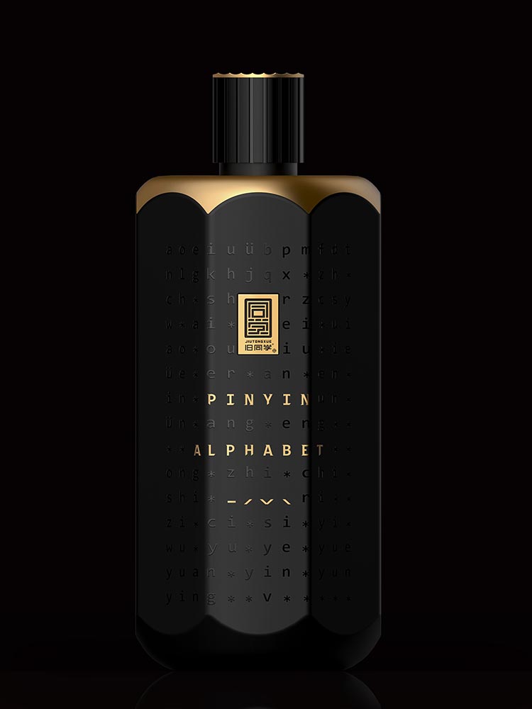
The design of the bottle takes inspiration from the quintessential symbol of learning – the pencil. Reflecting the classic hexagonal shape, the packaging design pays homage to the tool and the significance of writing Pinyin.
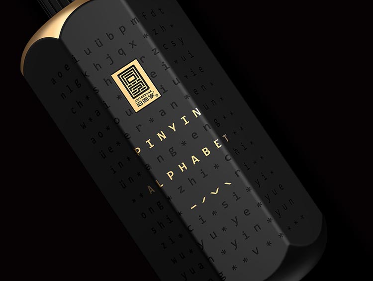
To further enhance the connection to childhood experiences and classroom friendships, the surface of the bottle is silk printed with Pinyin. This technique adds a unique aesthetic appeal and evokes the act of writing on paper. The black color of the packaging design represents the graphite core of a pencil and protects the liquor from direct light exposure.
Targeting consumers in Asia
The target groups for this product include consumers in the Asian region. The goal is to cater to the needs of all the individuals. This market penetration strategy aims to create a strong foothold in Asia and expand the product’s reach to larger global markets in the future.
