The Olympics celebrate athletic prowess and global unity. Their logos play a crucial role in this celebration. Each logo reflects the spirit of its Games and the design trends of its era. Here, we highlight nine of the best Olympic logos that have made a lasting impact.
1. 1964 Tokyo
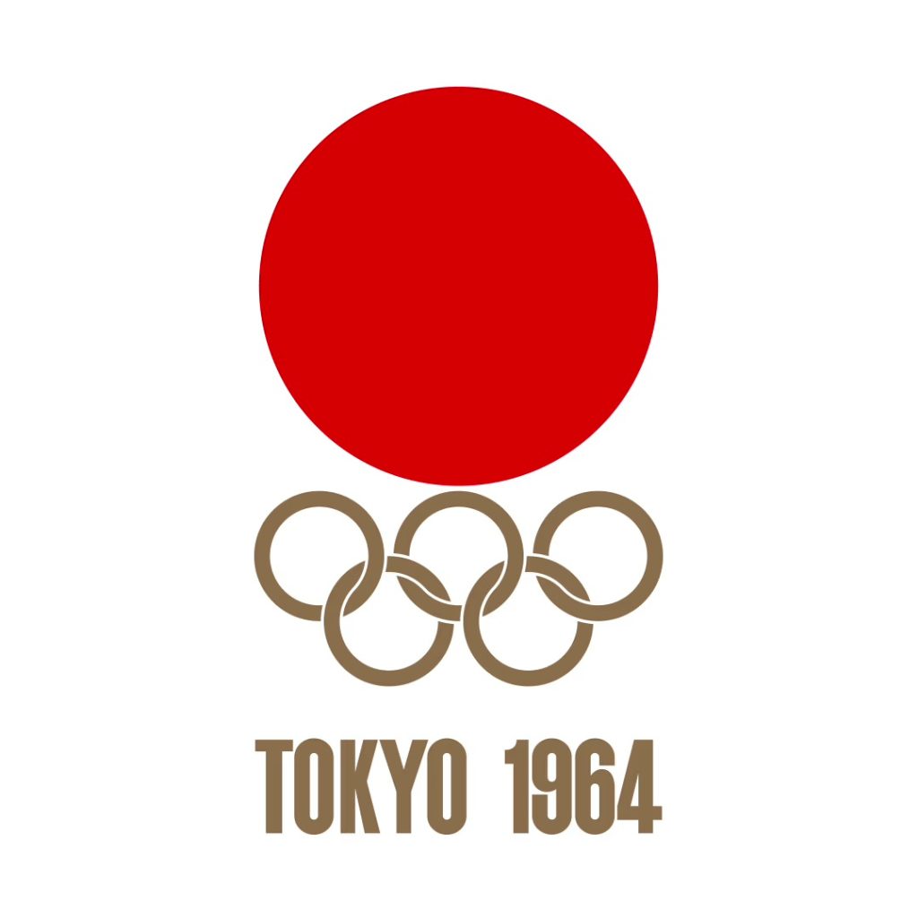
The 1964 Tokyo logo is renowned for its minimalist design. Created by Yusaku Kamekura, it features a red circle, symbolizing Japan’s national flag, paired with the Olympic rings. This logo stands out because of:
- Simple Design: Emphasizes clean lines and minimalism.
- Symbolism: The red circle represents Japan’s national pride.
- Impact: Set a high standard for future Olympic branding.
2. 1984 Los Angeles
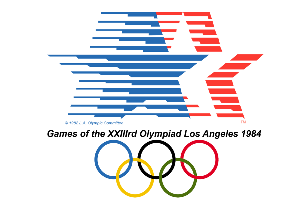
Robert Miles Runyan designed the 1984 Los Angeles logo with bold innovation. It features a geometric flame intertwined with the Olympic rings. Key aspects include:
- Geometric Flame: Modern representation of the Olympic spirit.
- Vibrant Colors: Captures the excitement of the Games.
- Legacy: Celebrated for its creativity and effective representation.
3. 1968 Mexico City
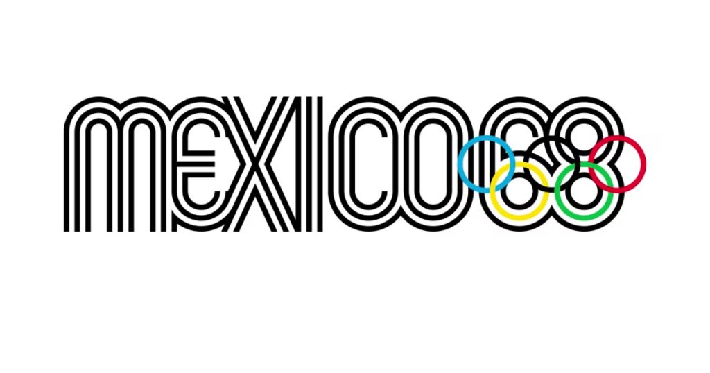
The 1968 Mexico City logo, created by Lance Wyman, merges Mexican cultural elements with modern design. Features include:
- Bold Graphics: Uses vibrant, eye-catching elements.
- Aztec Calendar: Symbolizes Mexico’s rich heritage.
- Cultural Fusion: Reflects the blend of tradition and modernity.
4. 2000 Sydney
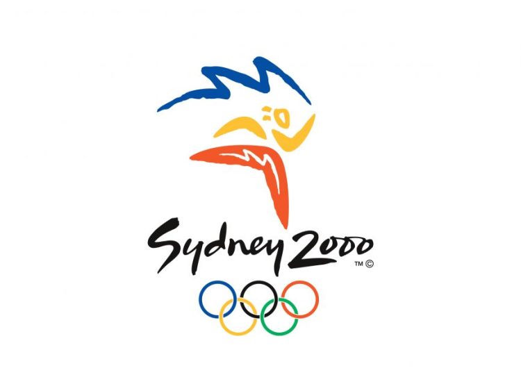
The 2000 Sydney logo, designed by Doyle Partners, stands out with its colorful and abstract depiction of a runner. Key points include:
- Abstract Runner: Represents athletic movement dynamically.
- Aboriginal Art: Incorporates elements inspired by Aboriginal culture.
- Multicultural Essence: Celebrates Australia’s diverse cultural landscape.
5. 2012 London
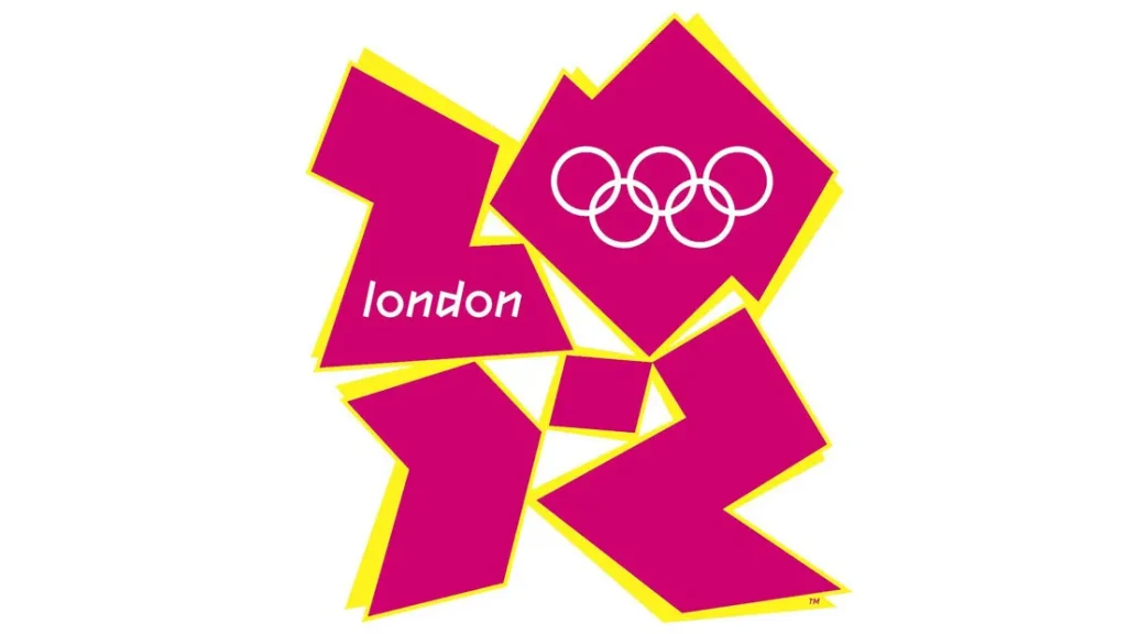
The 2012 London logo, created by Wolff Olins, is known for its modernist style. Although it received mixed reviews, its design features:
- Jagged Design: Striking and unconventional appearance.
- Color Palette: Uses vibrant colors to capture London’s energy.
- Controversy and Impact: Successfully conveyed a contemporary spirit
6. 2008 Beijing

The 2008 Beijing logo, developed by the China Central Television (CCTV) Design Center, features a stylized “dancing” figure. Notable aspects include:
- Dancing Figure: Represents dynamic movement.
- Red and Gold: Reflects traditional Chinese colors.
- Artistic Heritage: Emphasizes China’s rich artistic traditions.
7. 1992 Barcelona
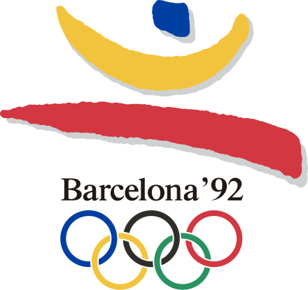
Alberto Corazón’s 1992 Barcelona logo showcases a vibrant postmodern design. Key points include:

- Abstract Athlete: Represents the energy of the Games.
- Catalan Colors: Uses colors from the Catalan flag.
- City Revitalization: Symbolizes Barcelona’s transformation.
8. 1928 Amsterdam
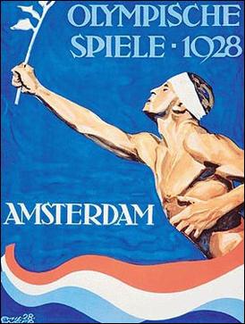
The 1928 Amsterdam logo, designed by Jean d’Ylen, is noted for its classic appeal. Features include:
- Classic Design: Clean depiction of the Olympic rings and flame.
- Traditional Values: Reflects the early Olympic movement.
- Historical Significance: Captures the essence of the 1928 Games.
9. 1972 Munich
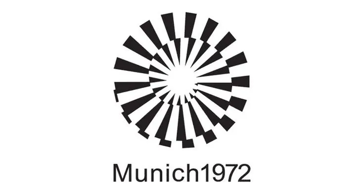
Otl Aicher’s 1972 Munich logo is known for its geometric style. Highlights include:
- Geometric Design: Clean lines and modernist trends.
- Munich Skyline: Adds a local touch.
- Design Trends: Emphasizes clarity and simplicity.
Conclusion
In conclusion, each Olympic logo tells its own story. They capture the spirit and design trends of their times. From the minimalist elegance of the 1964 Tokyo logo to the vibrant modernism of the 2000 Sydney logo, these designs represent the Games and reflect the cultural and artistic trends of their eras. These logos continue to inspire and showcase the enduring legacy of the Olympic Games.