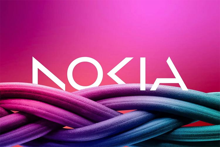
Finnish telecommunications company Nokia has unveiled a new logo and brand strategy, signaling a shift in focus as it looks to compete with its rivals. The new logo features a simpler design with the word “Nokia” in bold, blue letters.
The company said the change is part of its efforts to modernize and simplify its brand.
New goals, new logo
The move comes as Nokia looks to expand into new areas, including cloud services and cybersecurity. The company is also investing heavily in the development of 5G networks and other emerging technologies.
According to Pekka Rantala, Nokia’s Chief Marketing Officer, the new logo is meant to be more “modern and human.”
He added that the company wants to be seen as a “trusted partner” for customers as it looks to expand its business.
Rebranding strategy
Nokia’s iconic “connecting people” slogan, which has been used for over 20 years, will also be retired as part of the rebranding effort.
The company said it will focus on a new messaging strategy that emphasizes its commitment to innovation and sustainability.
The rebranding effort comes as Nokia looks to compete with rivals such as Ericsson and Huawei in the highly competitive telecommunications industry.
The company has struggled in recent years, but has made a comeback in the past year as it looks to take advantage of the growing demand for 5G networks and other emerging technologies.
Nokia’s decision to change its logo and brand strategy is seen as a significant move as the company seeks to regain its position as a major player in the telecommunications industry.
Nokia was once the dominant force in the mobile phone market, but lost ground to competitors such as Apple and Samsung in the smartphone era.
The company has since shifted its focus to telecommunications infrastructure, providing equipment and services to mobile network operators around the world. Nokia has faced tough competition in this space from rivals such as Ericsson and Huawei, but has managed to make a comeback in recent years.

innovative and sustainable way
Nokia’s new logo and brand strategy are part of a broader effort to modernize the company and appeal to a wider audience.
The company said it will focus on delivering “technology with purpose” that is both innovative and sustainable. Nokia has set ambitious goals for reducing its carbon footprint and improving its sustainability practices in the coming years.
Overall, Nokia’s rebranding effort reflects the company’s determination to remain competitive in a rapidly changing industry.
With its focus on innovation, sustainability, and customer trust, Nokia is positioning itself for long-term success in the telecommunications market.
Reference:+