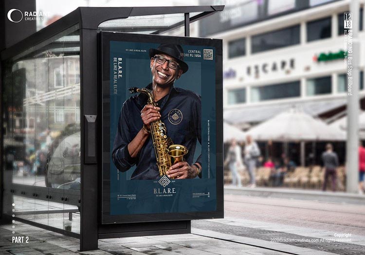
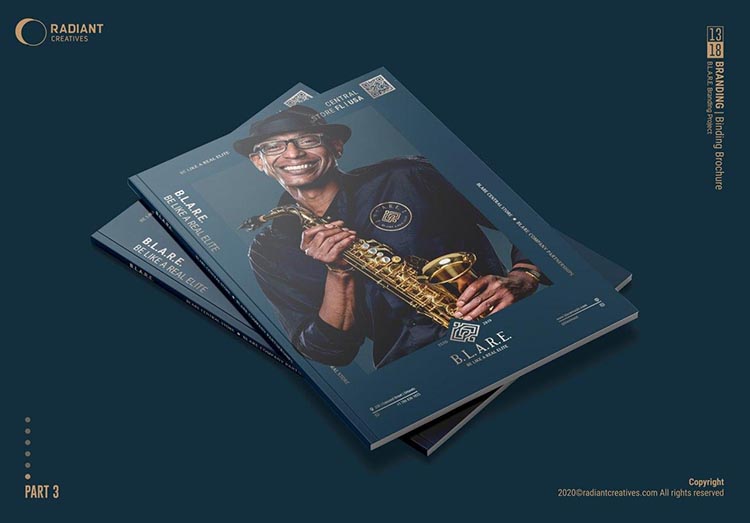
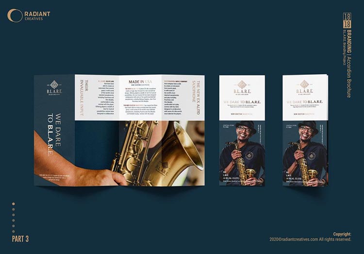
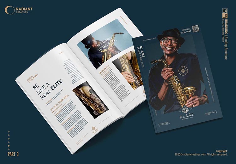
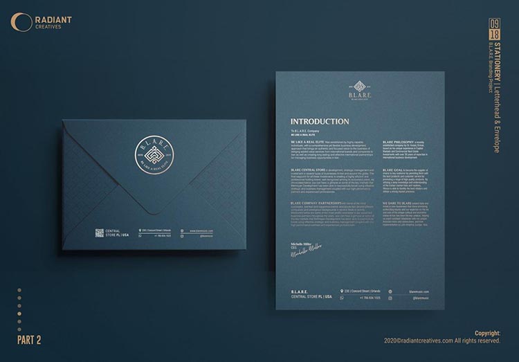
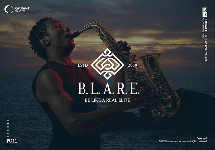
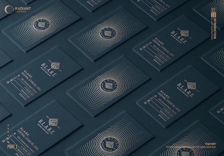
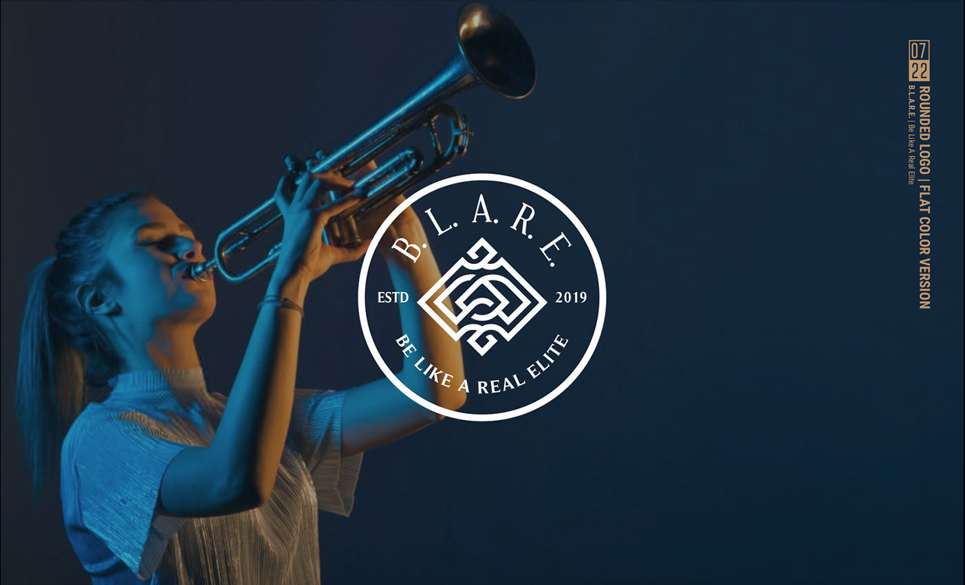
B.L.A.R.E is the Abbreviation form of “Be Like A Real Elite”
The client was really interested in Mediaeval design. According to their preference and interest, the designer tried to use that era motifs in a modern form.
Mohsen Beigzadeh is the designer of this project. He designs the visual identity & logo design of the B.L.A.R.E brand And he used CorelDrawX8 for this design.
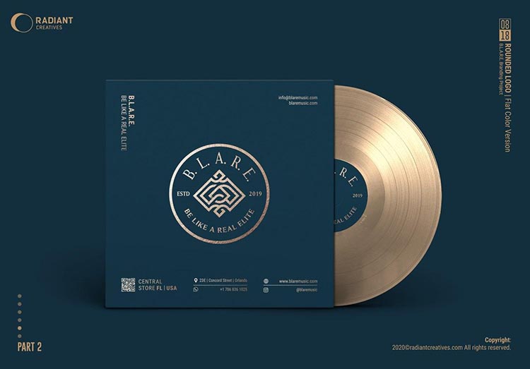
The color and shape of the logo represent the characteristics of the brand
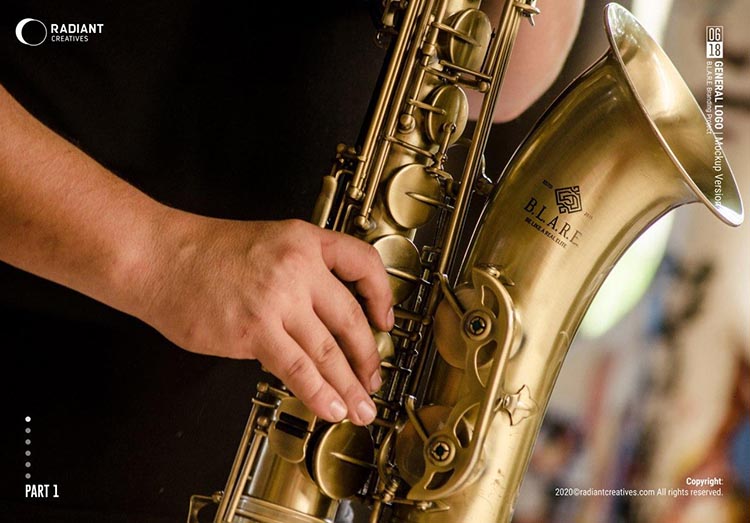
“B.L.A.R.E. is a company that produces wind musical instruments and some expensive accessories in the United States. Being luxury and general at the same time was the brand Priority.”
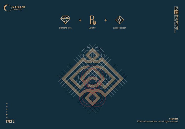
“By combination of the diamond shape, rhombus and letter B, we reached to this special logo. Gold color and knots of lines complete the form. It tried to be luxurious at the first sight.”
“Rotating arrangement of letters in the logo is one of the influential factors in this project. This form makes a visual identity. It shows the idea of sound reflection and sound equalizer forms.”
This identity project is done with collaboration of “Hamed Taleghani” in 2020.”
