The significance of certain beloved brand logos can be comparable to the cross of Christ for some individuals. Recently, Porsche revealed their newly redesigned logo, which had remained unchanged since 2008.
While this alteration might unsettle some die-hard fans, we believe that if something isn’t broken, it should only be slightly enhanced, and that’s precisely what the German automaker accomplished. Brand loyalty affects even the best of us, and often, it’s challenging to pinpoint the exact reasons why we favor a particular brand.
For example, when we observe Apple enthusiasts (no hate—I’m an iPhone user myself) and how they justify their intense desire for the latest Apple product (superior technology, better camera, and so on) it becomes apparent that these justifications are merely manifestations of hubris when compared to rival products in the market.
Logos and brand loyalty
What is the real reason behind such loyalty? An emotional connection prevails in brand loyalty over technical specifications and numerical data. We purchase and covet specific brands because they mirror the individuals we aspire to be and how we wish to be perceived.
Whether it is for better or worse, brands are inherently intertwined with our self-identities in this materialistic world of ours. And what represents the literal face of a brand? Logos. It is no wonder that some individuals become upset when that face undergoes changes.
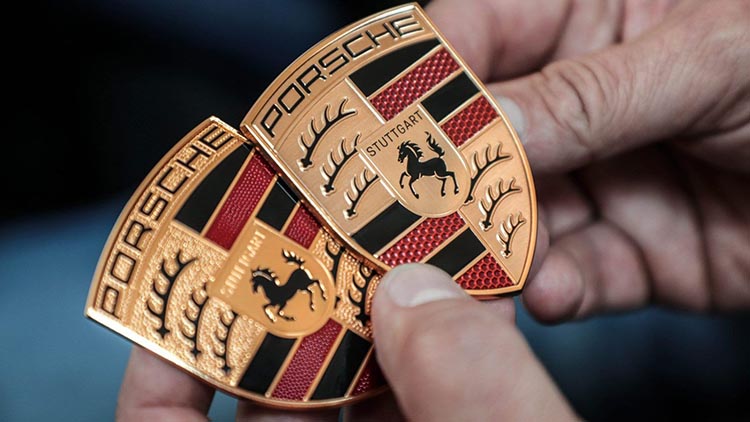
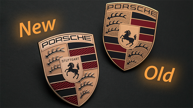
The modifications of the Porsche’s new logo
Porsche invested three years in designing their latest logo, and although the changes are hardly noticeable (thanks to numerous online articles and videos making comparisons), the subtlety of the new logo is precisely why we consider it a success.
The modifications, such as replacing the gold pebbled surface with a brushed gold texture, incorporating additional details on the horse, and positioning the letters “STUTTGART” above a black background, may appear insignificant on their own.
However, when combined, these elements work together to streamline and modernize the logo. They eliminate outdated details that now feel cumbersome and outdated, without compromising the logo’s inherent character and recognizability.

The liberation of Burberry’s logo
How many heritage brands have we witnessed exiling their iconic logos to Helvetica hell? The answer is far too many, particularly in the fashion industry, as evidenced by the industry’s wholehearted embrace of street wear in the past decade. Burberry may yet regain its senses, as one of the initial moves by their current creative director, Daniel Lee, was to liberate the previous logo from the clutches of Helvetica.
The semi-serif font that now serves as the emblem of this esteemed heritage brand could be seen as the first of many small steps, according to optimists, towards breaking free from the dominating influence that blocky Helvetica and similar designs have exerted over most of our beloved brands in recent years.
But let us return to the topic at hand. The airy subtlety of Porsche ‘s latest crest serves as a masterclass for heritage brands across all industries, demonstrating how to maintain a contemporary presence without sacrificing the essence that makes something special from the start.
Was it too long to spend three years developing a logo that feels familiar yet different? Our answer is a resounding no. Good things take time.