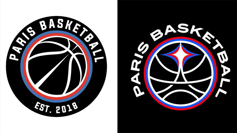
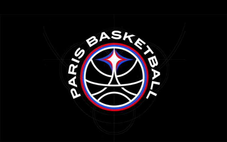
The Paris basketball team’s new logo has sparked debate, as is often the case with sports logos. Critics say the design is too obvious, especially with its use of the Eiffel Tower. However, the logo has personality and a clear connection to the team’s home city.
Tyrsa and YARD Behind the Design
Parisian graphic design studio Tyrsa created the logo, and the agency YARD coordinated the project. YARD has worked on the team’s visual identity since its founding in 2018. The new design replaces a simple circle with a basketball in the center. Now, the basketball lines form the shape of the Eiffel Tower.

The Eiffel Tower Debate
Some criticize the use of the Eiffel Tower as lazy and predictable. Still, familiar symbols often work well in logo design. Brand identity shouldn’t be a puzzle to decode. Many of the best logos deliver simple and recognizable messages. There are exceptions, such as the complex logo of fashion designer Katarzyna Konieczka.
Light and the Eiffel Tower
Tyrsa initially avoided the Eiffel Tower but wanted to include light in the design. The logo references Paris’s nickname, “City of Light,” and the shining talent of new athletes. Tyrsa realized that “the most beautiful source of light in Paris” is atop the Eiffel Tower. The redesign also features a custom font inspired by classic basketball and Parisian typography.
Social Media Reactions
Reactions on social media have been mixed. “It’s good. The minimalist mindset has ruined many brands. It’s refreshing to see a logo with identity instead of a soulless design,” wrote one Instagram user. However, some think the logo looks like that of the LA Clippers. Others believe the designer arranged the colors of the French flag incorrectly, making it resemble logos of Serbian or Russian teams. The colors, though, are those of both the team and the flag of Paris.
Conclusion
The Paris basketball team’s new logo combines familiar elements with a fresh approach. It symbolizes the team’s connection to the city and its future potential. Despite mixed reactions, it has successfully sparked a conversation about balancing creativity and tradition in sports branding.


