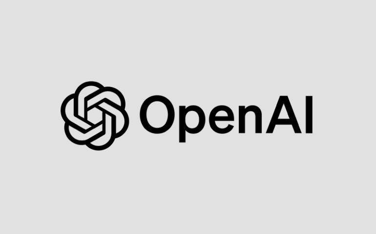
OpenAI, a major player in artificial intelligence, is going through a rebranding process, which includes a new logo design. However, recent reports indicate that the new design has left many employees dissatisfied.
The Planned Redesign of OpenAI’s Logo
OpenAI has been working for over a year on a new logo to replace its current six-sided floral pattern. The company hopes to roll out this new design next year, but reactions have been mixed.
Employee Reactions: Dissatisfaction and Criticism
During a recent meeting, employees were shown the new logo design. Many reacted negatively, describing the logo, a simple black “O” or ring, as lacking creativity. As a result, employees felt the design didn’t match the optimistic and precise image the current logo projects.
The Shift from Symbolism to Simplicity
The current OpenAI logo is seen as a symbol of precision and potential. In contrast, the new, simpler design seems to fall short of those expectations. Employees believe the new design lacks the character that defines the company.
Reasons Behind the Rebranding
OpenAI decided to redesign its logo after hiring new team members in its creative department. The main goal is to create a unique look for its brand, especially in typography and visual identity. By introducing this new logo, OpenAI hopes to strengthen its brand image and make a lasting impact on the public.
Organizational Changes on the Horizon
Aside from the logo, OpenAI is also planning major structural changes. According to Fortune, the company will shift from a non-profit to a commercial entity. CEO Sam Altman has already informed employees of this change, which is expected to take effect next year.
Conclusion
OpenAI is preparing for a significant transformation, including a new logo and a shift in its business model. However, the reception from employees suggests there are challenges ahead as the company continues to evolve.


