Alcoholic beverage packaging is an important aspect of product design, as it not only protects the product but also serves as a means of communicating important information to consumers. Here are some of the design features that are commonly used in alcoholic beverage packaging:
- Bottle shape and size: The shape and size of the bottle can greatly impact the consumer’s perception of the product. For example, a sleek, slim bottle might suggest a more sophisticated, higher-end product, while a larger, rounder bottle might suggest a more casual, party-friendly product.
- Label design: The label design is often the most prominent aspect of the packaging and can greatly influence the consumer’s decision to purchase the product. Labels can include information such as the brand name, product name, alcohol content, and any health warnings.
- Color scheme: The color scheme used on the packaging can evoke certain emotions or convey a particular message. For example, red might suggest boldness or intensity, while blue might suggest tranquility or calmness.
- Closure type: The closure type, such as a cork, screw cap, or snap-on lid, can also impact the consumer’s perception of the product. A cork might suggest a higher-end, more traditional product, while a screw cap might suggest a more convenient, everyday product.
- Packaging materials: The materials used in the packaging, such as glass, plastic, or aluminum, can impact the product’s perceived quality and price point. Glass is often associated with higher-end products, while plastic is often associated with more affordable, casual products.
- Secondary packaging: In addition to the primary packaging, such as the bottle and label, many alcoholic beverages also come with secondary packaging, such as a box or gift bag. This can add an extra layer of branding and make the product more visually appealing.
Overall, the design features of alcoholic beverage packaging are crucial in attracting and informing consumers, as well as conveying the brand image and message.
New Packing for Low-Alcohol Drinks in England
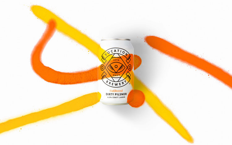
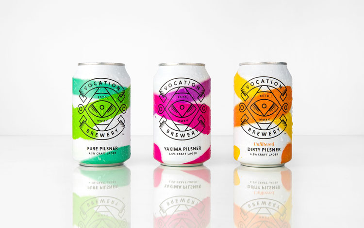
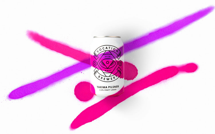
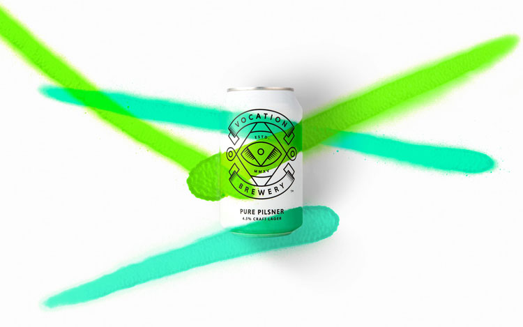
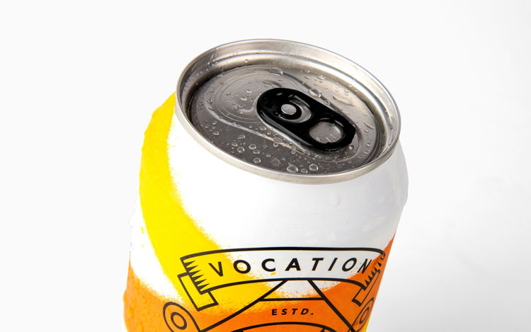
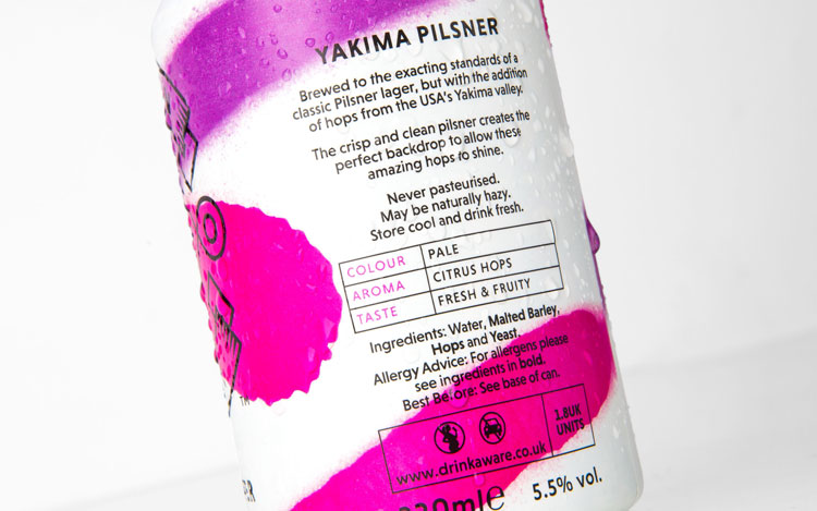
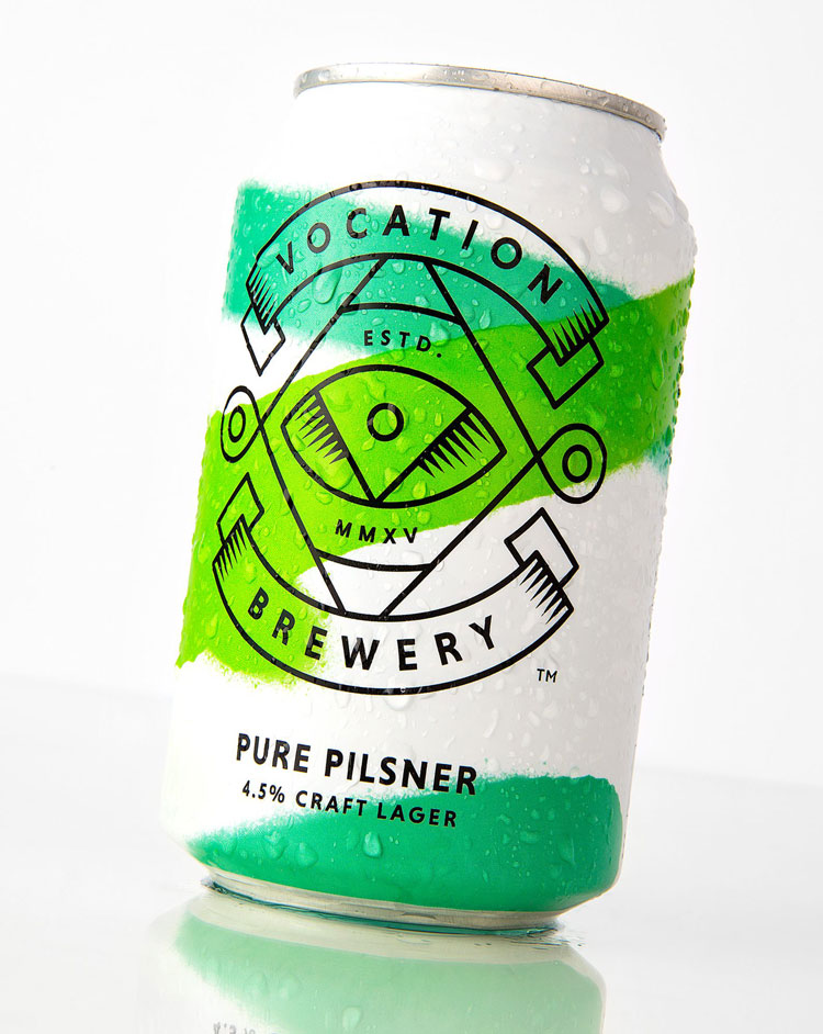
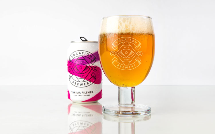
The Robot Food Agency has designed a new packaging for a series of low-alcohol drinks called “Vocation Brewery” in England. The can has a totally white background with bright neon colors, in the way that they have been sprayed on it.
New Production Line, New Packaging Design
The reason for choosing this new packaging was to differentiate this line form others such as Pure Pilsner, Yakima Pilsner and Dirty Pilsner. The new packaging has just been launched.
