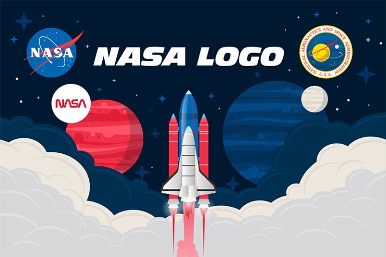
On July 15th, 1959, a now-iconic symbol blasted onto the scene: the NASA logo. This simple design, with its classic colors, quickly became a symbol of humanity’s space adventures.

A Designer’s Vision
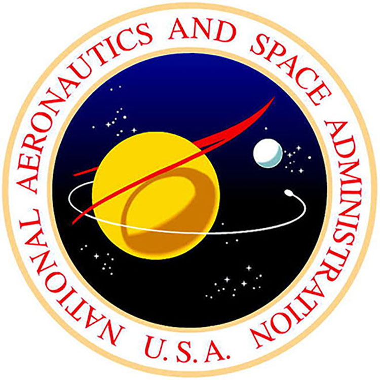
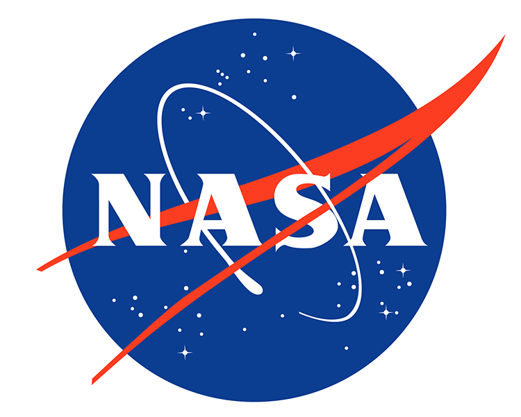
James Modarelli, the logo’s creator, drew inspiration from the vastness of space and the speed of flight. The circle represents endless space, while the wing symbolizes supersonic speeds. “NASA” sits proudly in the center, making it clear who this logo belongs to.
From Press Conference to Everywhere
The logo debuted in April 1959, gracing a press conference where NASA introduced its first astronauts. Over the next 15 years, it became synonymous with NASA, appearing on spaceships, buildings, and even astronaut gear.
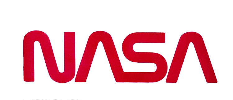
A Change, But Still a Star
Design trends shifted in the 1970s, leading to a new, more modern NASA logo. But the original? It remained a star. It transcended being just a NASA symbol and became a global icon for space exploration.

Hollywood and Beyond
The original logo even made appearances in Hollywood films, further solidifying its global recognition. Its popularity extends beyond movies, with NASA constantly receiving requests for space-inspired merchandise.
This iconic logo remains NASA’s official emblem, ready to accompany future missions – whether it’s returning to the moon or the ambitious Artemis program to Mars. It’s a symbol of both our past achievements and exciting future in space exploration.