A New Look for a New Era
Italian automaker Lamborghini has revealed a flat, simplified logo as part of its broader “transformation process” aimed at sustainability and decarbonization.
Simplified Design
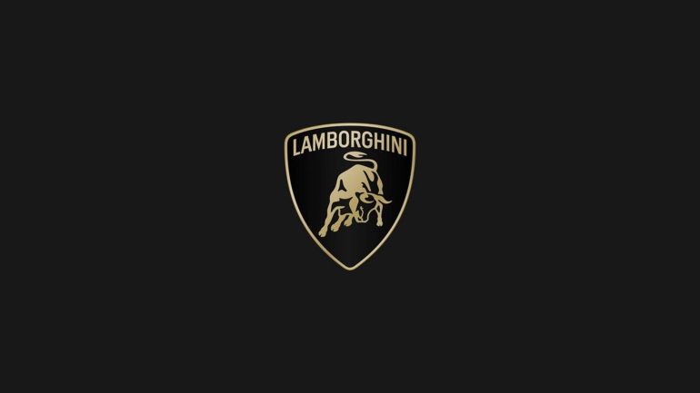
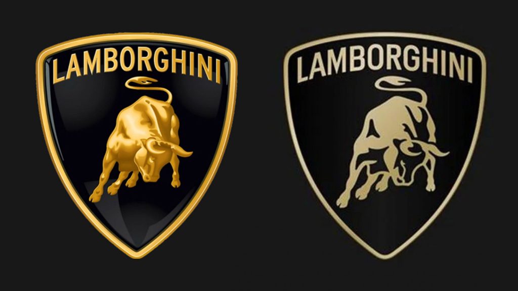
The new logo still features a bull at the center of a shield, but the design is now a silhouette. Lamborghini also introduced a broader, thinner typeface. “The new logo is redefined by a broader Lamborghini typeface and minimal yet bold colors,” the company stated.
Reflecting Brand Values
The redesign aims to reflect the brand’s ‘brave’, ‘unexpected’, and ‘authentic’ values. Future car models will display the logo in classic gold and black, and pared-down black and white versions. The bull, now separate from its shield, will feature prominently on the company’s digital platforms.
New Typeface
A new typeface, inspired by Lamborghini cars’ distinctive lines and angles, will appear in all communications. The lean, tall sans-serif font with hooked curves complements the rebrand.

Commitment to Sustainability
This rebrand, the first in two decades, aligns with Lamborghini’s Direzione Cor Tauri plan. The plan aims to build the first fully electrified Lamborghini model by the latter half of the decade, with hybrid models introduced along the way.
A Nod to Tradition
The original logo, inspired by founder Ferruccio Lamborghini’s love for bullfighting, has featured the Miura bull since the company’s inception in the 1960s. Lamborghini’s redesign follows the trend of other car companies, such as Volvo in 2021 and Audi in 2022, moving towards flat, simplified logos.