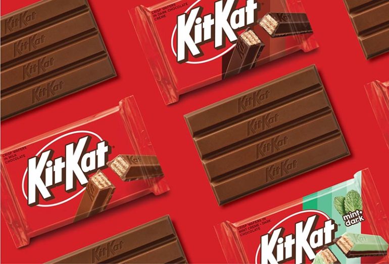
KitKat has introduced its new logo. The popular chocolate brand now has a fresh and attractive look. This time, it’s more professional and distinctive.
Collaboration with Sterling Brands
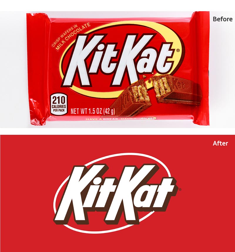
KitKat collaborated with the New York-based Sterling Brands to update its logo for the U.S. market. The goal was to keep its nostalgic appeal while adding a modern touch.
A Fresh Yet Familiar Design
The new logo features a cleaner design with a nostalgic feel. Sharper edges and thicker shadows give it a fresh, yet familiar appearance. These changes make it stand out more on the shelves.
Impact on Branding and Marketing
Even small changes in well-established brand logos can significantly impact branding and marketing.
Key Design Changes
The logo now has a thinner white ring, replacing the previous thick band. This change draws more attention to the KitKat name. The overall design appears more symmetrical. Letters are closer together, creating a more cohesive look.

Purpose Behind the Changes
Sterling Brands explained that the updates celebrate KitKat’s crisp and creamy taste. The new design energizes the brand with a positive and dynamic vibe.
Regional Differences in Logo Design
These logo changes apply only to the U.S. market, where the previous design was similar. KitKat fans in Europe will continue to see the old, familiar logo with the red mark at the end of the letter ‘a.’