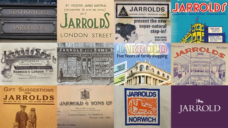
Introducing the department store’s fresh identity, crafted by The Click. This reimagined brand showcases a logo that pays homage to its rich history, while incorporating ink-inspired artworks that cleverly acknowledge its deep connection to the printing and publishing realm.
Jarrolds, the independent, family-run department store, has undergone a remarkable rebranding under the creative direction of The Click. The revitalized logo now showcases a majestic lion character, intricately designed to incorporate hidden, hand-drawn Js within its legs. This clever touch pays homage to the store’s longstanding heritage and adds a delightful element of discovery to its visual identity.
In 2019, the Norwich-based enterprise collaborated with The Click on a comprehensive endeavor encompassing naming, identity development, and packaging for its inaugural line of in-house food and beverage products. Encouraged by the success of their previous partnership, Jarrolds reached out to the design team once more in early 2022 with a vision to propel their store brand into the future. As stated by Adam Ewels, the design director at the studio, the objective was to evolve the brand while maintaining its roots and building upon the foundation of its established identity.
Through an exploration of the brand’s rich heritage, examination of archive materials, and comprehensive competitor research, Ewels explains, the studio skillfully crafted “a written brand story” to guide the visual direction for the client. From the outset, it became evident that the lion symbol played a pivotal role in accruing substantial brand equity, he further emphasizes.
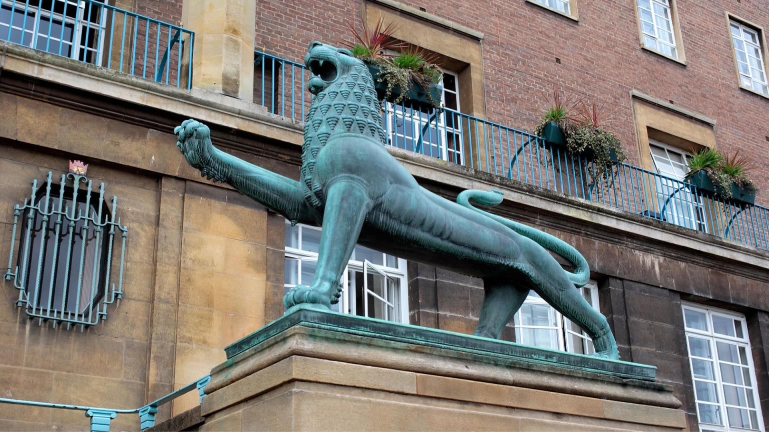
To commemorate the official inauguration of Norwich City Hall in 1938, sculptor Alfred Hardman crafted a pair of heraldic lions. Interestingly, these majestic figures stood proudly near the marketplace, in close proximity to the frontage of Jarrolds’ flagship store. More than five decades ago, Jarrolds embraced the civic lion of Norwich and incorporated it into their distinctive logo.
Previously, the lion had its front leg leaning against the stem of the letter J, resulting in confusion when viewed at a smaller scale. Ewels explains that this positioning often led to it being mistaken for a capital H. To rectify this issue, The Click undertook a complete redraw of both the lion and the J. They skillfully integrated the letter seamlessly into the body of the magnificent feline, resolving the previous confusion.
Described by Ewels as a “clever detail,” it possesses the ability to seamlessly fuse across various logo variations, establishing a harmonious relationship between the logomark and logotype. He further elaborates that the new design exudes a sense of modernity and geometry, featuring enhanced negative space around significant elements, such as the lion’s tail and legs.
Although the J was meticulously drawn by hand, the remaining part of the wordmark employs a traditional and charismatic serif font known as Lapture. The previous font had its shortcomings, with certain areas appearing thin and experiencing “awkward kerning issues between the capitalised R’s,” as Ewels elucidates. Consequently, the studio embarked on a quest for a typeface that exuded “greater weight and warmth,” while exuding an aura of being “premium and sophisticated.” Additionally, The Click made the decision to depart from the all-caps style, instead opting for title case, which, according to Ewels, imparts a sense of being “welcoming and less dated.”
As part of the rebranding process, the name has undergone a transformation from “Jarrold” to its plural form. The company, originally established by John Jarrold in 1770, evolved into Jarrold & Sons, and now boasts a legacy spanning eight generations of the Jarrold family’s involvement in the business. Ewels attributes the decision to change the name to factors such as the family’s rich history, the perception that “Jarrolds” conveys a friendlier tone, and the fact that it is already locally recognized as “Jarrolds” anyway.

In addition, slight modifications have been implemented to the color palette, which showcases prominent shades of purple and blue. The deeper shade of purple now conveys a sense of luxury, while the Verdigris Blue pays homage to Hardman’s bronze lion statues, which have acquired a distinct hue due to atmospheric oxidation. Ewels mentions that the blue tone was previously greener, but The Click decided to realign it with the blue utilized in Jarrolds’ “Our Type of Food” range and aptly name it after the bronze lions themselves.
According to Ewels, the newly established brand guidelines define that the two hues should be utilized independently. The Jarrolds Purple ought to be combined with white, while the Verdigris Blue should be accompanied by black. This approach aims to ensure “optimum legibility” and offer greater versatility in application, as Ewels discloses.
Utilizing Jarrolds’ historical background as a printer and publisher during the 19th and 20th centuries, The Click has crafted a collection of artworks inspired by ink. These captivating creations will be prominently showcased across various channels, including points of sale, advertising materials, and brand awareness campaigns.