Pixar’s sequel, Inside Out 2, dives back into Riley’s mind, this time as a teenager. While exploring the emotional rollercoaster of adolescence, the film also offers a fascinating window into the graphic design choices that bring these emotions to life.
Designing for Emotion
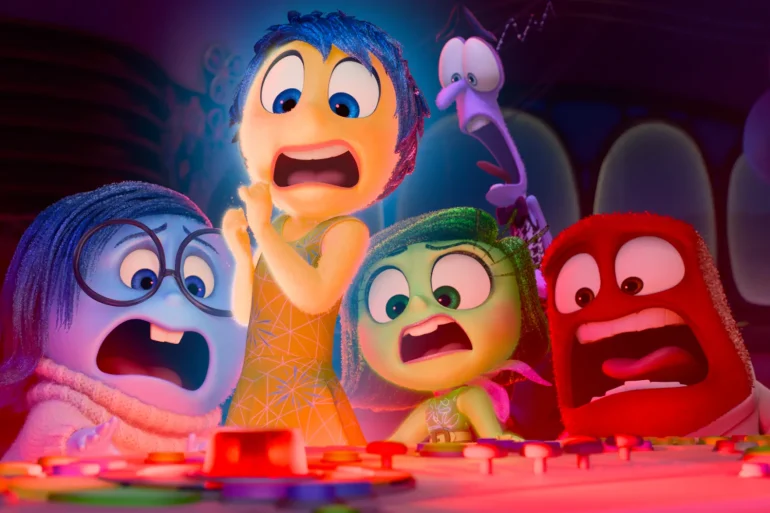
Graphic designers wield color, shape, and typography to evoke specific feelings in their work. Inside Out 2 takes the same approach, with characters designed to visually embody their emotions. Look at Anxiety, voiced by Maya Hawke. Early concept art reveals a monstrous design that was ultimately rejected [3]. The final, relatable and visually anxious character showcases the power of visual communication in conveying emotion.
Color Palettes
The film’s color palette plays a crucial role. Remember Joy’s world, awash in bright, cheerful colors, contrasted with Sadness’s dominated by blues and grays? We can expect Inside Out 2 to follow suit. The new teenage emotions will likely have unique color palettes reflecting their personalities. Imagine Envy bathed in emerald greens, symbolizing jealousy,while Apathy cloaks itself in muted tones, conveying indifference. Analyzing these choices can be a goldmine for graphic designers aiming to evoke specific emotions in their audience.
Typography and the Language of Emotions
Typography, the art of arranging text, can also be a powerful emotional tool. Imagine the jagged, frenetic font used for Anger’s thoughts compared to the soft, rounded font for Joy. Inside Out 2 might delve into how Riley’s internal world uses typography to reflect her emotional shifts. Perhaps moments of anxiety are depicted with jittery, distorted text, while calmness is accompanied by clear, structured fonts. Studying these choices can empower graphic designers to use type to visually communicate emotions in their own work.
A Character Study in Design
But the exploration goes even deeper. Let’s take a closer look at how each character might be designed:
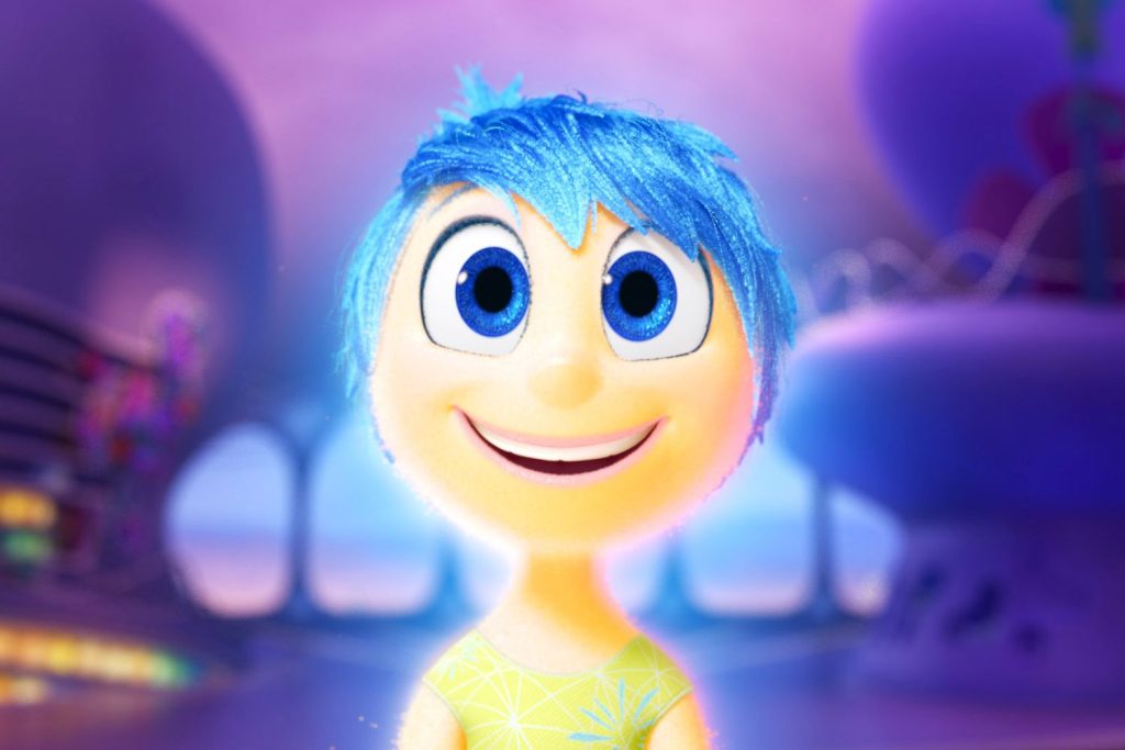
Joy (Amy Poehler):
- Design: Joy remains a radiant star-shaped figure, but with a slightly more nuanced design reflecting Riley’s teenage experience. Perhaps her colors have a touch more complexity, showcasing the bittersweet nature of teenage joy.
- Color Palette: Vibrant yellows and oranges remain dominant, but accents of gold and a touch of purple could hint at the growing maturity and self-awareness of a teenager.
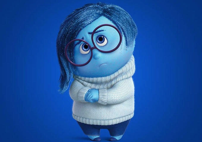
Sadness (Phyllis Smith):
- Design: Sadness might retain her teardrop form, but with a more determined expression. Maybe she even holds a paintbrush, hinting at the potential for sadness to inspire creativity.
- Color Palette: Blues and grays remain the core, but with splashes of lavender or indigo representing a more introspective and contemplative sadness.
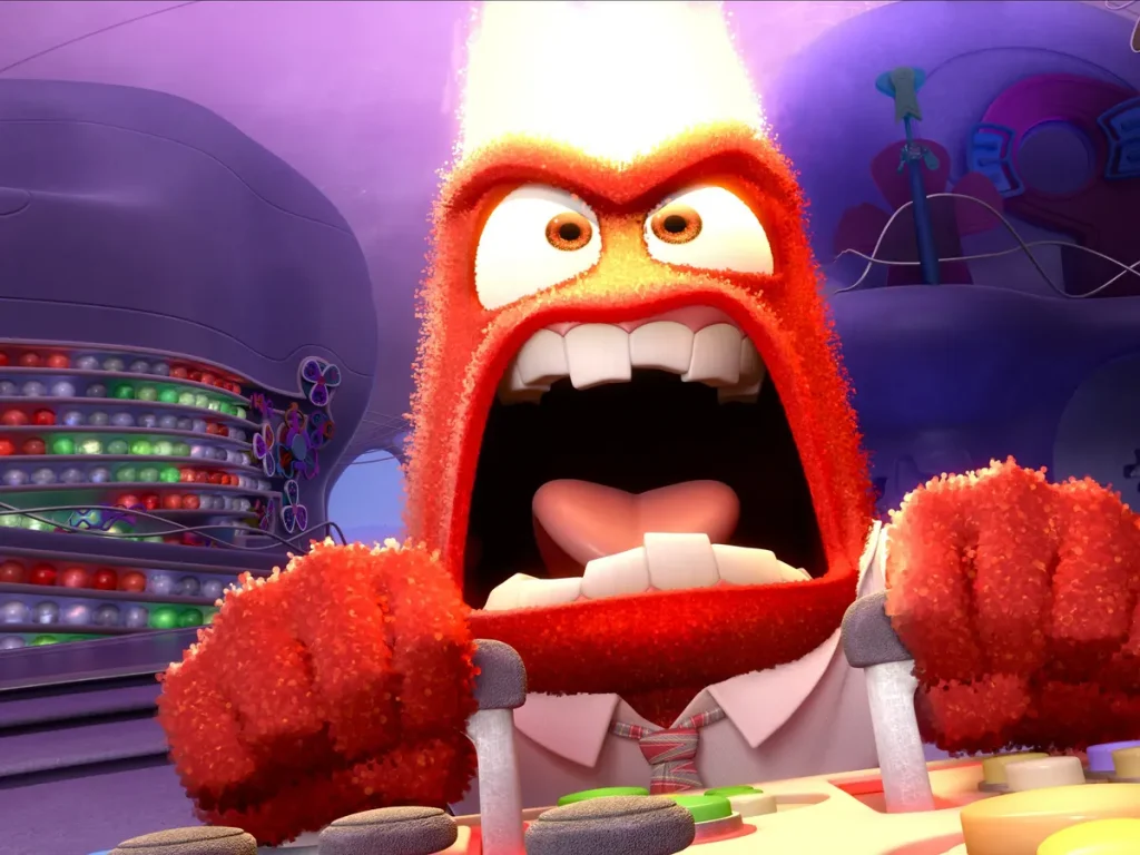
Anger (Lewis Black):
- Design: Anger might be slightly taller and broader, reflecting the increased intensity of teenage emotions. Perhaps his fiery mane has more dynamic movement, showcasing the unpredictable nature of teenage anger.
- Color Palette: Fiery reds and oranges remain, but with accents of black smoke representing a simmering anger that can erupt unexpectedly.

Disgust (Ayo Edebiri):
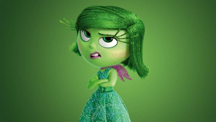
- Design: Disgust might retain her green color scheme, but with a more sophisticated outfit reflecting Riley’s developing sense of style. Perhaps her expressions are a little more nuanced, showing a growing capacity for discernment.
- Color Palette: Forest greens remain dominant, but with accents of teal or olive green representing a more refined and discerning distaste.
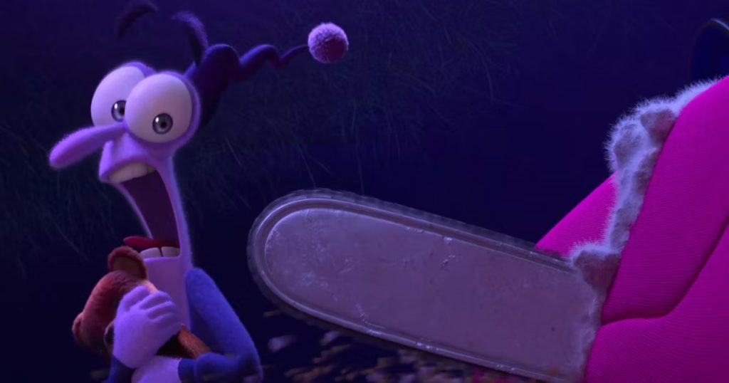
Fear (Tony Hale):
- Design: Fear might remain a jittery ball of nerves, but with a slightly more focused expression. Perhaps he carries a magnifying glass, symbolizing the tendency to overthink things during adolescence.
- Color Palette: Purples and blues remain, but with accents of a cooler gray representing a more analytical and less paralyzing fear.
New Emotions:
- Envy (Maya Hawke): Imagine a sleek, serpentine figure draped in emerald greens, with a constant side-eye glance highlighting envious comparison.
- Embarrassment (Paul Walter Hauser): A blushing, crimson creature constantly caught hiding behind a giant hand, showcasing the awkwardness of teenage self-consciousness.
- Apathy (Adèle Exarchopoulos): A muted, gray figure shrouded in a long robe, conveying a sense of indifference and lack of motivation.
Beyond the Screen
Inside Out 2 is a treasure trove for graphic designers. By dissecting the film’s use of color, character design, and typography, designers can learn valuable techniques to visually communicate emotions more effectively. Analyze the film’s design choices and translate them into your own visual language, fostering a deeper emotional connection with your audience.