
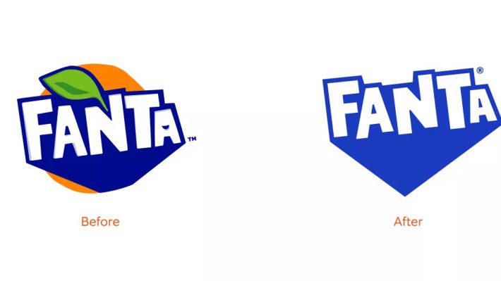
Did you know that Fanta’s visual identity differed in different parts of the world until recently? Although it may have gone unnoticed by some, the brand’s taste varies in different regions. However, starting from now, Fanta has launched a new global visual identity, created by Jones Knowles Ritchie.
According to a press release, the new identity aims to “inspire people to find the fun in life and make the plain playful, with a look that remains unmistakably Fanta”. The new look is very much in line with the brand’s previous iterations.
Jones Knowles Ritchie has dropped the leaf and leaned into the blue of the previous logo, creating a bolder and more striking tone. The orange background has also been removed to make the logo work better across the different flavors of the drink.
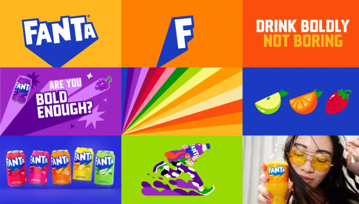
A video released by the company talks about moving away from a boring world and injecting color, fun, and playfulness into the brand. The new Fanta logo “pops and fizzes”, the typeface is playful with a pop, and the illustrations move and pop.
Lisa Smith, ECD Global of Jones Knowles Ritchie, said: “By thinking about what this meant for the brand’s expression, attitude, and actions, we were able to build a distinctive brand identity that signaled Fanta’s commitment to fun at every level – from real life to digital.”

The change to a single global identity brings Fanta in line with Coca-Cola and Sprite. Overall, it’s a solid job that does exactly what it says on the tin. The brand now feels more unified, and the message is clear.
Sue Murphy, senior director of design at The Coca-Cola Company, said, “Fanta’s identity, and particularly the logo, has evolved significantly from the 1940s to today. With this refresh, we aimed to crystalize each element of the brand to be bold and iconic so that we could ensure it would stand the test of time and be recognized around the world.”
While the Fanta wordmark may never be as iconic as Coca-Cola’s, the new logo is definitely a step up from the previous one. Fanta isn’t the only soft drink company to get a new look lately. This rebrand comes hot on the heels of Pepsi‘s own rebrand.
Source