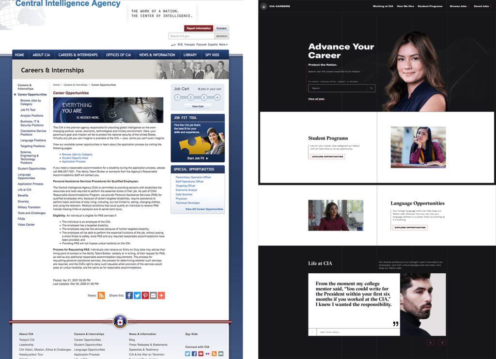
Out with the Old
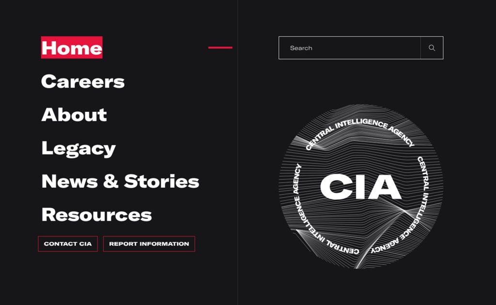
The previous website, stuck in the early 2000s, had become outdated. It was heavy with text, used classic colors reminiscent of early Windows, and wasn’t mobile-friendly. The redesign is here, but opinions are mixed. Some say the new look feels like a Berlin underground techno festival or a Netflix series. While trendy and very “2024,” it may not be what one expects from a government agency. However, if you’re in your 20s or 30s, you’d probably prefer the updated version. The new design is simple and effective for sharing information.
A New Direction Under New Leadership
Gina Haspel, the CIA’s director since 2018, led the push for modernization. In 2019, a report showed that only 26.5% of the agency’s employees were minorities. Haspel, the first woman to head the CIA, wants to move forward: “We must learn from the past, but we cannot dwell on the past.” The broader context of movements like Black Lives Matter, which challenge white privilege and social inequalities, may have also influenced this change.
The redesign is part of a broader effort that began with the launch of a CIA Instagram account in April 2019, which now has 358k followers, and a series of ads on streaming platforms. The goal is clear: to attract and recruit young, diverse talent from all backgrounds.
A Blend of Culture and Technology
The website’s design features micro-lines reminiscent of topographic maps and the graphic codes of electro music festivals like Mutek in Canada. It also recalls the Joy Division album cover designed by Peter Saville, though this time it’s more about reunion than division.

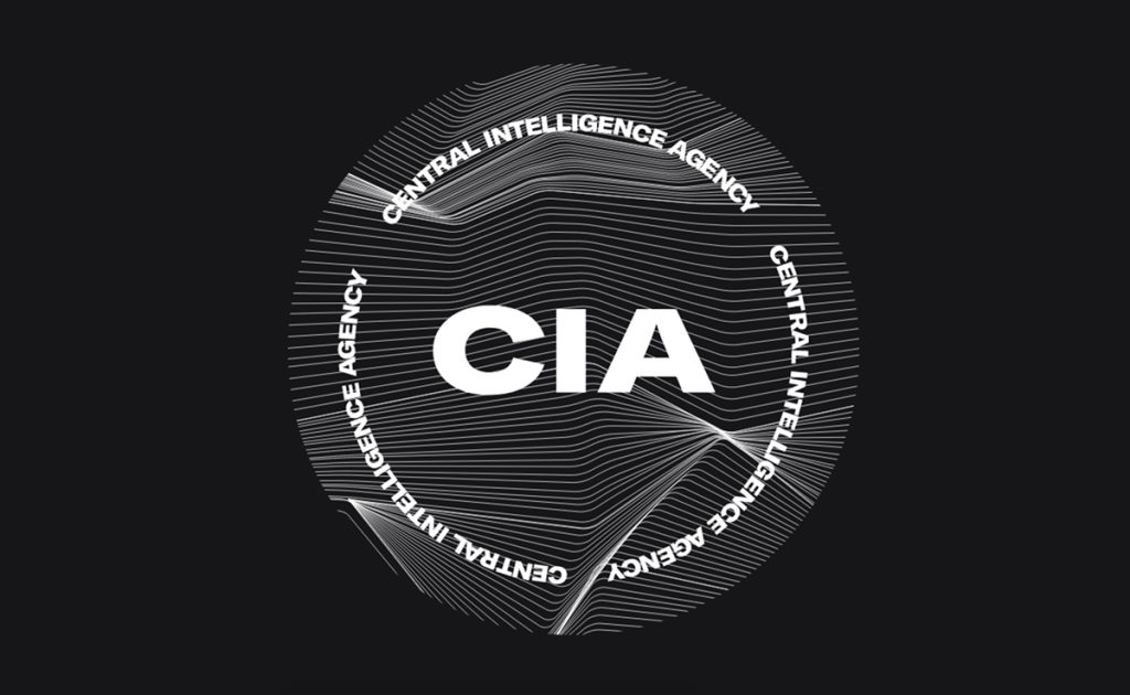
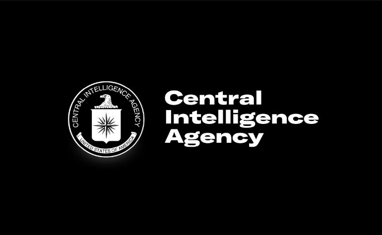
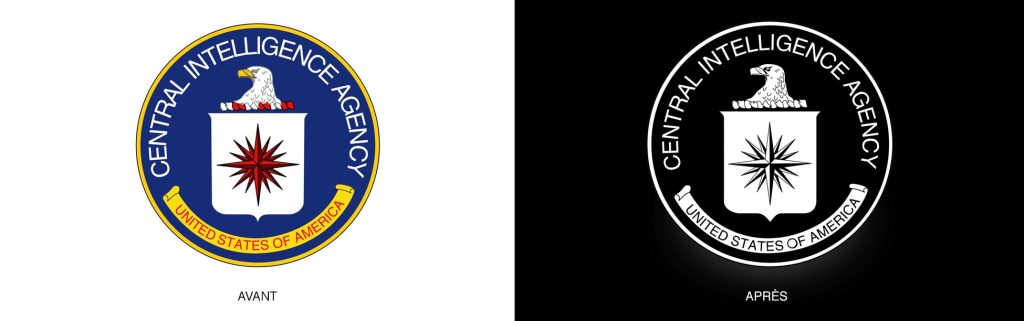
The combination of technology and electro music might seem unusual for the CIA, but the modern, youthful approach could help attract the right candidates. The actual CIA logo remains largely unchanged, now simply rendered in black and white. A more significant redesign might have been more fitting.
The typography used is GT America from Grilli Type—a font that breathes American identity. Who would have guessed that the CIA would take inspiration from an underground electro series? It’s a bold move, and who knows, it might just be a hit on Netflix
If you’re interested in applying, visit their website at www.cia.gov.
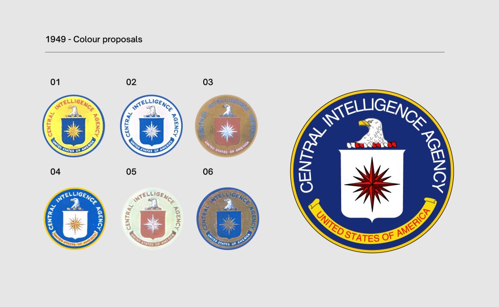
A Brief History of the CIA Logo
The CIA was established in 1947, replacing the OSS, which was dissolved in 1945. The agency is tasked with intelligence gathering, particularly through espionage, and conducting most clandestine operations outside the U.S. It functions as an independent agency of the U.S. government.
President Truman was in a rush to reorganize his intelligence services after the war, and the creation of a logo was overlooked. Though a logo might seem like a minor detail, the lack of an official seal soon became a problem. Young recruits found their authority questioned when they couldn’t produce an “official” ID.

In July 1949, CIA leadership called for internal proposals to design a logo. The submissions were judged on originality and relevance rather than artistic talent, with employees given only two weeks to submit their designs.
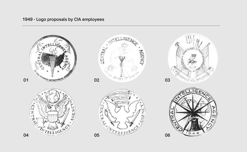
After reviewing the proposals, the CIA leaders decided to cancel the competition, deeming none suitable. Realizing they needed professional help, they turned to the heraldic institute of the American Army.
In December 1949, the Institute of Heraldry presented the design that would become the CIA’s official logo, with a few color variations. The design was chosen by CIA director Roscoe Hillenkoetter and approved by President Truman.
Interestingly, the employees’ proposals were not entirely discarded—elements like the compass rose, the eagle, and certain fonts were incorporated into the final logo. The symbolism is straightforward: the eagle represents vigilance, the shield symbolizes defense, and the compass rose denotes global intelligence gathering. However, the meaning of the small red and white knots beneath the eagle remains a mystery.