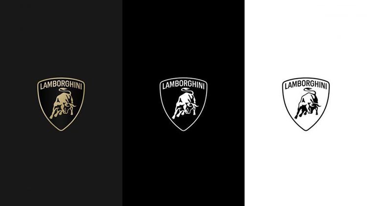
Italian automaker Lamborghini has undergone a brand refresh, featuring a sleek and minimalistic logo as part of a larger “transformation process” towards sustainability and reducing emissions.
The iconic bull and shield remain at the heart of the logo, but with a modern twist. The detailed bull silhouette has been simplified, and a wider, thinner typeface replaces the previous one.
“The new logo boasts a bolder Lamborghini typeface than before, complemented by minimal yet impactful colors,” the company stated. “This restyling aligns with a new strategy, where our visual identity reflects the brand’s core values: brave, unexpected, and authentic.”
This marks Lamborghini‘s first logo update in twenty years. The logo will adorn future car models, retaining the classic gold and black color scheme, while also introducing a pared-down black and white option.

In another first, the iconic bull will take center stage on the company’s digital platforms, independent of the shield, showcasing its prominence.
“The raging bull has received a significant makeover,” Lamborghini announced. “For the first time, it will stand alone across our digital touchpoints, separated from the classic shield for even greater impact.”
The rebrand also introduces a new typeface, inspired by the “unmistakable lines and sharp angles” of Lamborghini cars, to be used across all communication channels.
This new logo and typeface represent the company’s first rebrand in two decades and will be implemented across all official channels.
The shift towards a simplified logo aligns with a broader industry trend, following similar rebrands by Volvo in 2021 and Audi in 2022.
The new logo is part of Lamborghini’s larger sustainability initiative, “Direzione Cor Tauri,” which aims to introduce the brand’s first fully electric model by the “second half of the decade,” with hybrid options along the way.
The raging bull, a nod to founder Ferruccio Lamborghini’s passion for bullfighting, has been a mainstay of the logo since the company’s inception in the 1960s.


