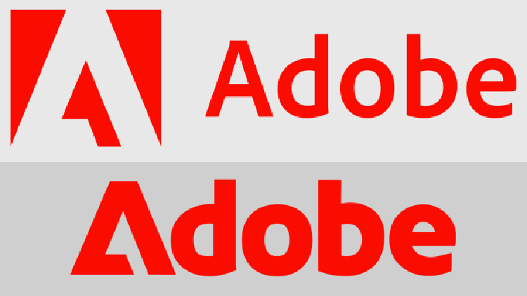
Adobe has recently introduced a new design in its promotional videos. Instead of the classic red “A” graphic mark, the videos show a sleek and slanting “A” that precedes the letters “dobe,” set in a bold typeface.
According to one of the Adobe representatives, the new design is not a replacement for the current corporate logo but a new addition to their brand toolkit. The current corporate logo was designed by Marva Warnock, the wife of the company’s co-founder John Warnock, in 1982.
It features a slanted “A” with a crossbar forming an open triangle and was updated in 1990 to the red, white, and black logo still in use today. Despite having a consistent visual language from its earliest days, Adobe has decided to add a new piece to its tool kit to express its brand in multiple ways.

Adobe’s new design; a modern wordmark
The new design is a wordmark, which is a design made with letters set in a typeface. Although some wordmarks can be considered logos, such as Coca-Cola, Google, and FedEx, Adobe’s new design is not the official corporate logo.
According to the rules of corporate branding, it cannot be considered a logo at all. However, the new design is still a significant addition to Adobe’s brand toolkit, as it is a modern and futuristic design with a classic look that could have easily been Adobe’s first logo from the ’80s.
New typeface for the AI era
Adobe‘s typography team crafted a new version of the Adobe Clean typeface to accompany the new wordmark. The team felt that they were missing a bolder version of Adobe Clean, which led to the creation of a new version that takes up more presence. The new design can be used as an intriguing way to express the brand.
Adobe has no plans to replace the current logo with the new wordmark. However, the new design is more scalable to social media and other places where the current Adobe logo can feel a bit cramped. The new design also ties into Adobe’s new generative AI era, making it feel like it is coming at a pivotal time for the company.


